
In a market flooded with flat digital prints, one handcrafted mixed-media painting is proving that tactile texture and a restrained warm palette can carry an entire room — without ever raising its voice.
Walk into any furniture showroom today and you'll see the same thing: row after row of mass-produced canvas prints, smooth and perfectly uniform, stripped of any trace of the human hand. A new decorative art arrival is pushing back against that trend. This mixed-media geometric painting combines collage technique, granular surface texture, and a deliberately warm neutral palette to create a piece that feels equally at home in a Copenhagen apartment, a Tokyo townhouse, or a New York loft.
It is not loud. It does not demand attention. But step closer and it rewards you — the kind of quiet confidence that defines truly great interior design.
◆ ◆ ◆
🎨 Up Close: What Makes This Piece Different
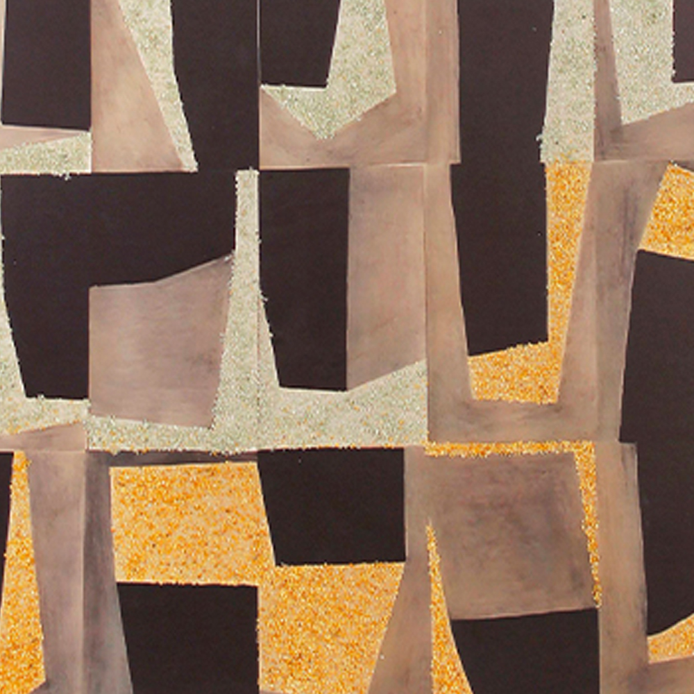
Stand within arm's reach and the first thing you notice is the surface. This is not a smooth printed canvas. Layered paper-like elements are arranged in an irregular grid of geometric fragments — rectangles, trapezoids, and softly curved shapes that overlap and interlock like a quiet, unfinished puzzle.
The color story unfolds in four movements:
- Deep espresso brown forms the bold structural anchors across the composition
- Warm beige and soft taupe bridge the dark and light zones with subtle gradients
- Pale cream with a fine sandy grain catches overhead light and adds depth
- Amber-gold textured accents introduce warmth without ever feeling flashy
The granular texture is the signature detail. In select areas, the surface carries a fine, almost sand-like quality that shifts as you walk past — catching daylight in the morning and glowing softly under lamp light after dark. It is the kind of detail that rewards a second, third, and hundredth look.
Because each fragment is placed by hand, no two pieces are identical. Slight variations in edge alignment, texture density, and color layering mean your painting is genuinely yours — not a pixel-perfect copy rolling off a printer.

◆ ◆ ◆
🏠 Where It Shines: Room-by-Room Styling Guide
The Entryway — A First Impression That Lingers
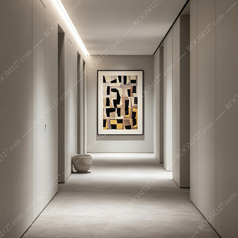
Hang it in a long, light-filled hallway and it becomes the architectural focal point your entryway was missing.
Paired with recessed ceiling lighting and a simple ceramic vessel on the floor, the painting sets a tone of refined calm before guests even step into the main living area. Its vertical orientation draws the eye upward, making narrow corridors feel more generous and considered.
The Living Room — Above the Sofa, Perfectly Proportioned
This is where the piece earns its place. Hung above a low-profile sofa in light gray or warm cream, the painting's earthy palette complements rather than competes with your existing furniture.
The dark brown shapes ground the composition, while the golden accents echo wood flooring and natural textiles. It works equally well in a monochrome minimalist scheme and a warmer, layered Japandi interior.
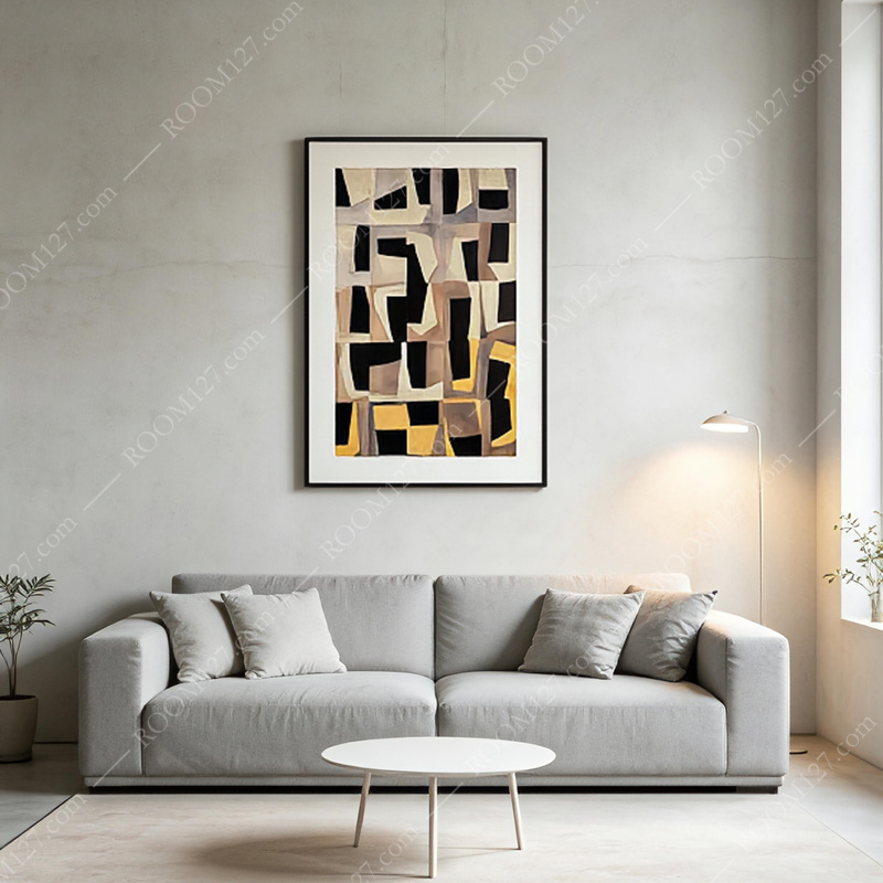
Pro tip: Leave 15–20 cm (6–8 inches) of wall space between the top of your sofa and the bottom of the frame. This keeps the artwork feeling connected to the furniture rather than floating awkwardly above it.
The Dining Room — A Quiet Conversation Starter
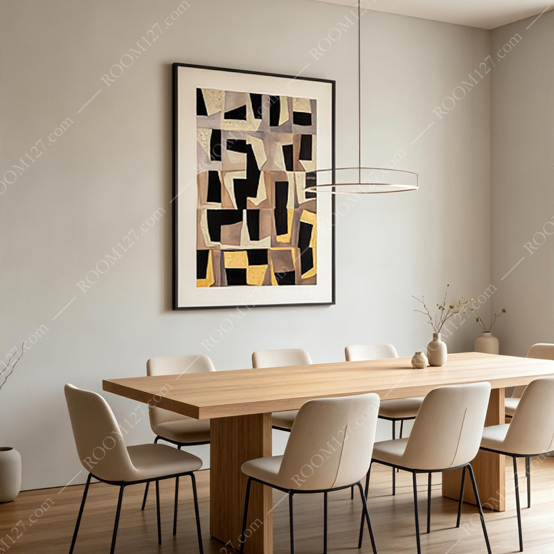
Above a wooden dining table with upholstered chairs, the painting adds visual weight and warmth to a space that can sometimes feel sparse.
The geometric rhythm mirrors the repetition of place settings and chair backs, creating a subtle harmony that makes every meal feel more considered. Pair it with a simple pendant light and let the art do the talking.
The Reading Corner — Intimate and Inviting
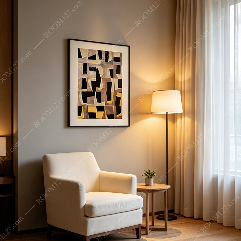
Tucked beside a cozy armchair with a floor lamp and side table, the painting transforms a forgotten corner into a destination.
The warm tones feel especially inviting under indirect lamp light — the golden textured areas seem to glow from within, making the space feel cocoon-like rather than empty.
The Gallery Wall — A Solo Statement
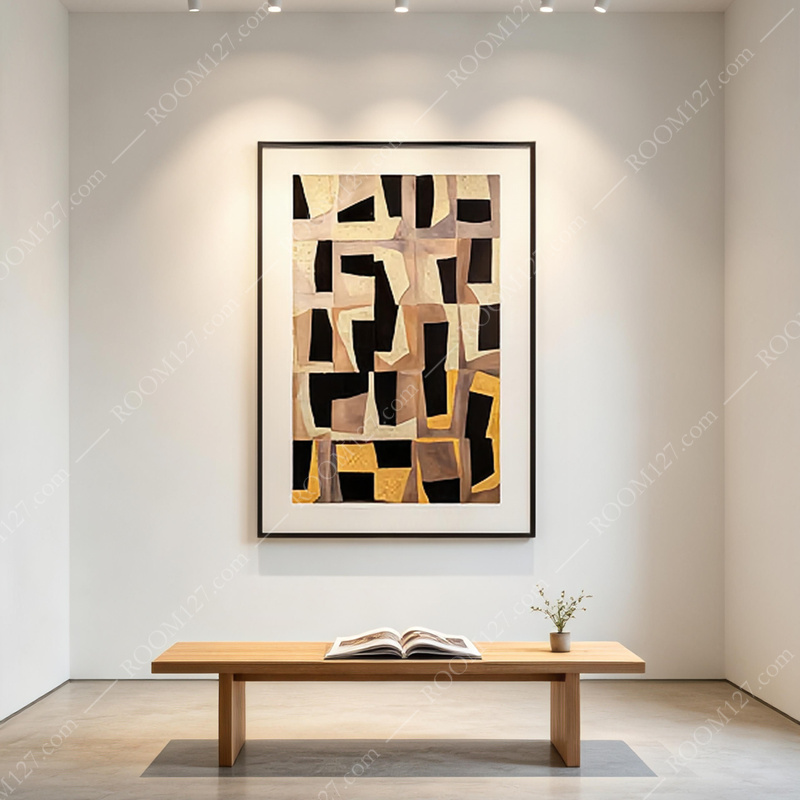
In a dedicated art wall with track lighting, the piece holds its own as a single monumental work.
The texture becomes even more apparent under focused gallery lighting, with soft shadows playing across the granular surface. No need for a cluster of smaller pieces — this one deserves the whole wall.
◆ ◆ ◆
✋ Craftsmanship & Material Details
What sets this piece apart from printed alternatives is the hand of the maker.
Each geometric fragment is positioned individually, creating subtle variations that make every piece unique.
The mixed-media approach combines:
- Collaged paper elements with visible edges and deliberate overlaps
- Textured medium applied in select zones for that signature granular finish
- Matte and subtly reflective areas that play with light differently throughout the day
- A restrained warm palette that feels current but will not feel dated in five years
The framing is clean and minimal — a thin profile in a neutral tone that lets the artwork breathe rather than competing for attention. It arrives ready to hang, with sturdy hardware appropriate for its weight.
◆ ◆ ◆
🛒 Practical Buying Advice
Size Matters — Measure Before You Buy
This vertical-format piece works best when it fills roughly two-thirds to three-quarters of the wall space above your furniture. A piece that is too small will look lost; one that is too large will overwhelm. Measure your wall, measure your furniture, and choose accordingly. When in doubt, go slightly larger — undersized art is the most common styling mistake.
Lighting Is Half the Experience
Because texture is such a key feature, position the painting where it receives indirect natural light or dedicated wall washing. A simple picture light or a well-placed track spotlight will dramatically enhance how the textured surface reads throughout the day. Avoid direct, harsh sunlight — it can fade the warmer tones over time.
Match Your Undertones
The painting leans warm. It pairs beautifully with oak, walnut, cream linens, and terracotta accents. If your space is predominantly cool-toned — think gray marble, chrome fixtures, blue-gray walls — consider whether you want the artwork to introduce warmth or clash with it. In most cases, warm art in a cool room adds exactly the balance a space needs.
Do Not Over-Style Around It
This piece has enough visual interest to stand alone. Keep surrounding decor minimal — a low sofa, a simple coffee table, one well-chosen plant. The goal is quiet confidence, not visual noise.
◆ ◆ ◆
🔚 Final Thought
Great art does not need to shout. This mixed-media geometric painting proves that warm neutrals, handcrafted texture, and thoughtful composition can carry a room with understated elegance. Whether you are furnishing a new home or refreshing a tired wall, it is the kind of piece that grows on you — revealing new details with every season and every change of light.
In an era of disposable decor and fast furniture, choosing something made by hand is a small act of resistance. This painting is not just something to hang on your wall. It is a daily reminder that texture, warmth, and imperfection are worth paying for.
Available now as part of the new decorative art collection. Each piece is hand-finished and may vary slightly in texture and fragment placement — that is not a defect. It is the signature of handmade work, and it is exactly what makes it yours.