
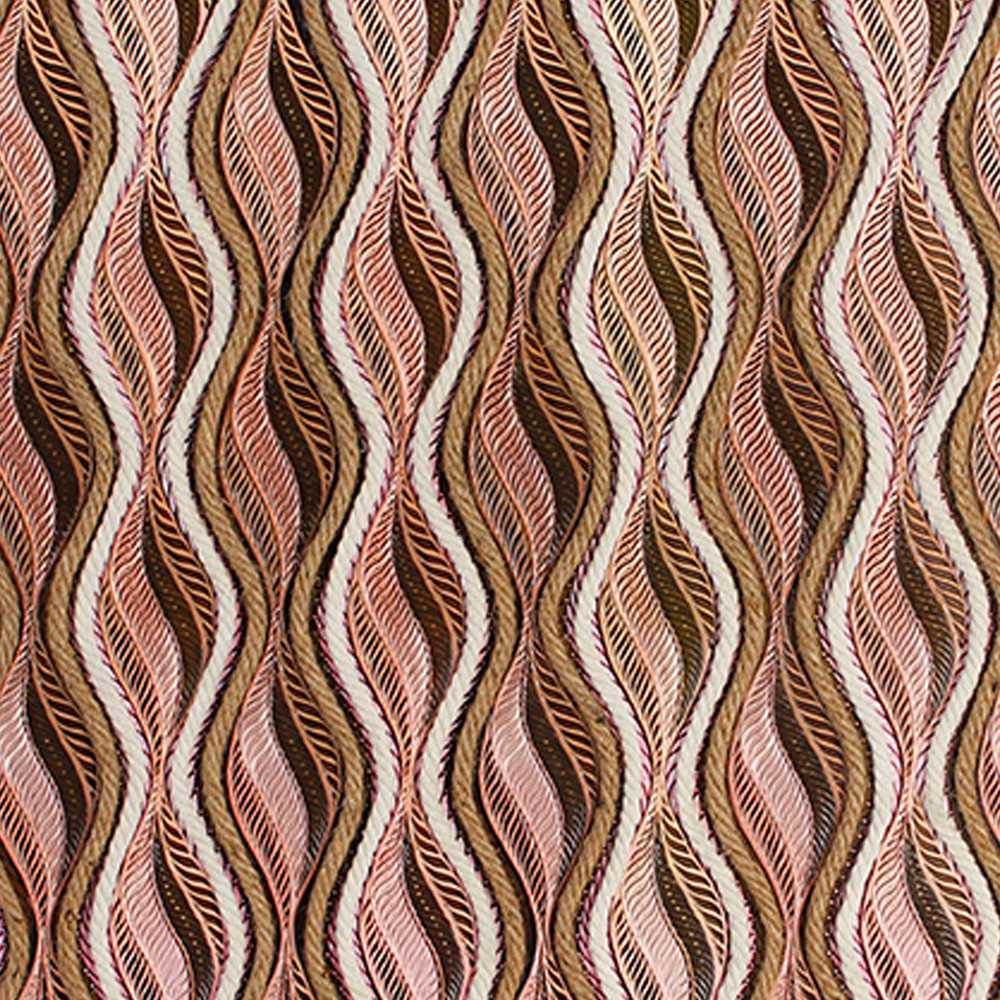
Feather-like strands undulate across a square canvas in warm clay, dusty rose, and cream. It looks like fabric, feels like autumn, and fits almost anywhere you hang it.
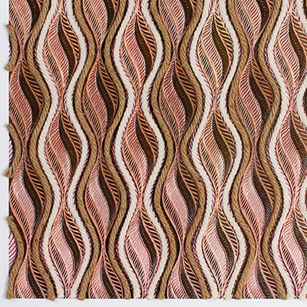
Most wall art comes in one of two shapes: a tall rectangle or a wide one. This painting is neither. It is a perfect square, and that simple choice changes everything about how it lives on a wall. It does not stretch upward or spread outward. It sits. It holds its ground. And within that square, dozens of interwoven feather-like strands rise and fall in warm waves of terracotta, dusty rose, caramel, and cream.
From a distance it reads as a rich, earthy pattern — almost a textile. Up close, each strand reveals fine parallel lines, subtle color gradients, and the rough, hand-cut edges of paper. It is the kind of artwork that makes you want to reach out and touch it, which is perhaps the highest compliment a decorative painting can receive.
1Up Close: The Texture You Can Almost Feel
The pattern is built from repeating vertical columns, each containing a pair of undulating feather or leaf shapes that nest together like interlocked fingers. Within each shape, dozens of fine lines run parallel to the curve, creating a ribbed, almost quilled texture that catches light differently from every angle.
Color & Texture Breakdown
- Terracotta and rust form the warmest strands, grounding the composition in clay and earth
- Dusty rose and blush soften the palette, keeping it feminine without feeling sweet
- Cream and off-white strands separate the columns, creating rhythm and breathing room
- Caramel and tan add mid-tone depth between the warm and light zones
- Dark chocolate brown fills the negative spaces, making each strand pop with definition
- Hand-torn paper edges are visible along the left margin — a deliberate signature of the handmade process
It does not look like a painting. It looks like something woven — a tapestry, a basket, a piece of fabric that someone decided to frame. That ambiguity is its charm.
The square format means there is no "correct" orientation. You can hang it as delivered, or rotate it 90 degrees for a horizontal wave effect. Most people will not notice the difference, but you will know, and that small flexibility is surprisingly useful when you are rearranging a room.
2Why the Square Format Works
Square art is having a moment, and for good reason. Unlike vertical pieces that need a tall wall or horizontal pieces that need wide furniture, a square painting is adaptable. It works above a bedside table, beside a window, in a narrow hallway nook, or centered on a large wall with room to breathe.
It also pairs beautifully with other art. Because it does not compete in height or width, a square painting can sit beside a rectangular piece, above a low console, or in a grid of smaller works without throwing off the balance. Think of it as the neutral of art formats — it gets along with everyone.
Hanging Height for Square Art
The center of the painting should sit at roughly 145–155 cm (57–61 inches) from the floor — standard eye level. When hanging above furniture, leave 15–20 cm (6–8 inches) between the furniture top and the frame bottom. Because the piece is square, it will naturally feel centered whether your furniture is wide or narrow.
3Where It Feels Most at Home
The Bedroom — Warmth Before Sleep
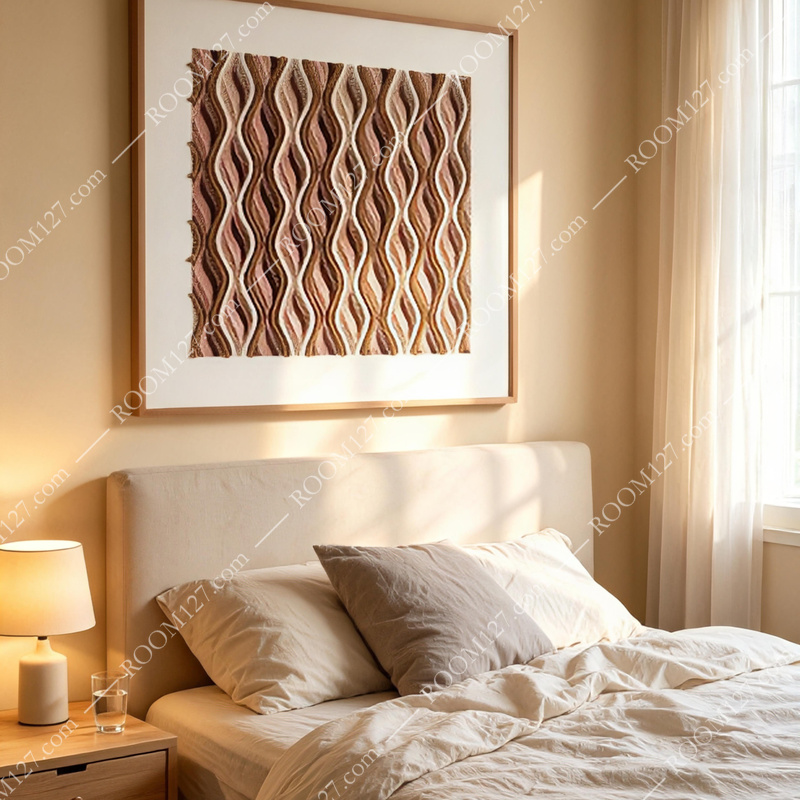
Above a beige upholstered headboard with white linen bedding, the painting's terracotta and rose tones echo the warmth of morning sunlight filtering through curtains. It feels intimate and calming — the last thing you see before sleep and the first thing you see when you wake. Pair with a wooden nightstand and a simple ceramic lamp.
The Living Room — Cozy and Collected
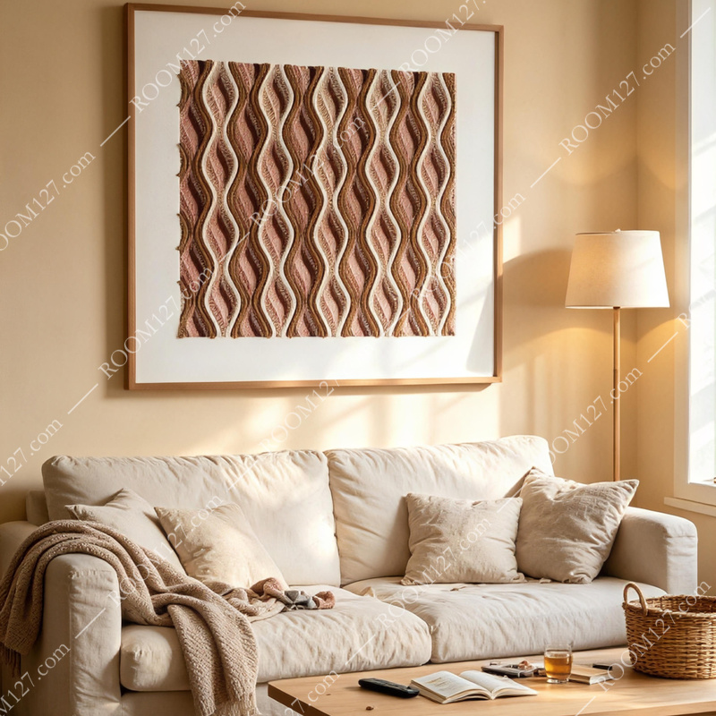
On a wall behind a cream slipcovered sofa with a knit throw and an open book on the coffee table, the painting adds layered warmth without clutter. The earthy palette complements natural wood, linen, and rattan. It is the kind of art that makes a room feel "lived-in" in the best possible way.
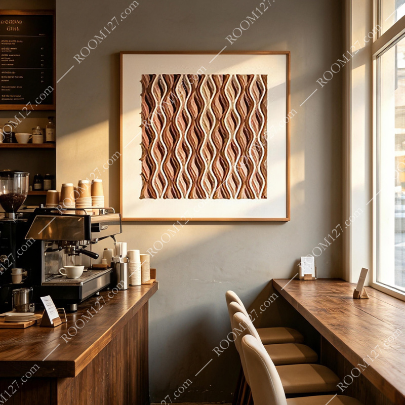
The Coffee Shop — Character on the Wall
Beside an espresso machine and a wooden counter with bar stools, the painting's warm tones mirror the colors of coffee itself — crema, roasted bean, ceramic cup. It adds texture and personality to a commercial space without feeling corporate. Customers will notice it, even if they cannot say why.
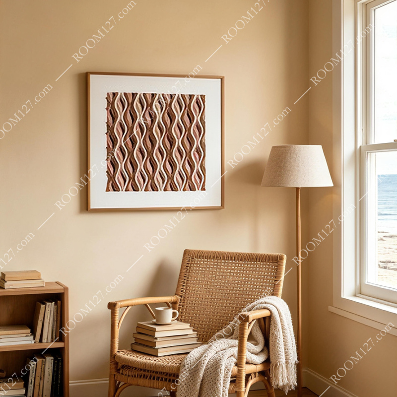
The Coastal Reading Nook — Warmth by the Water
In a sunlit corner with a rattan chair, stacked books, and an ocean view through the window, the painting brings warmth to a space that could otherwise feel stark. The terracotta and rose contrast beautifully with blue water and white walls, proving that coastal decor does not have to mean only blue and white.
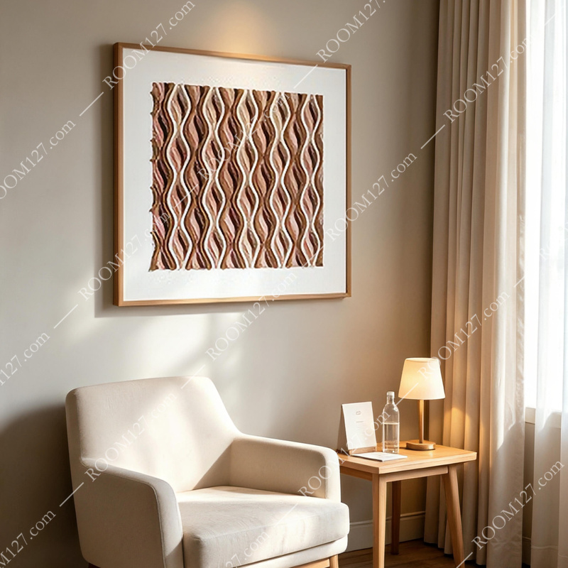
The Hotel or Guest Room — Quiet Luxury
Beside a cream armchair and a small wooden side table with a carafe and glass, the painting creates a moment of considered design in a room that is often overlooked. It tells guests that the space was designed, not just furnished. Warm, approachable, and memorable.
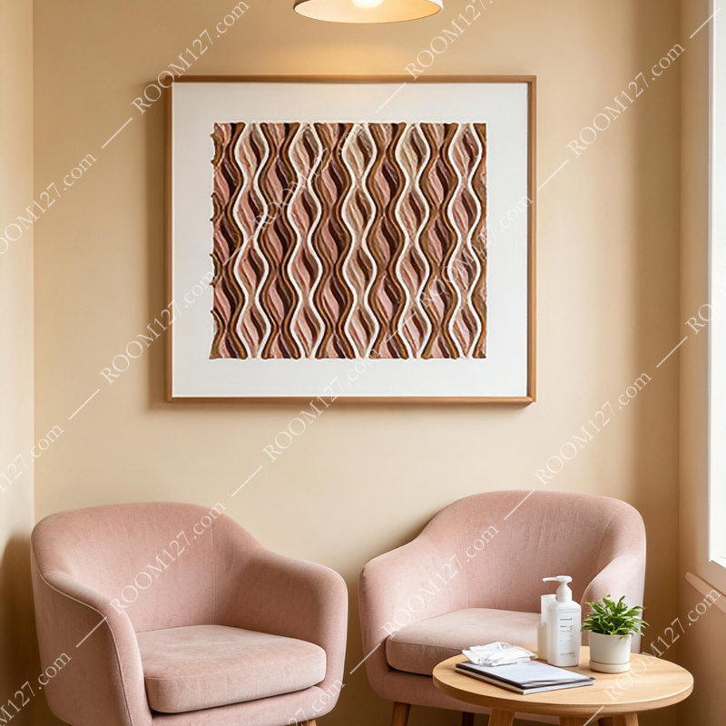
The Waiting Area or Salon — Soft and Inviting
Above two dusty pink armchairs with a small round table and a pendant lamp, the painting's rose tones harmonize with the seating while the terracotta adds depth. It makes a waiting area feel like a destination rather than a limbo — warm, soft, and quietly stylish.
4Making & Material
This is not a canvas print stretched over a frame. Each strand in the composition is built from layered and cut paper elements, applied by hand to a sturdy backing. The fine parallel lines within each feather shape are drawn or scored individually, creating the ribbed texture that gives the piece its textile-like quality. The dark brown gaps between strands are painted ground, providing contrast and depth.
The frame is a thin natural wood profile with a wide white mat, which serves two purposes: it protects the delicate paper surface behind glass, and it creates a generous border of white that makes the warm colors appear richer and more saturated. The overall effect is that of a piece you might find in a boutique gallery — not a mass-market home goods store.
5Before You Bring It Home
Lighting
Warm white light (2700K–3000K) makes the terracotta and rose glow. Cool daylight can flatten them. Avoid direct sun — it will fade the paper over time.
Pairing
Best with natural wood, rattan, linen, cream, and warm white walls. Avoid high-gloss surfaces and neon accents — they will fight the handmade aesthetic.
Care
Dust the frame with a dry cloth. Never spray cleaner near the glass — it can seep behind the mat and damage the paper. Replace the glass if it gets scratched.
6The Bottom Line
What makes this painting work is not any single detail. It is the combination of warmth, texture, and shape. The square format gives it flexibility. The terracotta and rose palette gives it warmth. The woven feather texture gives it tactile interest. Together, they create a piece that feels both ancient and contemporary — like something you might find in a Moroccan souk and somehow also in a Milan design showroom.
If your walls feel cold, flat, or unfinished, this is the kind of art that fixes all three at once. It does not shout. It wraps the room in warmth, and that is a rare and valuable thing.
Available now.
Each piece is hand-assembled and framed to order. Because the strands are cut and placed by hand, no two pieces are identical — slight variations in edge texture and color layering are part of the work's character.