
walk into a room with a blank wall and you usually reach for a framed photograph or a generic botanical print.
Walk into a room with this canvas and you stop.
That pause is exactly what it was designed for.
Launched as part of the new "Quiet Strata" collection, the piece is a vertical abstract built from stacked, irregular color blocks — olive green, charcoal, rice-paper beige and a
single band of terracotta orange — each one applied with a different hand technique so that light plays across it all day long.
1 The texture is the whole point 🖌️
Open the detail shots and the first thing you notice is that nothing here is flat ink on paper.
The left-hand olive block carries vertical brush strokes pulled downward; the lower-green block curves in slow, sweeping arcs.
The central beige shape isn't a flat color either — it has the fibrous, wrinkled grain of handmade washi paper, as though a sheet of paper pulp were pressed into the canvas.
On the right, the charcoal panel is built up with a palette knife into chipped, sculptural ridges that cast tiny shadows when a side light hits them.
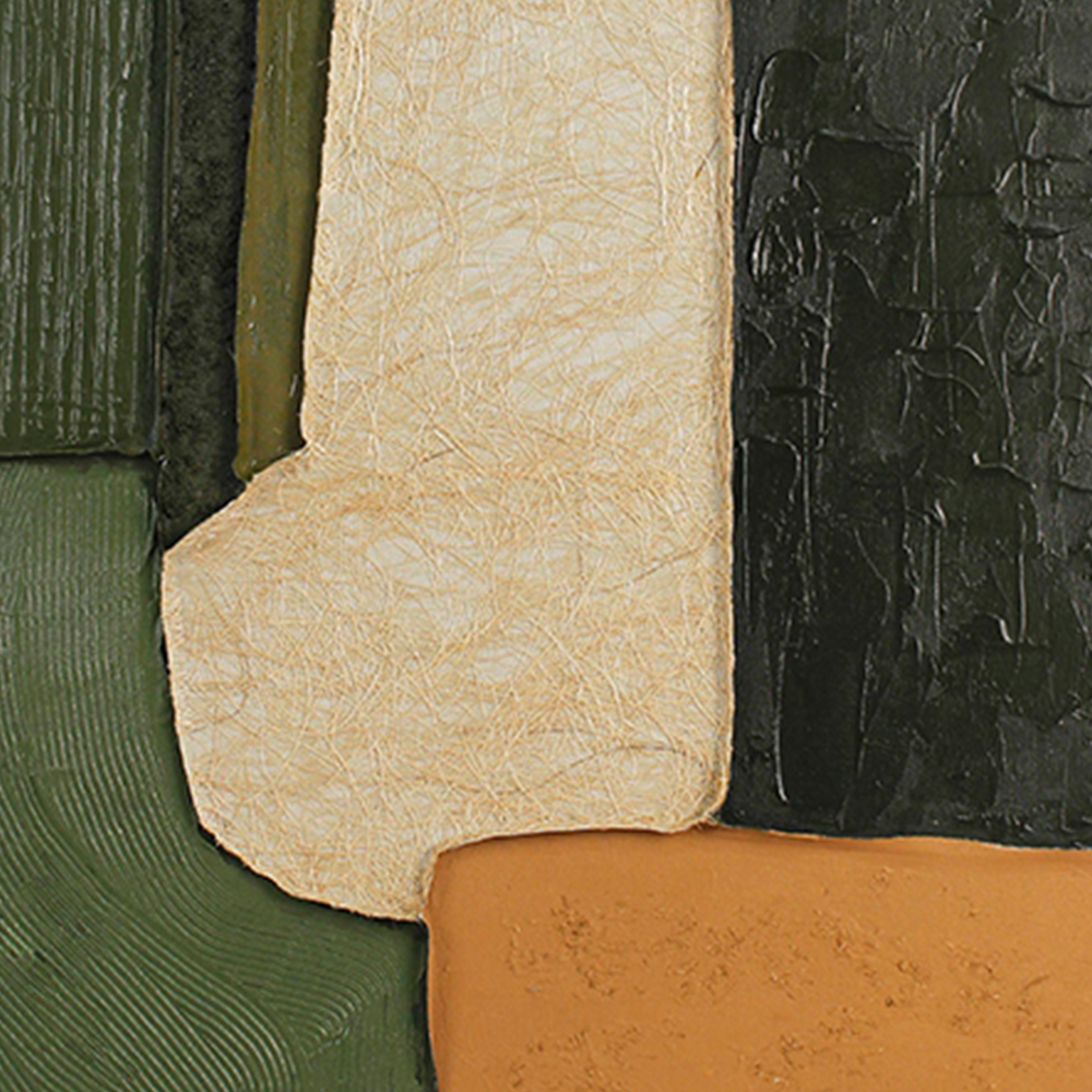
Fig.1 — Close study: fibrous beige block meeting vertical green strokes and the thick, knife-worked charcoal ridge.
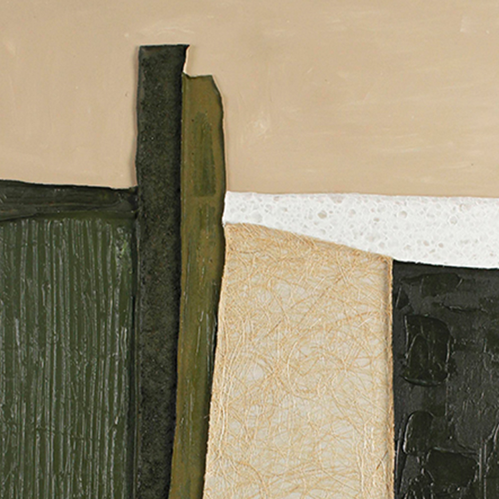
Fig.2 — Macro: the sand-colored upper plane, the speckled white band and the narrow olive stripe.
Run a finger across it (gently, of course) and you'd feel layers. That physicality is what separates a hand-textured canvas from a $29 canvas print — and why this one reads as investment decor rather than a disposable trend.
2 Why this color story actually works 🎨
A lot of "earthy" abstracts fall into one beige blob. This one has a backbone. Five tones, chosen to work together:
FOREST OLIVE
structure + calm
CHARCOAL
grounding weight
RICE PAPER
warm light
TERRACOTTA
the warm kick
SAND
soft upper plane
The greens and charcoal do the quiet work; the single terracotta block at the bottom right does the talking. It's the same trick a good interior designer uses — 80% neutral, 20% surprise — which is why the painting sits so comfortably next to oak, linen, travertine and jute without shouting.
3 Real rooms, not a studio backdrop 🛋️
We hung the same canvas in seven very different interiors to see where it actually belongs. Here's what held up:
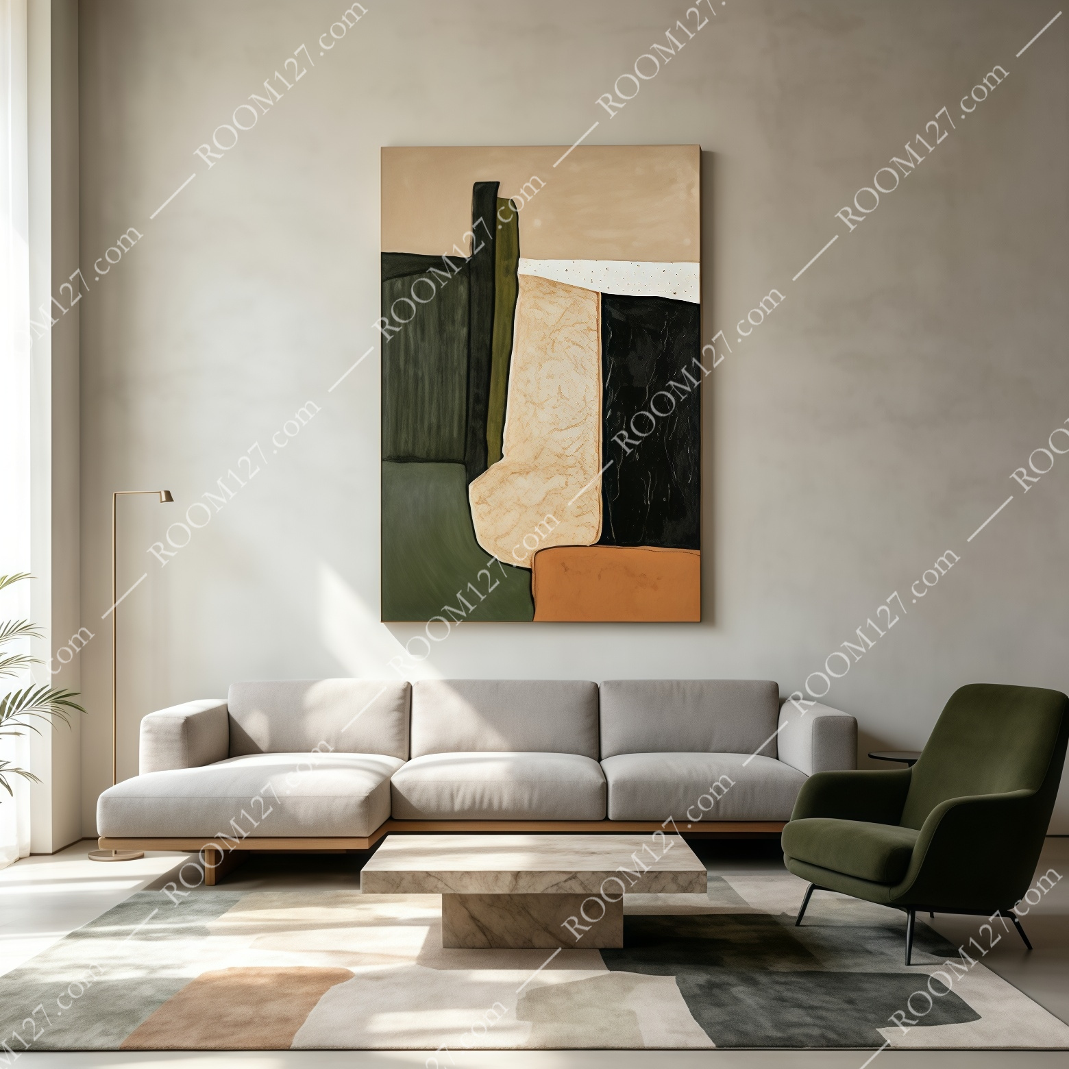
Living room — paired with a light linen sectional, a forest-green armchair and a low marble coffee table.
The painting echoes the rug tones rather than competing with them.
In a scandinavian living room, the canvas becomes the anchor above a pale sectional — its dark side balancing a single olive armchair.
Above an oak sideboard in an entryway, it reads as a quiet welcome piece next to a monstera and a terracotta vase of ferns.
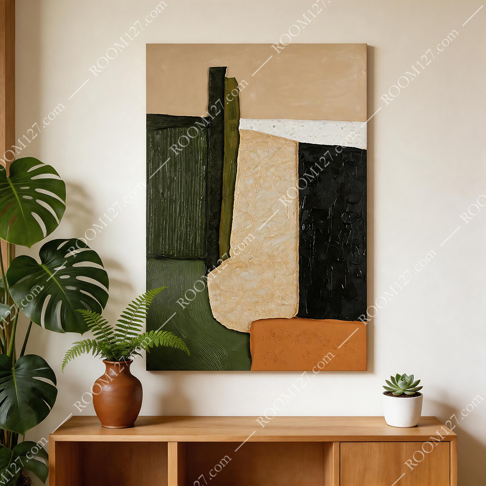
Entryway — above a light oak cabinet with a monstera and terracotta urn.
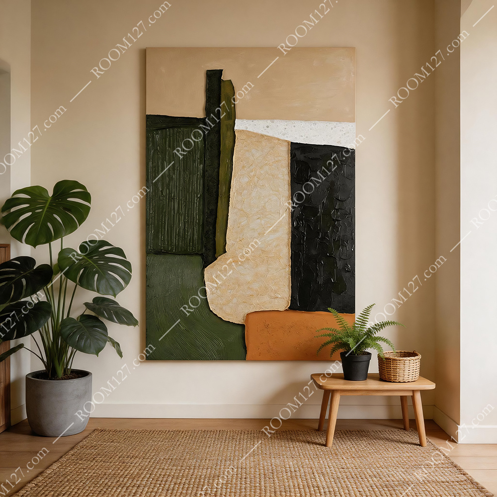
Corner view — vertical proportions suit a narrow wall between floor and ceiling.
It even survived a dark walnut-paneled lounge — against warm wood veneer and cream upholstery, the olive picks up the panel grain rather than disappearing.
And in a sun-drenched plant-filled dining nook with rattan chairs, the terracotta block picked up the earthenware pots.
That's the mark of a versatile piece: it doesn't just look good in one photoshoot.
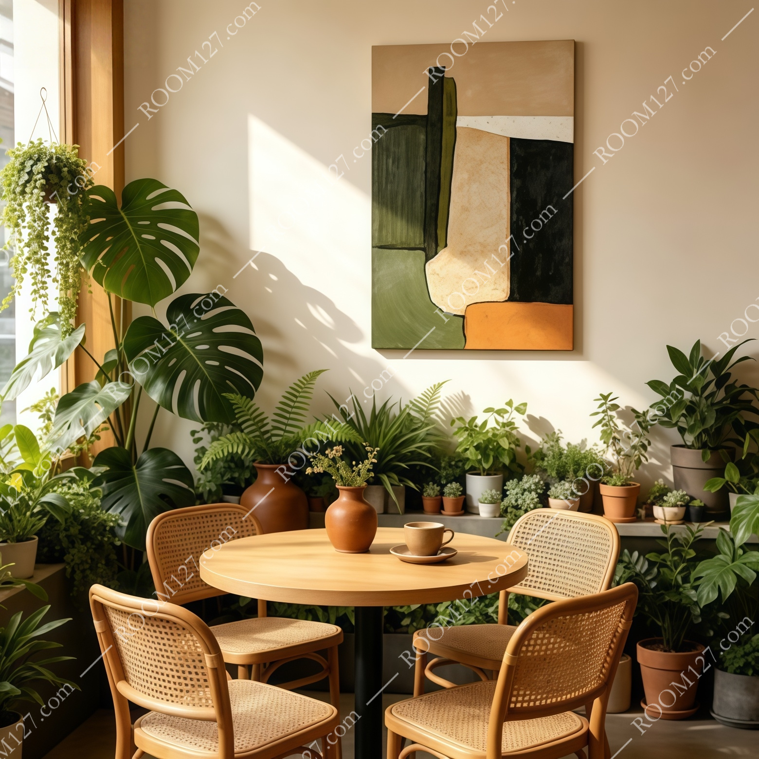
Dining corner — the terracotta block matches the earthenware pots.
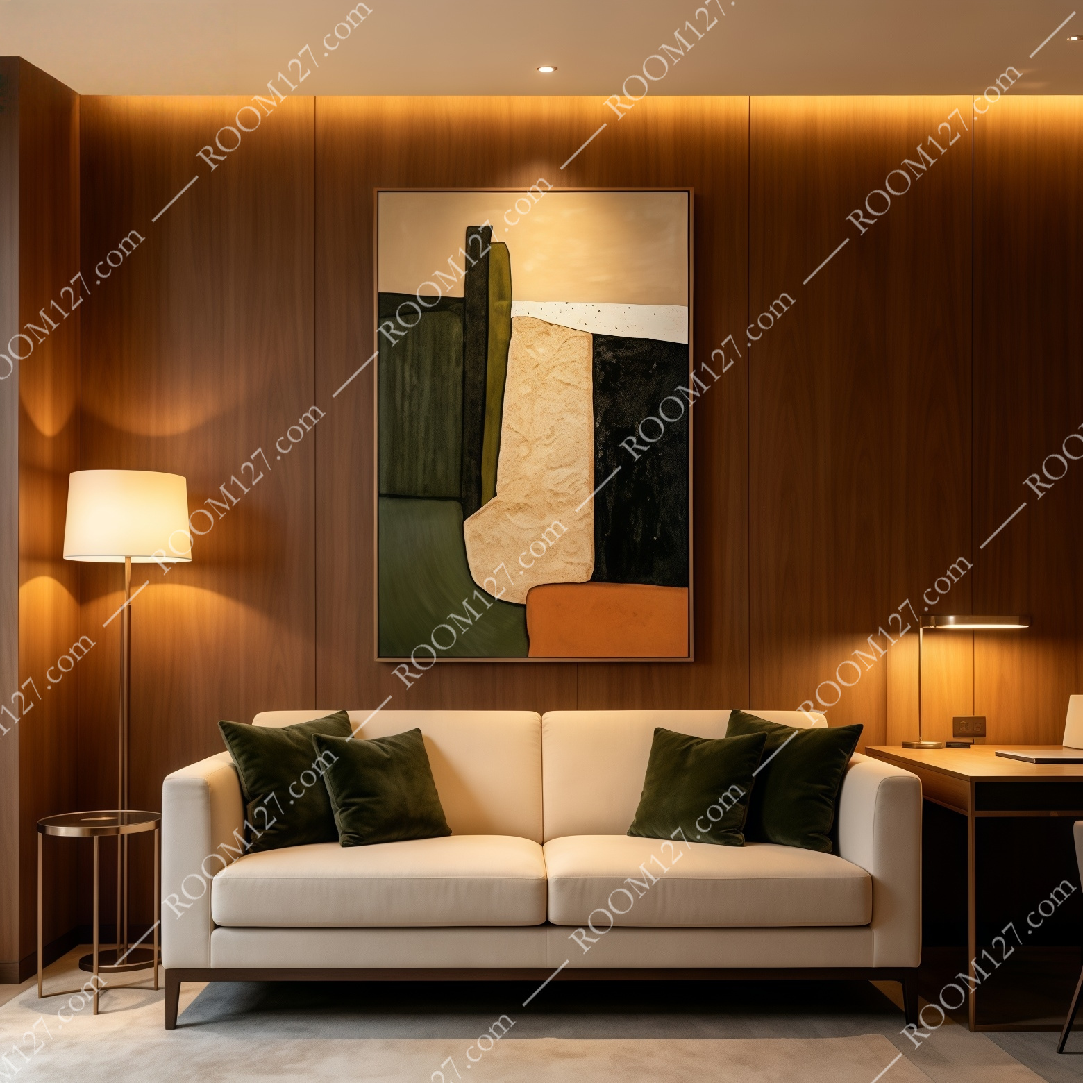
Executive lounge — deep walnut + cream leather; the olive echoes the wood grain.
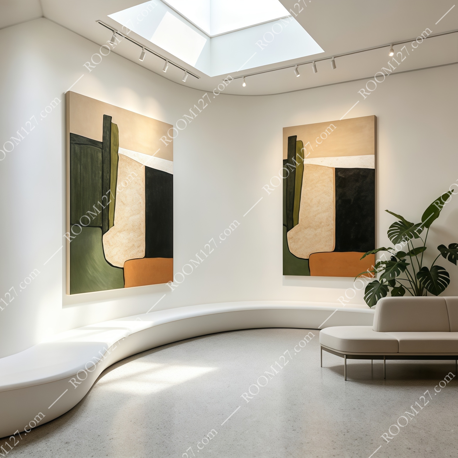
Gallery view — hang two as a facing pair for a hallway or showroom; the asymmetry stays interesting from either side.
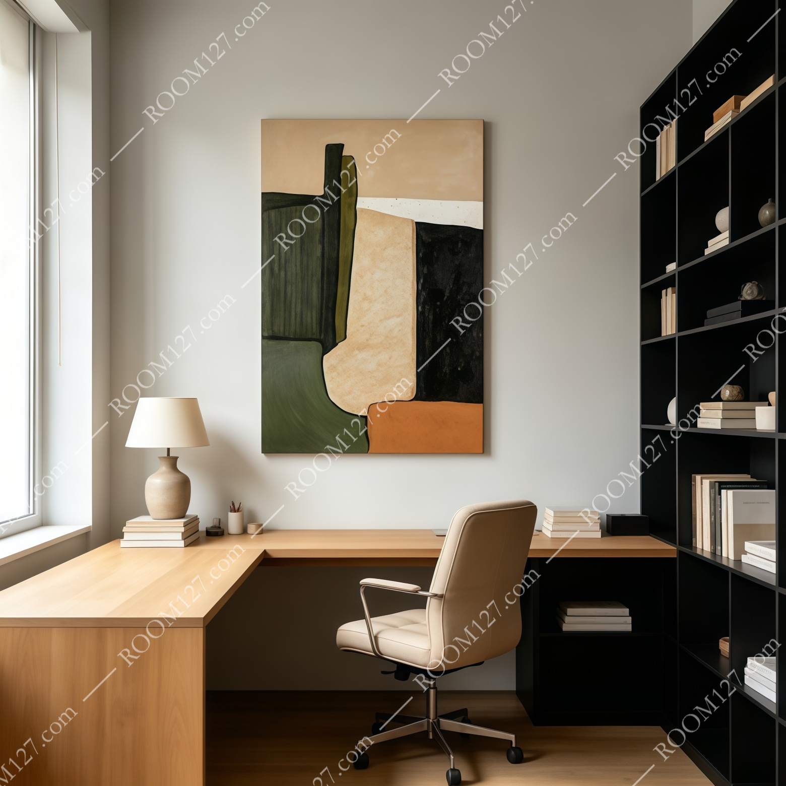
Home office — above an oak desk, it keeps the wall calm during long screen hours.
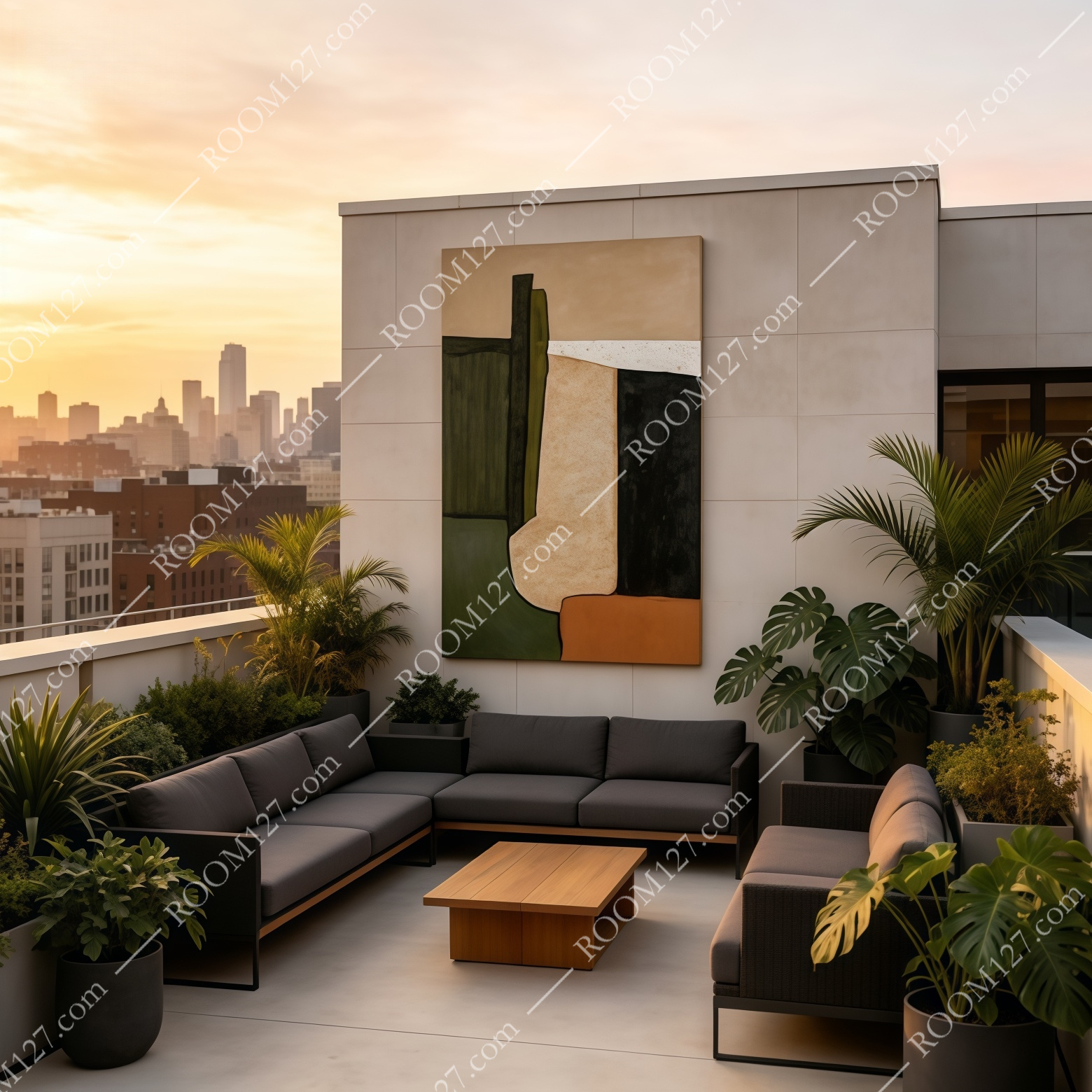
Rooftop terrace — UV-stable finish also suits covered outdoor walls.
4 A practical buyer's guide — before you order 📏
Beauty only works if it's hung right. Three things we'd tell a friend:
- 📐 Size: It's a vertical rectangle.
For a typical sofa or sideboard, go 90 × 120 cm; for a two-seat wall or above a desk, 80 × 100 cm; for a statement entryway, 100 × 150 cm. As a rule, the width of the art should cover roughly two-thirds of the furniture below it.
- 🧭 Hanging height:
Centre the canvas at eye level — about 145 cm from the floor to the middle of the piece. Not too high, or the texture disappears.
- 💡 Lighting:
A track light or picture lamp angled 30–45° above is what makes the impasto ridges cast shadows. Flat ceiling light flattens it; raking light makes it feel alive at dusk.
- 🪟 Frame choice:
A thin oak or black floating frame keeps the modern look. The canvas also ships ready-to-hang with D-rings and wire, so frameless mounting is perfectly acceptable.
💡 Pro tip: This painting hates being cluttered. Leave at least 60 cm of empty wall on either side, and keep surrounding objects low — a single vase, a stack of books, one plant. The asymmetry does the work; don't surround it with other artwork.
5 Materials & care — the honest spec 🧾
- 🎨 Hand-applied acrylic texture over cotton canvas; thick impasto on the charcoal and green panels.
- 🪵 Stretched on a solid wood internal frame; arrives with D-ring + hanging wire.
- ☀️ UV-protective finish — colors stay true near a window; clean with a dry, soft brush.
- 📦 Shipped in a protective hard box; available in the sizes above, custom dimensions on request.
The bottom line? If you've been searching for wall art that doesn't shout but refuses to be ignored, that ages like a well-worn linen shirt instead of dating like last season's trend, this is the piece. It costs more than a print, but it will still be the most talked-about object in your room in five years. 🏡