
Hand-cut wood curls, assembled in a square walnut frame, radiate from a honey-amber centre to a quiet off-white edge. It is, in plain terms, a star made of wood.
Most wall art pulls you in with a single image.
This one pulls itself apart — a square of grey-linen cloth holds hundreds of tiny hand-cut wood curls, packed tight at the centre and flung outward in a widening spiral until only a few lonely discs are left near the frame.
The effect is not decoration. It is momentum frozen on a wall: the instant a wave breaks, the instant a star explodes, the instant a tree ring opens into itself.
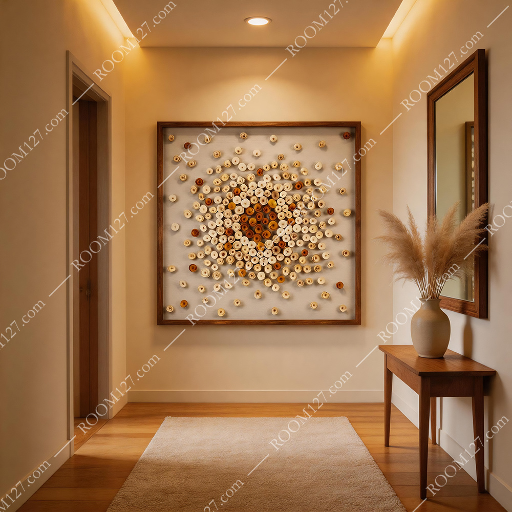
The piece as hung: square walnut frame, warm downlight, walnut console and a matte ceramic vase of pampas — the entryway it was quietly designed for.
Hundreds of little curls, no two alike
Open the macro shots and the object announces itself.
Each "dot" on the surface is a small wood curl — like a thin shaving from a carpenter's plane, rolled into a loose ring and fixed onto the linen backing.
The centre curls are deep, honey-amber and toasted orange, tightly packed; as you move outward they lighten to pale oak, cream and almost off-white, and the spacing widens until the last few discs drift like seeds.
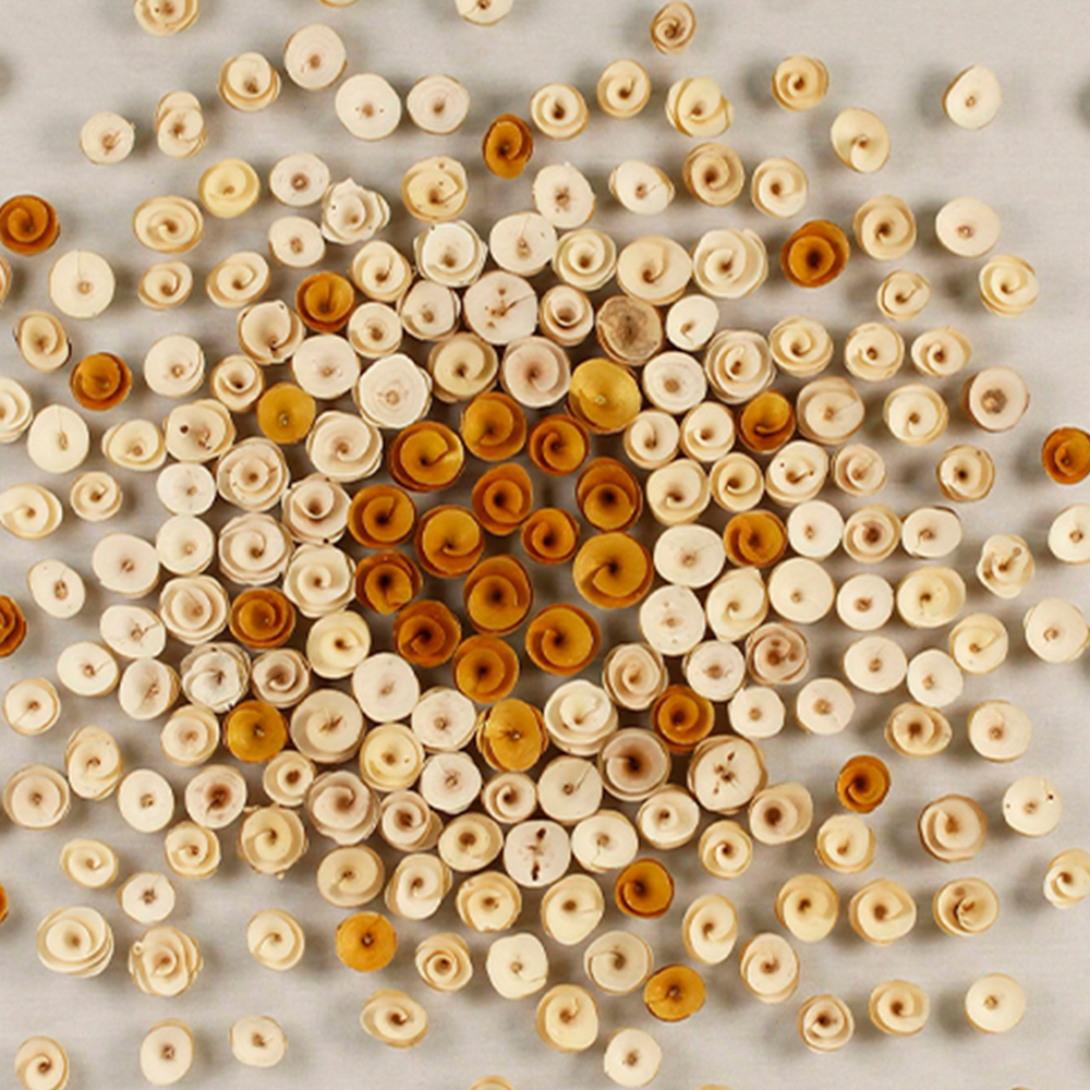
Centre: packed amber curls.
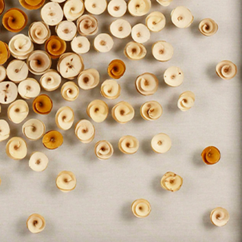
Edge: pale, drifting discs.
Because each curl is cut by hand from a different scrap of natural wood, no two pieces are identical — the grain, the curl direction, the warm-to-cool shift in colour all vary. That is the opposite of a printed repeat, and it is why collectors pay for it. Run a finger (gently) and you feel every disc sit proud of the cloth; under raking light, each one casts a micro-shadow, so the panel comes alive after sundown.
It doesn't hang on your wall.
It pulsates from it.
Four tones, one temperature
The piece works because it never introduces a colour outside the wood family. Four natural tones, graduated from the core outward:
DEEP AMBER · the burning centre
HONEY OAK · the mid-radius
PALE MAPLE · the outward drift
CREAM LINEN · the breathing ground
That monochrome-within-wood rule is what lets the panel sit inside almost any neutral room without shouting. Put it on a warm grey or cream wall and the walnut frame becomes the fifth tone. Put it on a wood-paneled wall and it vanishes politely into the grain — which is exactly what the restaurants and hotels you'll see below have done.
Six interiors, one square
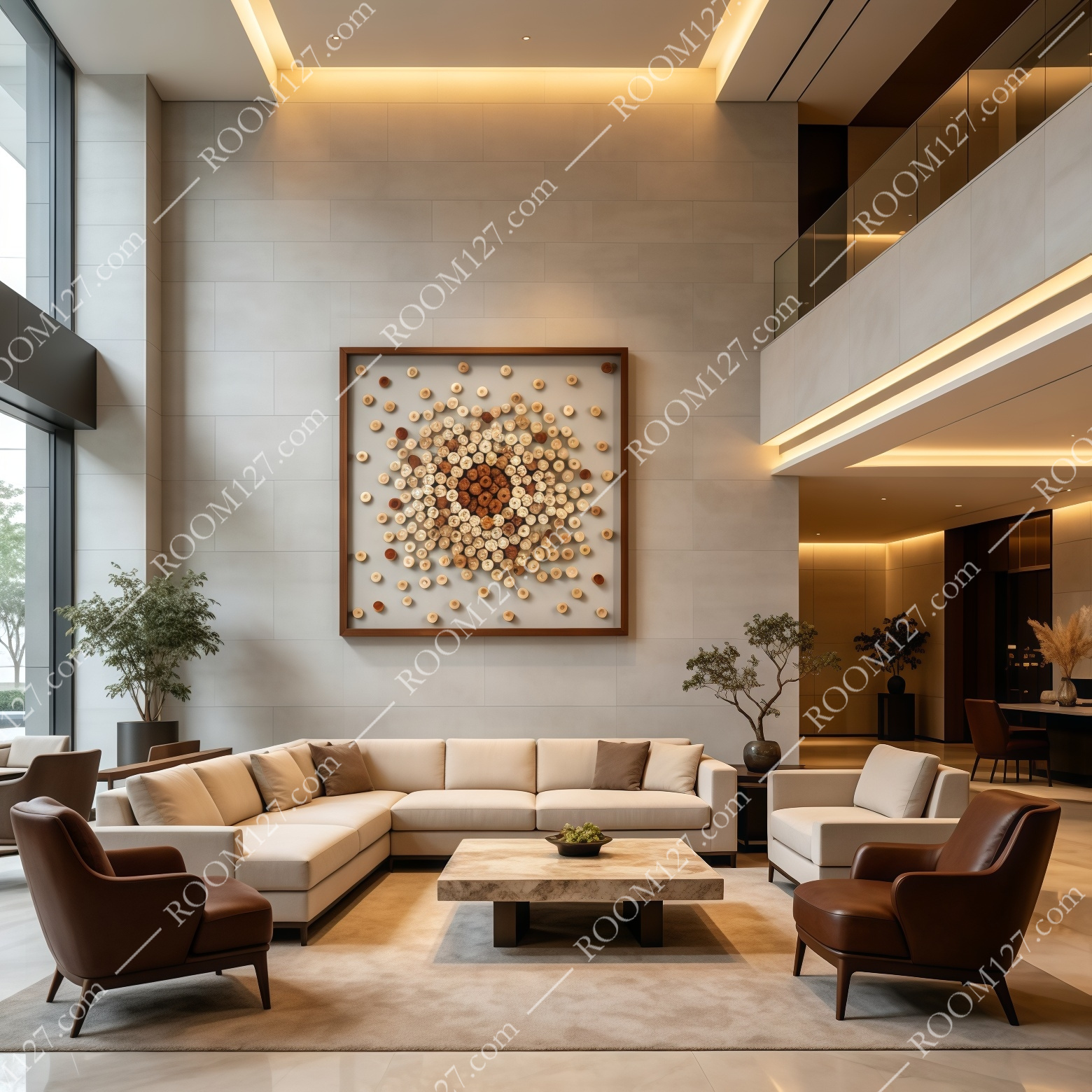
Hotel lobby, double-height void. The panel reads as a single, quiet focal point above a low L-shaped sofa — its centre aligned with the eye line of a seated guest.
We hung the same 100×100 cm piece across six very different spaces. The first thing that held true everywhere: this is not a wall you crowd. In a double-height hotel lobby on pale stone, the square panel floats alone above a cream sectional; in a coffee bar, it hangs behind the counter where customers waiting for their espresso have three minutes to actually look at it.
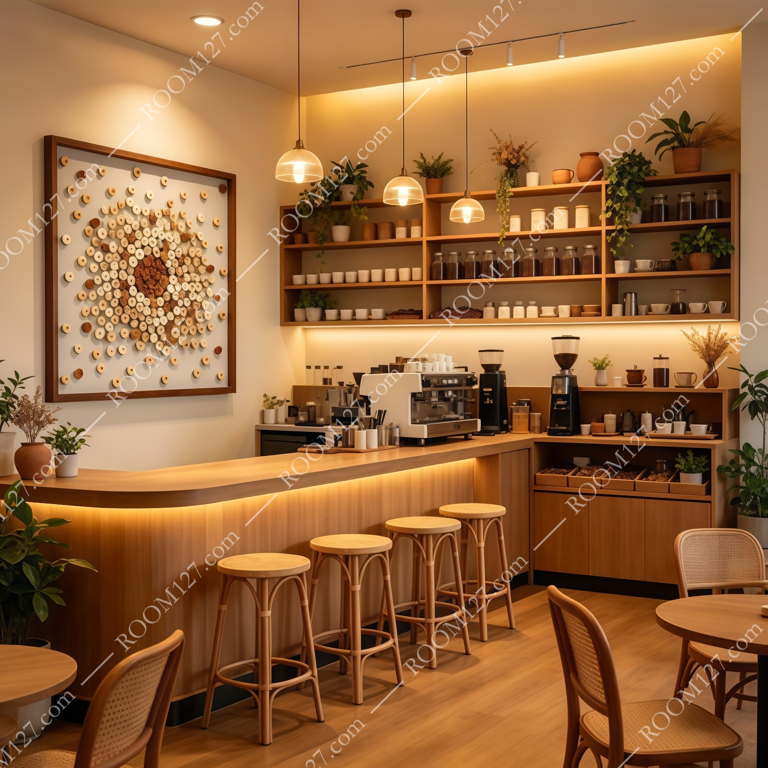
Coffee bar. Hung behind the service counter, it becomes the brand's visual signature — warm, tactile, photogenic.
Editor's note — Notice how every room below keeps the wall around the panel empty. The composition already contains hundreds of shapes; adding a mirror, a shelf or a second piece beside it is the most common way owners kill it.
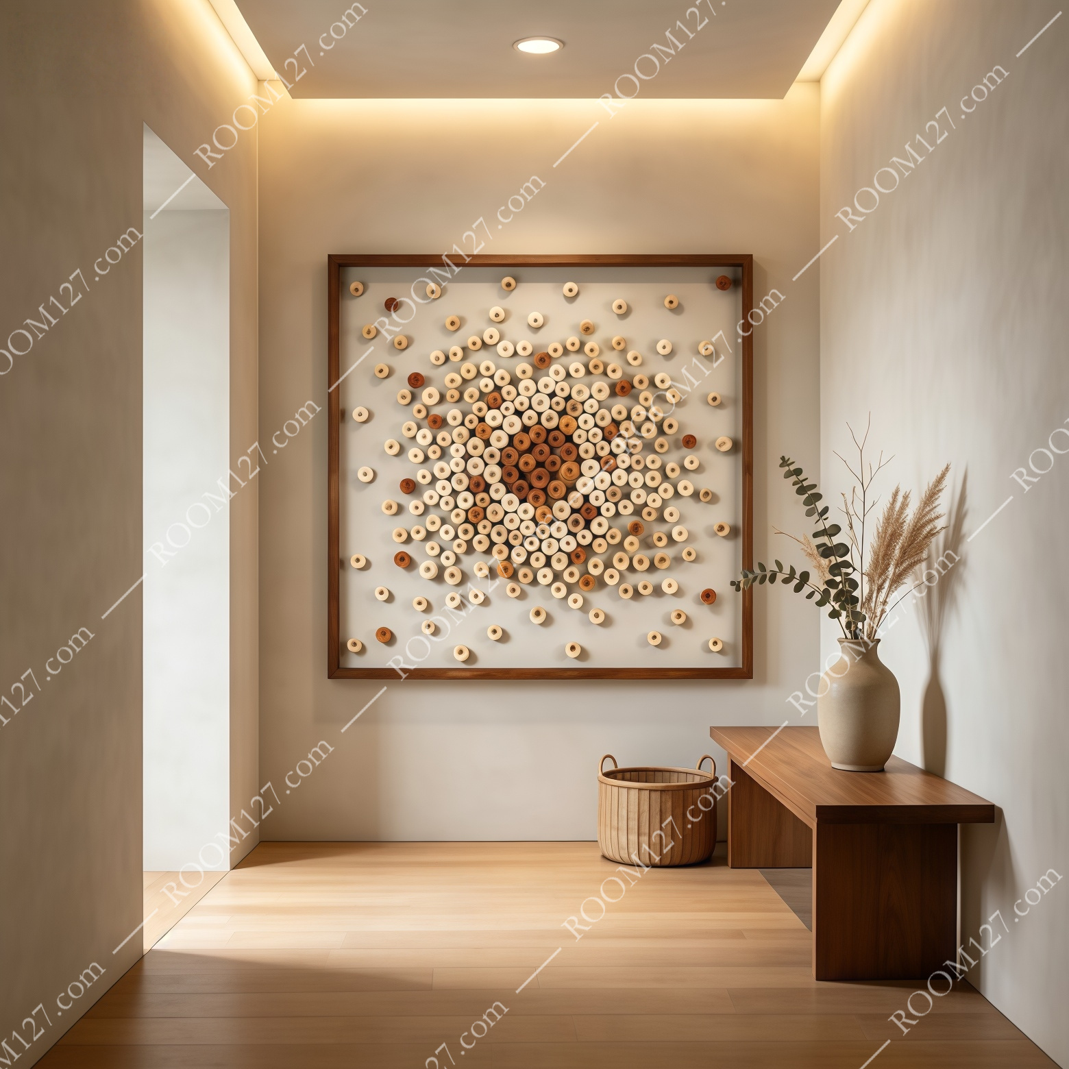
Minimal hallway. Walnut bench, ceramic vase, pampas — the panel does the talking.
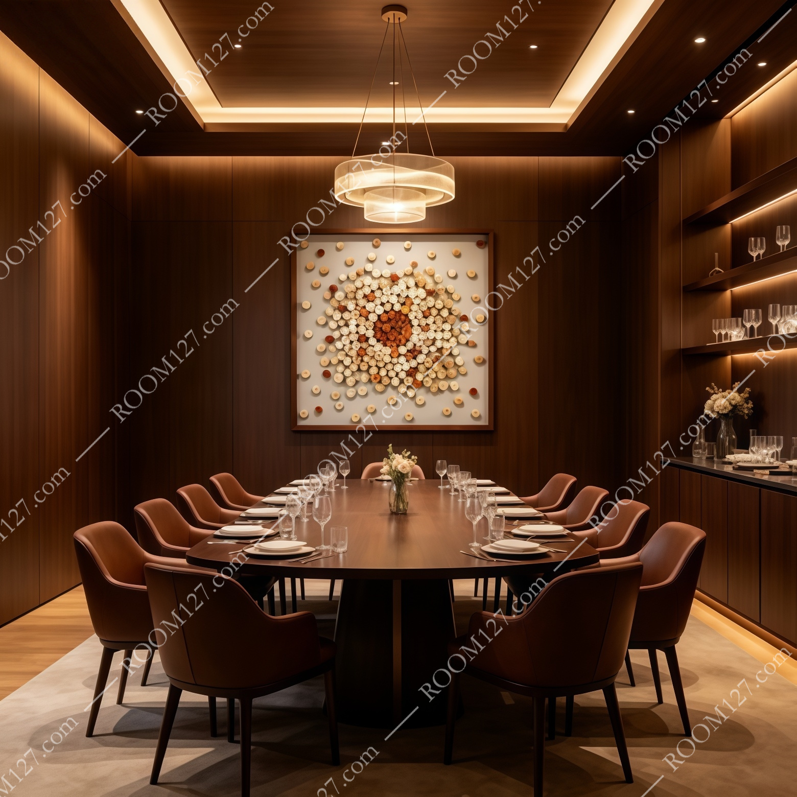
Private dining room. On walnut paneling, the amber centre glows like a lantern.
On dark walnut paneling — as in the private dining room below — the amber core seems to emit its own light, and the pale outer discs read as stars. In a bright study with a pale oak desk and black bookshelves, it stays calm enough to sit behind a computer screen for eight hours a day. Even on a sunlit courtyard wall, between planters and a rattan lounge chair, it held its own — though we'd recommend a covered outdoor wall rather than open weather.
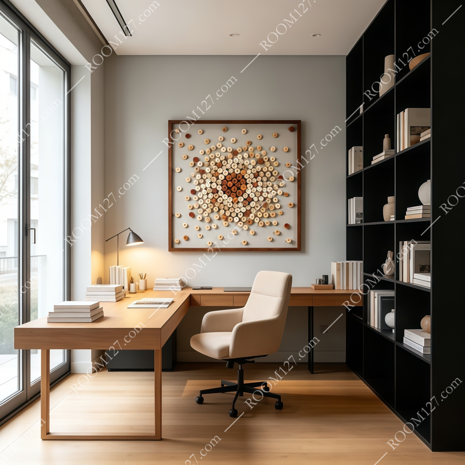
Home study. Above a pale oak desk — warm enough to keep focus, quiet enough not to distract.
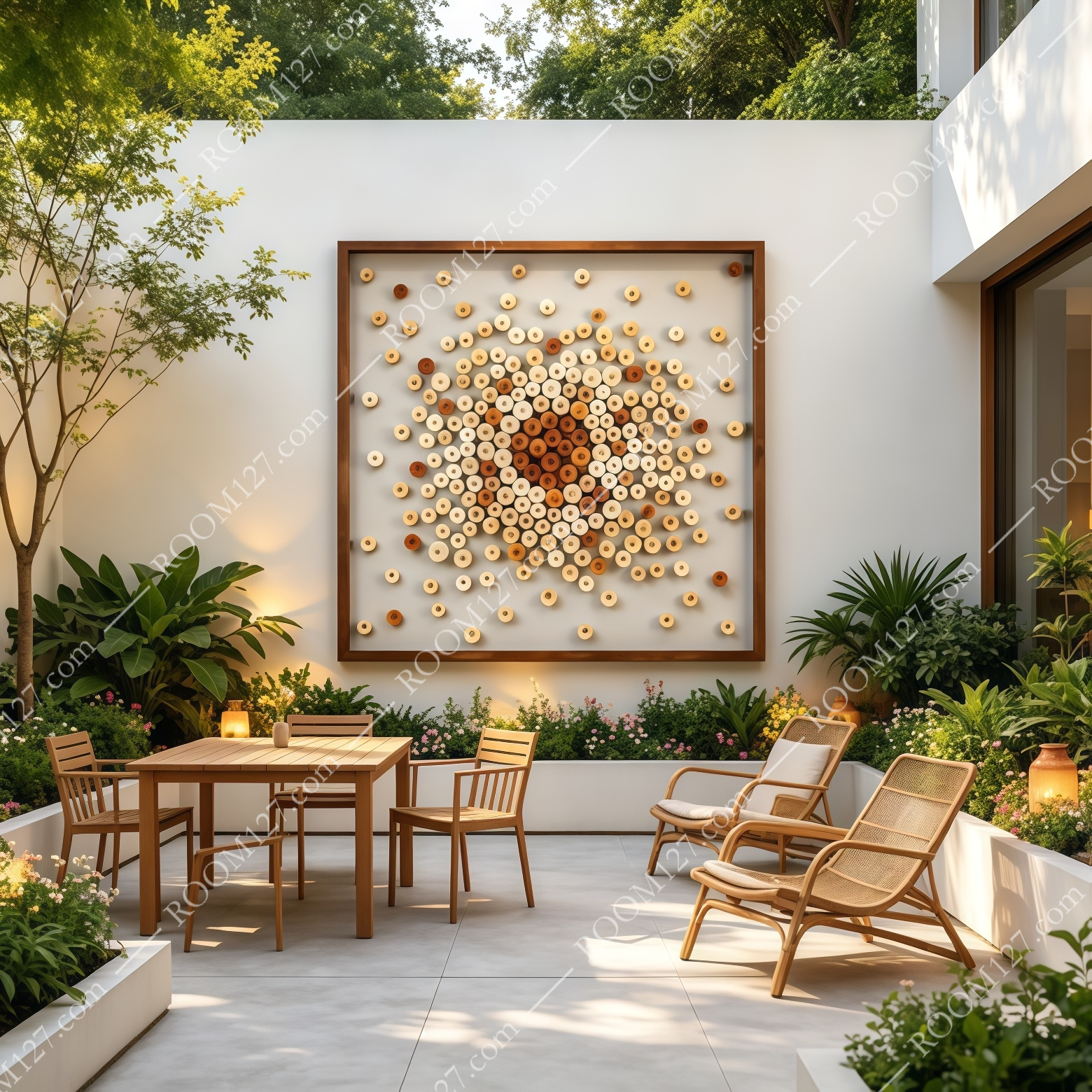
Courtyard. On a covered exterior wall, the natural wood tones pick up the surrounding green.
Five things to know before you order
- Square by design.
The piece is a 100 × 100 cm square (also available 80×80 cm and 120×120 cm). A square wants a square-ish wall — avoid hanging it in a tall, narrow corridor where the frame will be cramped.
- Hang it at the centre of attention.
Because the visual weight lives at the middle of the panel, align that centre with eye level — about 150 cm from the floor to the visual core. Not higher.
- Light is everything.
A single downlight or track spot from 45° above is what makes every wood disc cast its own tiny shadow. Flat, even light flattens the piece; raking light is what sells it.
- Walnut frame is included.
The dark walnut floating frame comes with the piece. Do not pair it with a second wood tone — keep surrounding furniture either walnut, pale oak or cream, and let the art bridge them.
- Care. Wood is natural.
Dust with a dry, soft brush or a cool hairdryer; never wipe with a damp cloth. Avoid bathrooms and permanently damp basements. Expect a tiny amount of natural variation in tone — that is the material, not a defect.
This is not a print you'll tire of in a season. It is a small, hand-assembled object in which hundreds of natural wood curls are arranged into a single radiant gesture — warm on a cream wall, dramatic on a dark wood wall, quietly premium in a hotel lobby. If you've been searching for wall art that is genuinely built rather than printed, and that photographs as well as it looks in person, this is the piece. 🌳