
Gold Veins
A taupe ground, a raised lattice of hand-applied gold. The kind of panel a hotel lobby commissions and a private client buys.
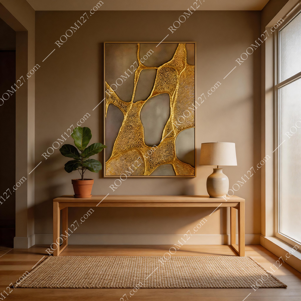
The piece in a quiet entryway — oak bench, fiddle-leaf fig, ceramic lamp, straw mat.
There is a particular kind of wall art that does not shout about being handmade. It hangs in a five-star lobby, an executive suite, a dining room that only gets used six times a year — and yet every visitor asks what it is. "Gold Veins" is that piece. On a matte taupe ground, a network of irregular, cell-like shapes is outlined and filled with raised metallic gold: part leaf, part net, part something between a dried leaf and a river map.
It is not a print. It is not a photograph. It is a built surface — troweled, layered, and finished to a satin sheen that shifts under any light source. The effect is quiet from across the room, and unmistakable when you step close.
I.What the gold actually is
Step close and the surface separates into two textures. The cells are a smooth, matte, warm grey-brown — a troweled finish, like microcement on a wall. The veins and the golden fields between them are not flat gold paint. They are a textured metallic compound: raised by hand, built up in layers, finished to a satin sheen that changes with the light. At one angle it reads as polished gold; at another it reads as dark, bronze antique. That shift is the whole point.
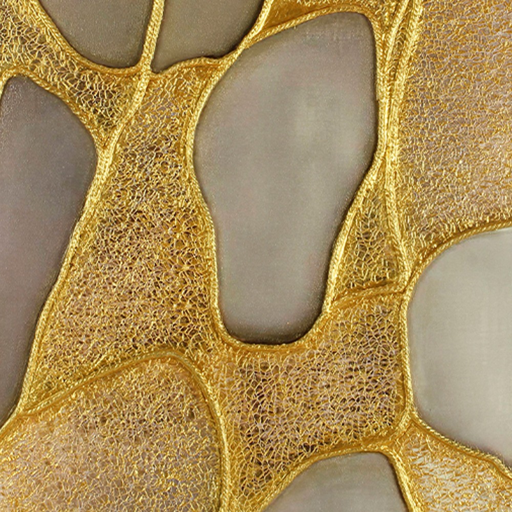
The gold is raised and fibrous; the taupe cells are smooth and matte.
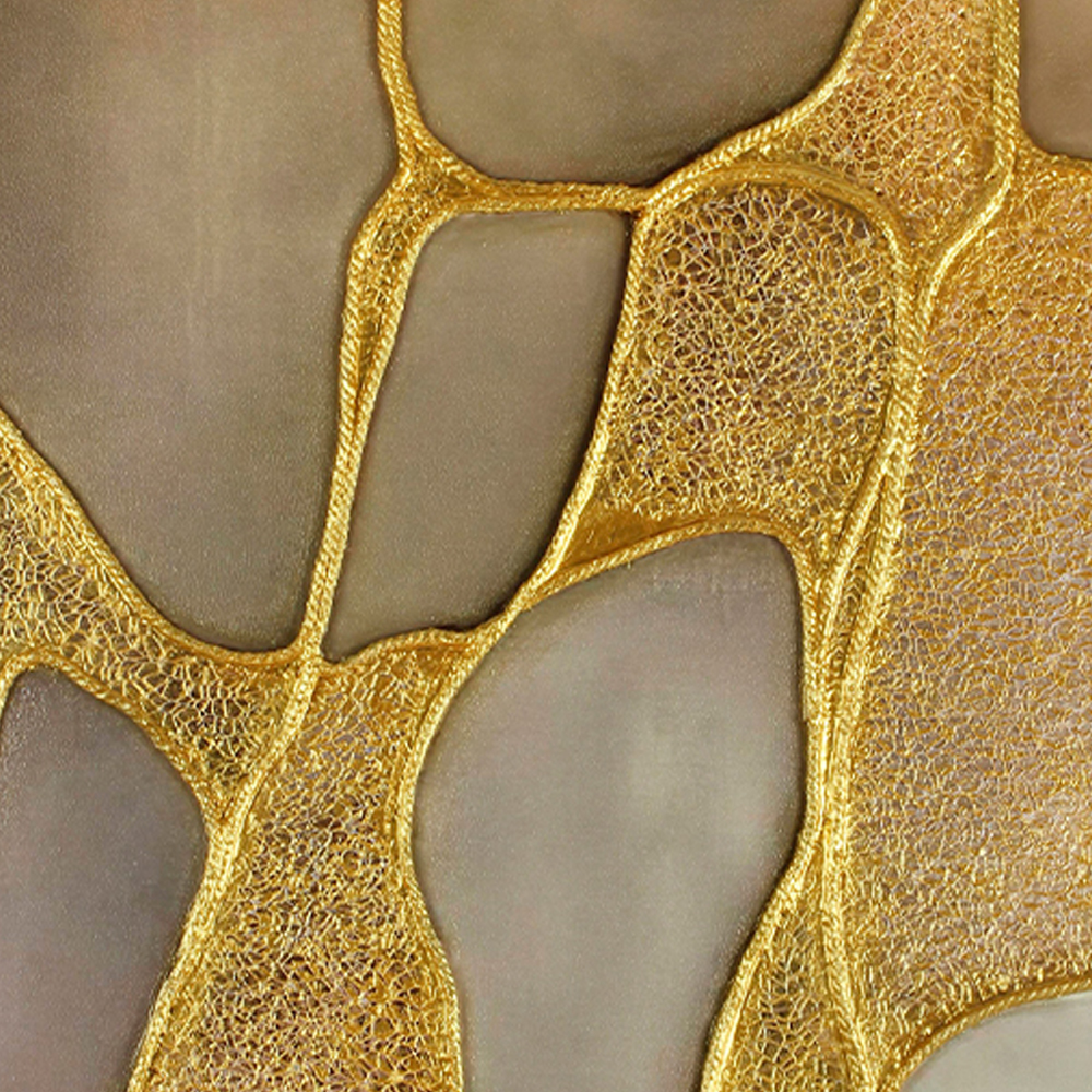
The edges are hand-drawn, not machined — every junction is slightly irregular.
Because the gold is raised, it casts a micro-shadow under ambient light. This is why the piece reads so differently in a hotel corridor (downlights grazing it from above) versus a living room (warm lamp light from the side): the same surface, two entirely different textures.
The gold is not decoration.
It is the structure.
The taupe is what holds it.
II.Six rooms, one attitude
This is a vertical 80 × 120 cm piece. It wants a wall that can hold it: an entryway console, a dining room sideboard, an executive desk wall, a hotel corridor. We photographed it in six interiors — and in every one it behaved the same way: it made the room feel more expensive than it was.
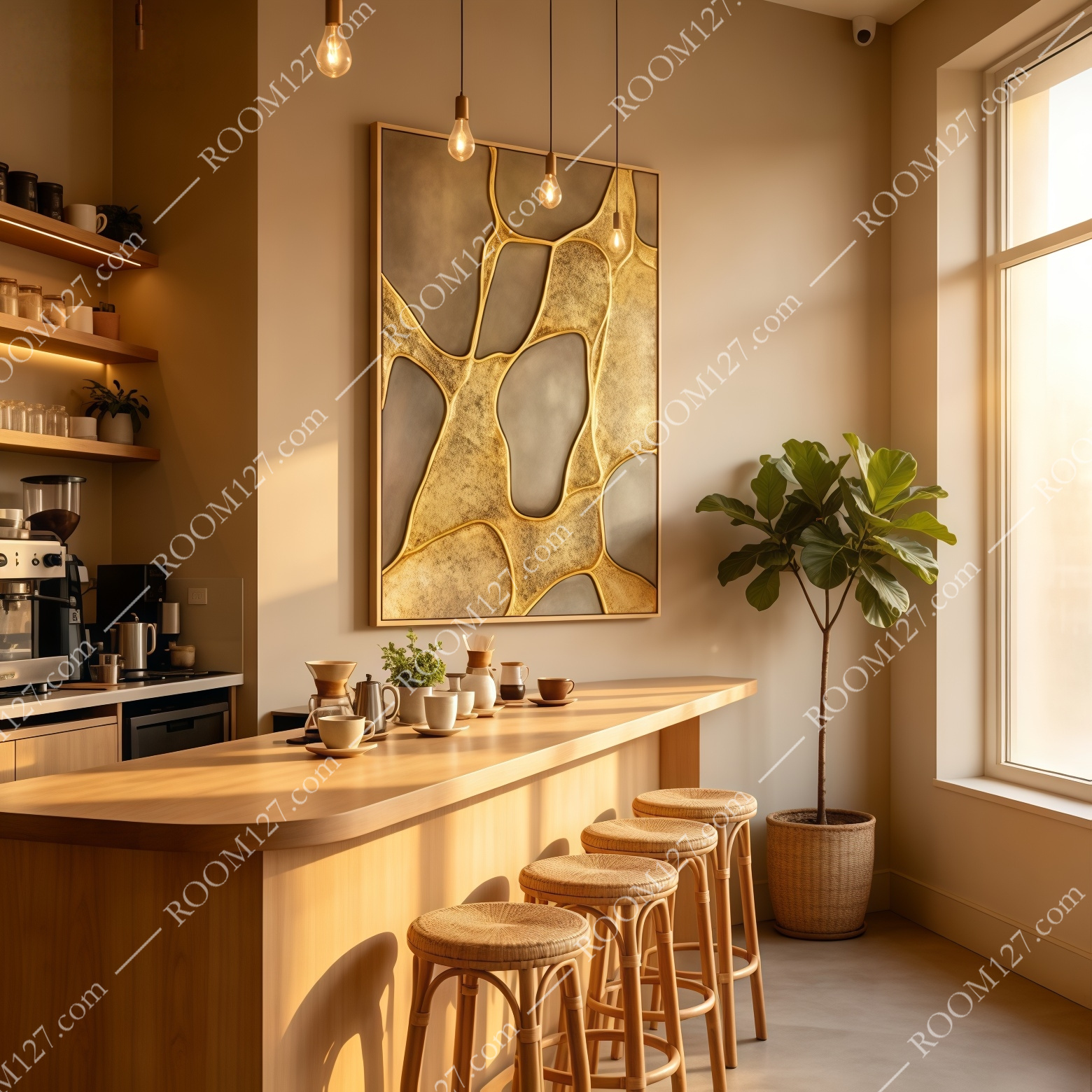
Café bar. Warm oak counter, rattan stools, exposed bulbs — the gold picks up every warm light source in the room.
In a café bar, above a wooden counter and under exposed Edison bulbs, the gold glows. In a private dining room with dark walnut paneling and a paper pendant, it is the only warm metallic note in a dark, calm room. In an executive office with a white desk and black bookshelves, it reads as confident, not decorative.
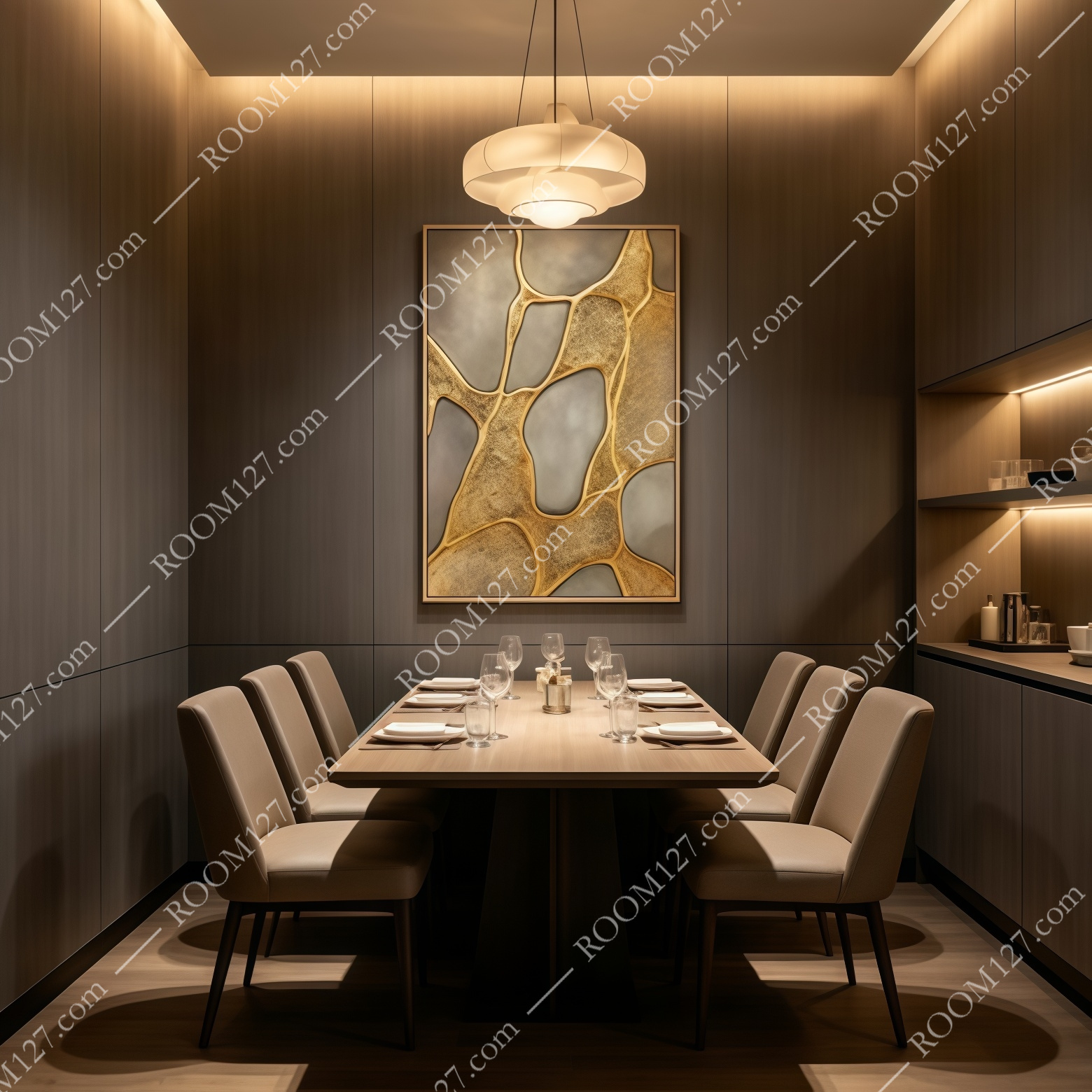
Private dining room. Dark walnut walls, beige chairs, white paper pendant.
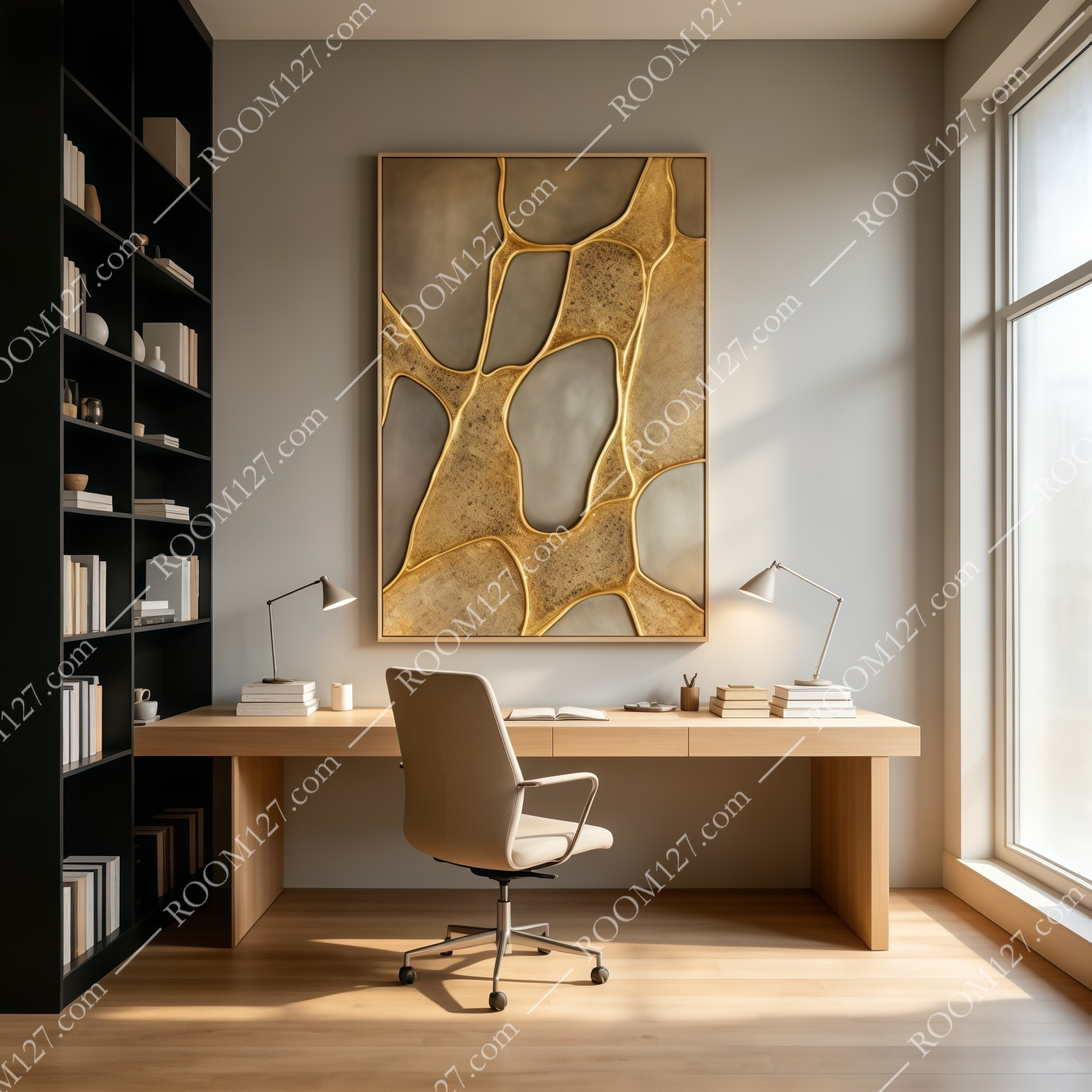
Executive office. White oak desk, beige task chair, black floor-to-ceiling bookshelf.
In a bright modern entryway with a wooden bench and a ceramic vase, it is the quiet hero. In a neutral living room with a cream sofa and a cognac leather chair, it ties the room together. In a white-cube gallery with track lighting, it becomes a museum piece.
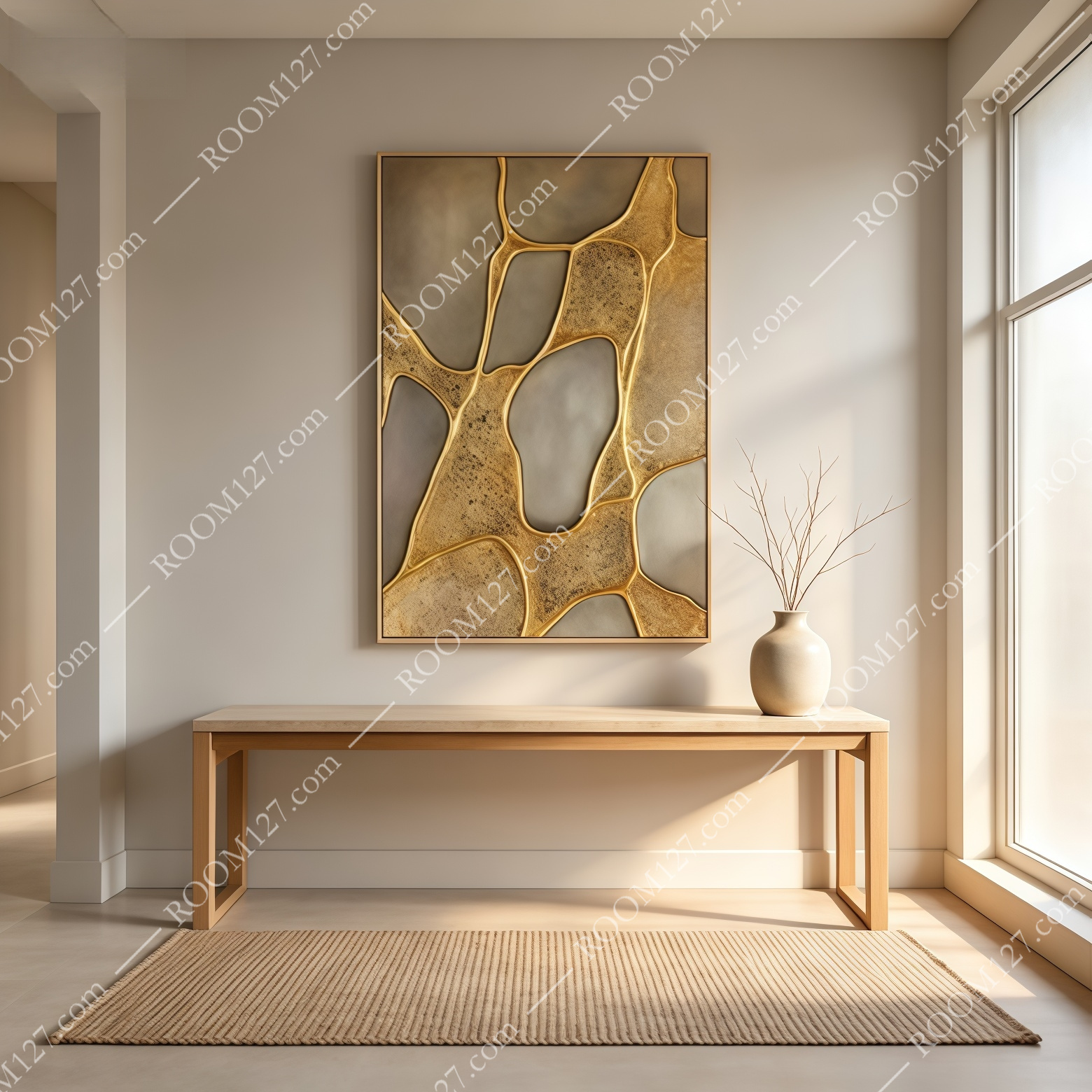
Bright entryway. Oak bench, ceramic vase, straw rug, afternoon light.
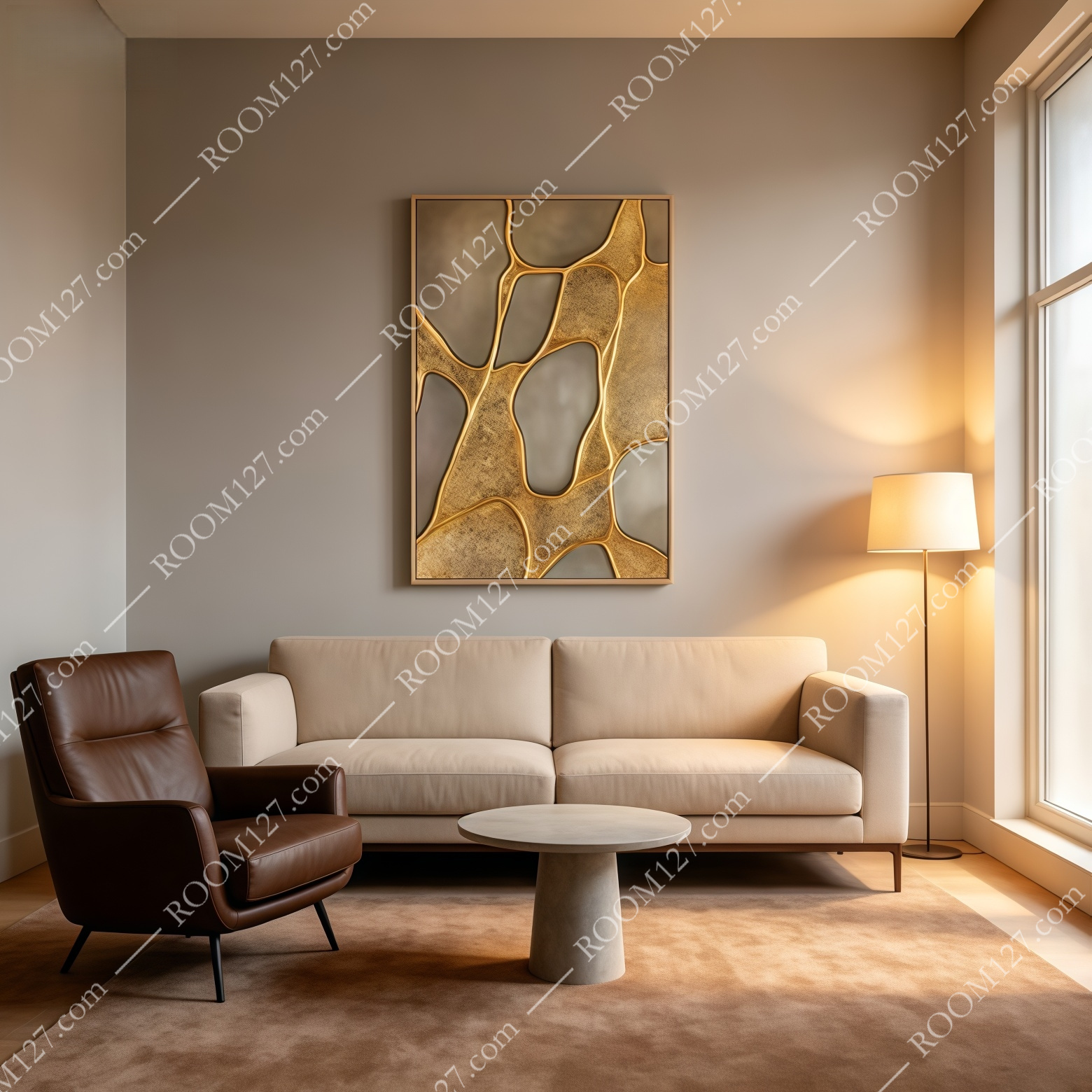
Neutral living room. Cream sofa, cognac leather chair, travertine side table.
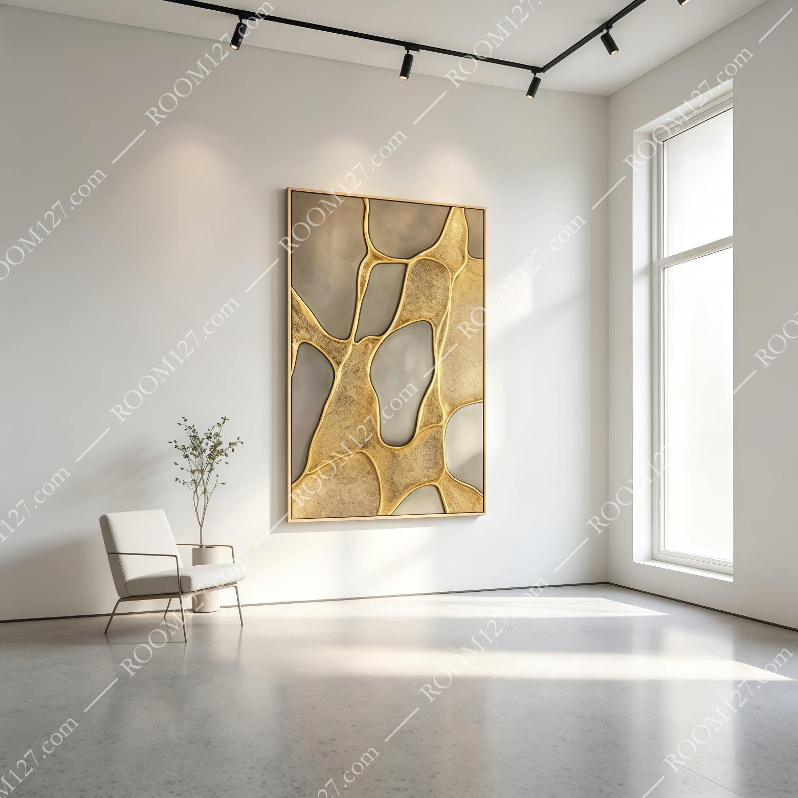
White-cube gallery. Track lighting, white armchair, polished concrete floor.
III.Buyer's notes
- Size and orientation.
80 × 120 cm vertical (also 60×90, 90×135).
Do not hang it on a wall shorter than 100 cm. The composition is tall and narrow; squashing it between two pieces loses the rhythm of the veins.
- Hang the centre, not the edge.
Align the visual centre of the panel to 150 cm from the floor.
Because the gold veins run top-to-bottom, the piece wants to be read standing up.
- Grazing light is the secret.
A narrow-beam picture light from above, or wall-wash sconces either side, makes the raised gold throw real shadows.
Flat frontal light flattens the whole piece into a photograph.
- It loves warm neutrals.
Taupe, cream, oak, walnut, cognac leather, linen.
It will clash with bright primary colours or cold minimal white — the gold reads wrong on a stark cool wall.
- Frames.
Ships in a thin oak veneer frame (also available in black or brushed gold).
For a hotel or commercial installation, the brushed gold frame is the default choice.
- Care.
Troweled ground, raised metallic compound.
Dust with a soft, dry cloth; do not polish the gold — its satin finish is built in.
Stable in controlled indoor humidity; avoid bathrooms and kitchens.
✦ A note on gifting:
This is a piece for a housewarming that needs to feel expensive without being garish.
If you have a client, a parent, or a friend who just moved and "already has everything", this is the answer.
It costs less than a weekend in a city hotel, and it stays on the wall for twenty years.
IV.The verdict
There are a hundred gold abstracts online. Most are printed on canvas.
This one is built. The difference is what happens when you walk past it in low light: the gold moves.
If that is what you are paying for — a piece that rewards being lived with — this is it.