
Walk into a stylish home right now.
Notice what catches your eye.
Chances are, it isn't a flat canvas print. It's something that catches the light differently as you move — something with shadow, depth, and a physical presence on the wall.
That's the shift happening in interiors this year, and this piece sits right at its center.
◆ What You're Actually Looking At
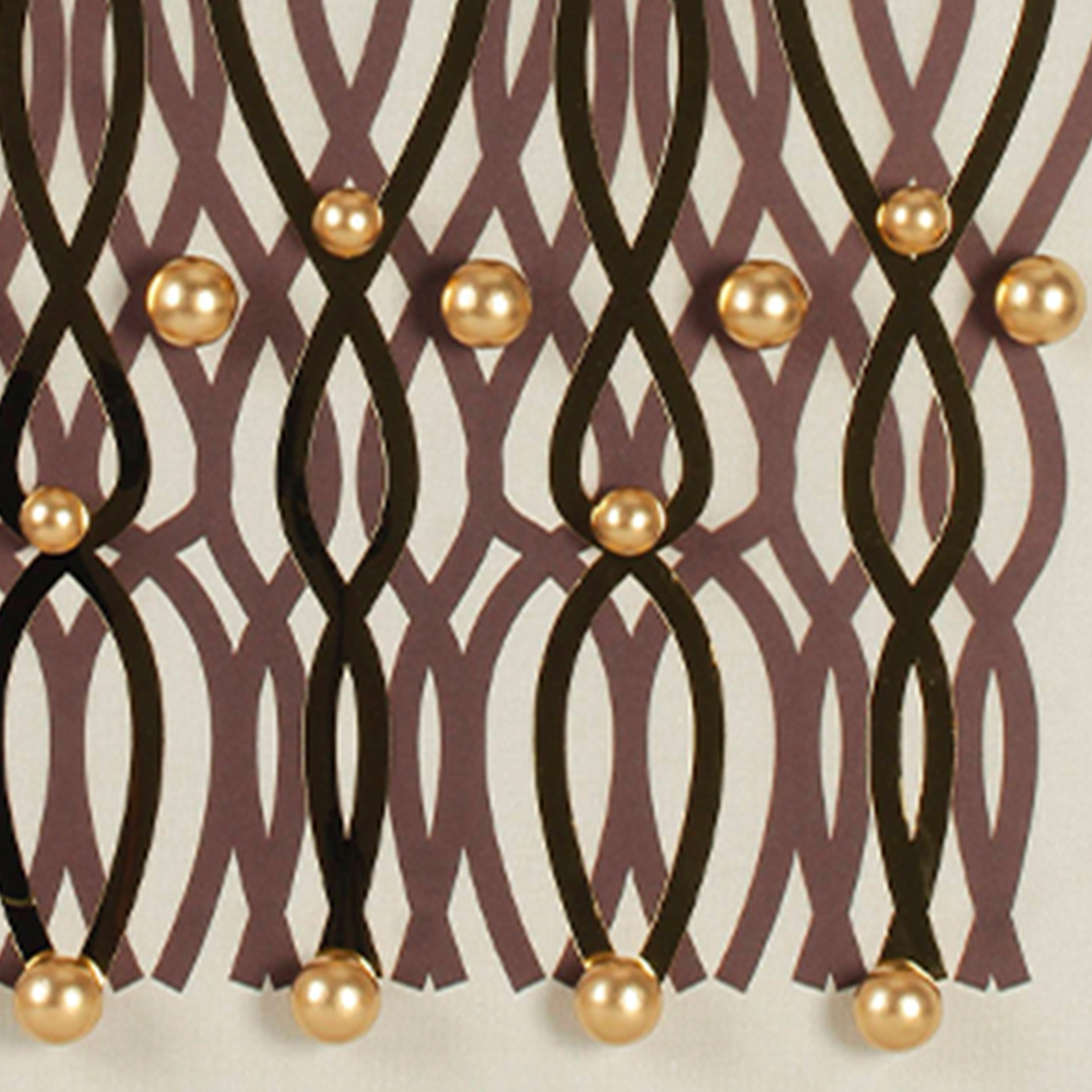
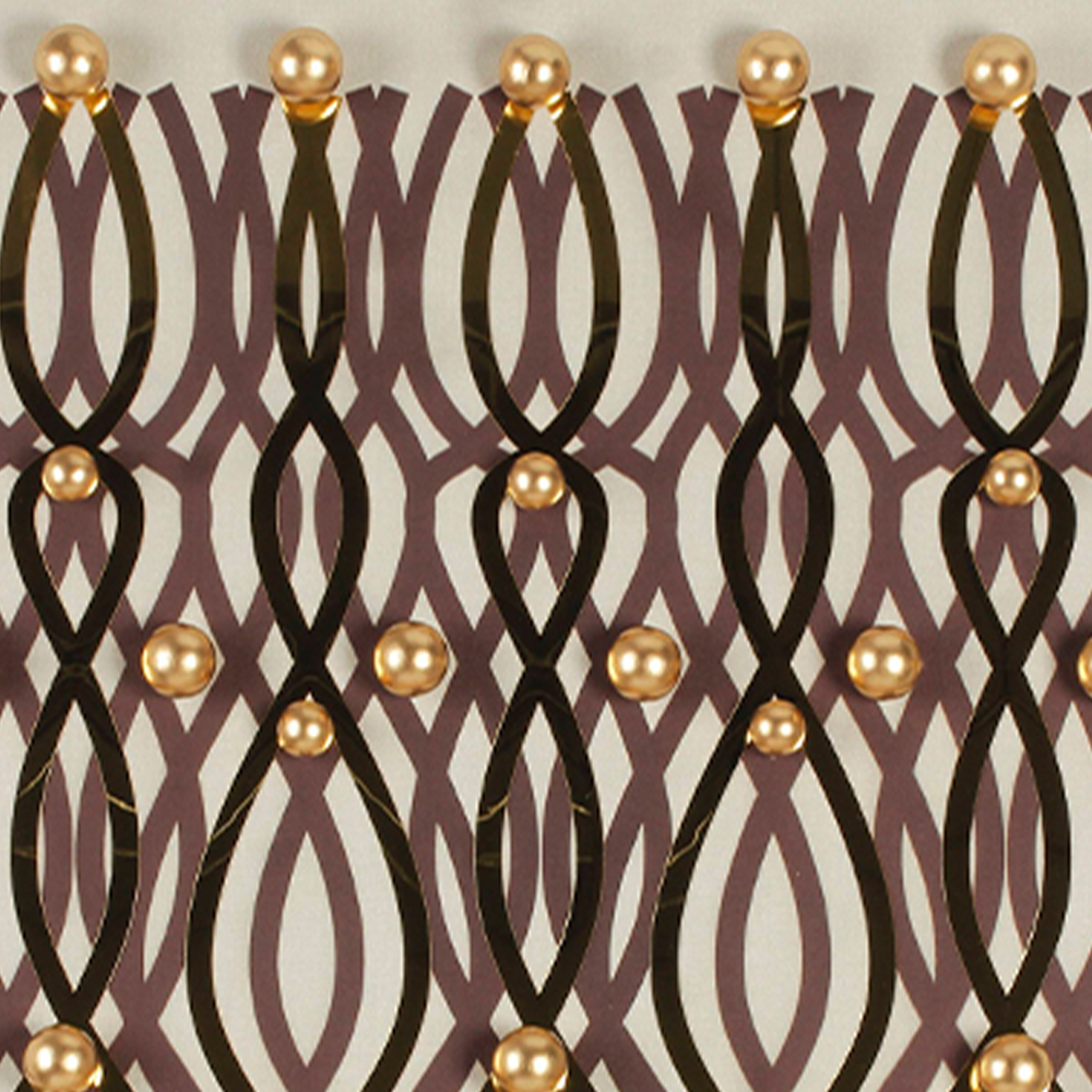
At a distance, the pattern reads as a rhythmic weave — repeating diamond and oval forms that interlock like a woven textile. But step closer and the difference becomes obvious: the dark strips aren't printed. They're raised off the surface. Layered, dimensional, with real thickness you can see cast shadow along the edges.
Scattered across this lattice are hand-placed gold metal beads — small, perfectly round, catching ambient light like scattered dew. They're not painted on. They're individual elements set at the intersection points of the weave, adding a third layer of texture. The contrast is deliberate:
◇ Deep espresso-brown strips (almost black in low light, warm wood-brown in daylight)
◇ Brushed gold spheres (matte enough not to be gaudy, shiny enough to glow)
◇ Cream linen ground (soft, warm, never stark white)
◆ The Detail That Makes Buyers Stop and Zoom
We cropped in on the surface so you can see exactly what separates this from a mass-produced print:
→ The weave itself. Each interlaced strip is a physical element, not a graphic. Look at where two strips cross — you can see one passing over the other, with a tiny shadow in the gap. It's the same optical rhythm as a rattan chair or a woven rug, but frozen on the wall in a permanent, elegant pattern.
→ The gold beads. Run a finger across the surface (we did). Each bead is smooth, weighted, and individually positioned. They're not evenly spaced in a grid — they sit at the crossing points where the weave's natural intersections occur, so the gold feels organic, not mechanical.
→ The shadow play. This is the part photos don't fully capture. Under a side light, the raised strips cast micro-shadows that make the pattern seem to breathe. Under a spotlight, the gold beads spark individually. In flat daylight, the piece reads calm and graphic. It changes character depending on where you hang it and what light you give it.
◆ Six Rooms, Six Personalities — Real Placement Tests
A good art piece shouldn't force a room into one style. We tested it in six very different settings:
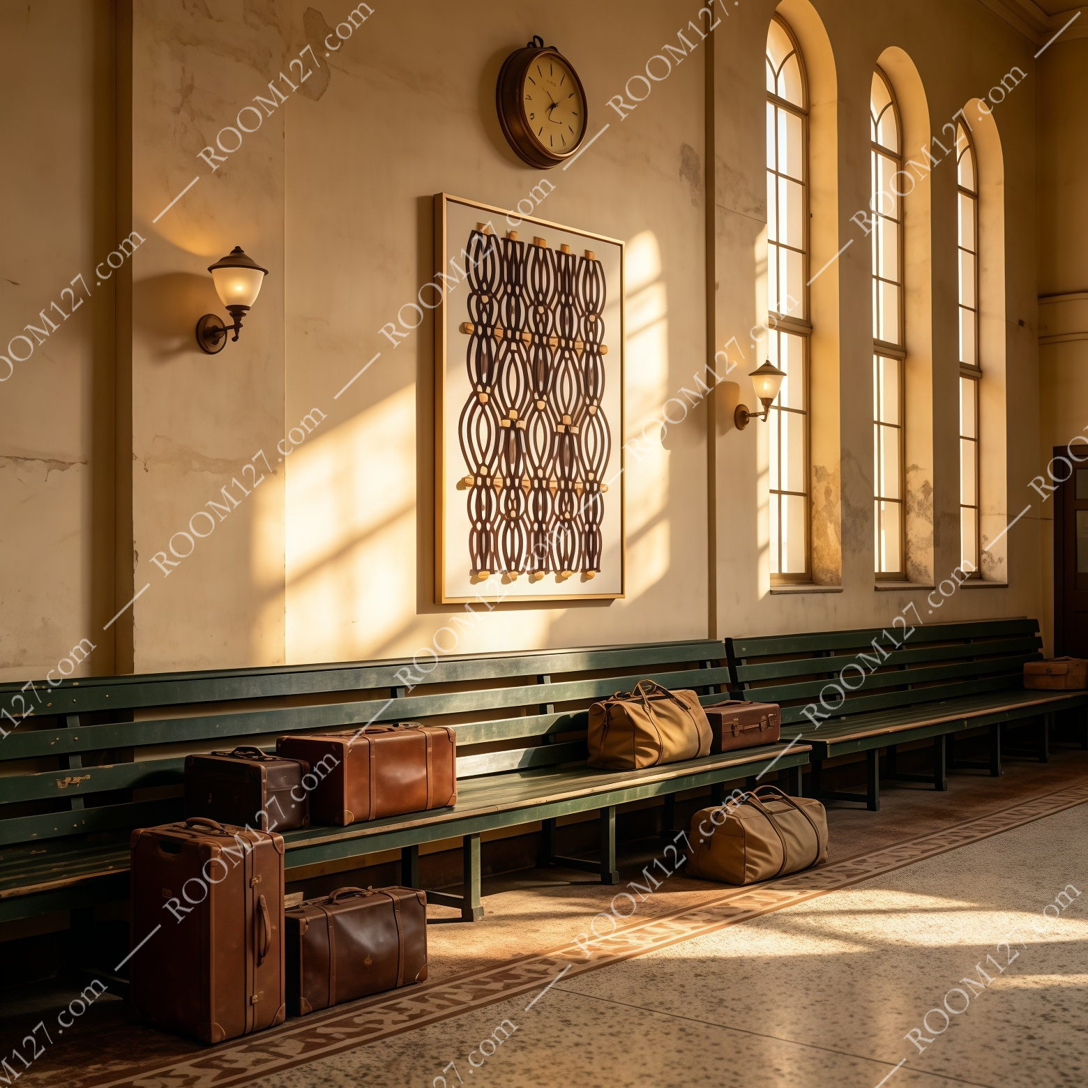
🏛️ The old train station concourse
Arched windows, vintage green benches, leather suitcases, a brass wall clock. This piece didn't look out of place at all — the geometric pattern echoed the ironwork of the windows, and the gold beads picked up the warm afternoon light streaming through. It felt like it belonged in a restored 1920s waiting room.
⬜ The minimal concrete stairwell
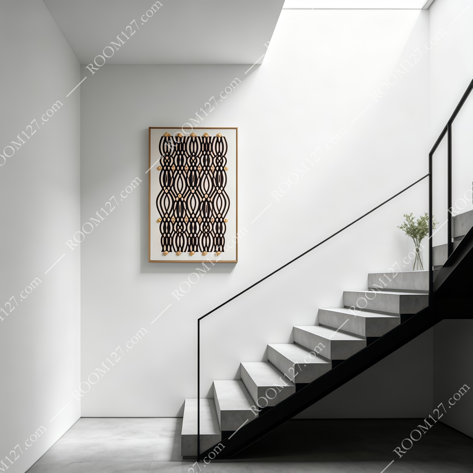
Pure white walls, raw concrete steps, black steel handrail. Here the piece acts as the warm anchor. The cream background doesn't fight the white; the dark strips add weight; the gold beads are the only decoration. It's the perfect one-piece solution for a space that would otherwise feel too cold and empty.
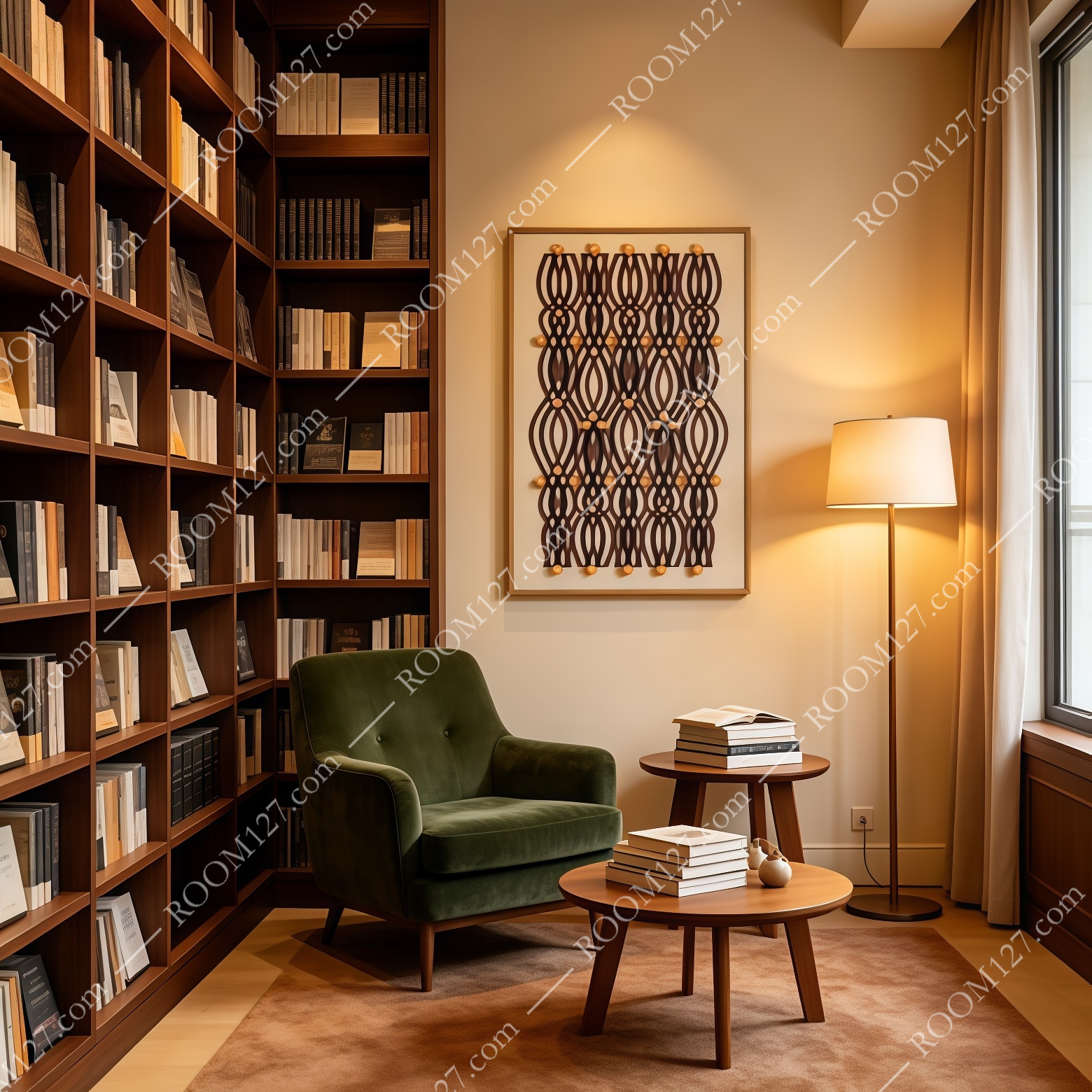
📚 The library reading corner
Floor-to-ceiling walnut bookshelves, a green velvet armchair, a floor lamp. The geometric pattern visually rhymes with the spines of hundreds of books — vertical lines and rhythmic repetition. The dark tone of the artwork doesn't compete with the book jackets; it sits behind the chair like a quiet, sophisticated companion.
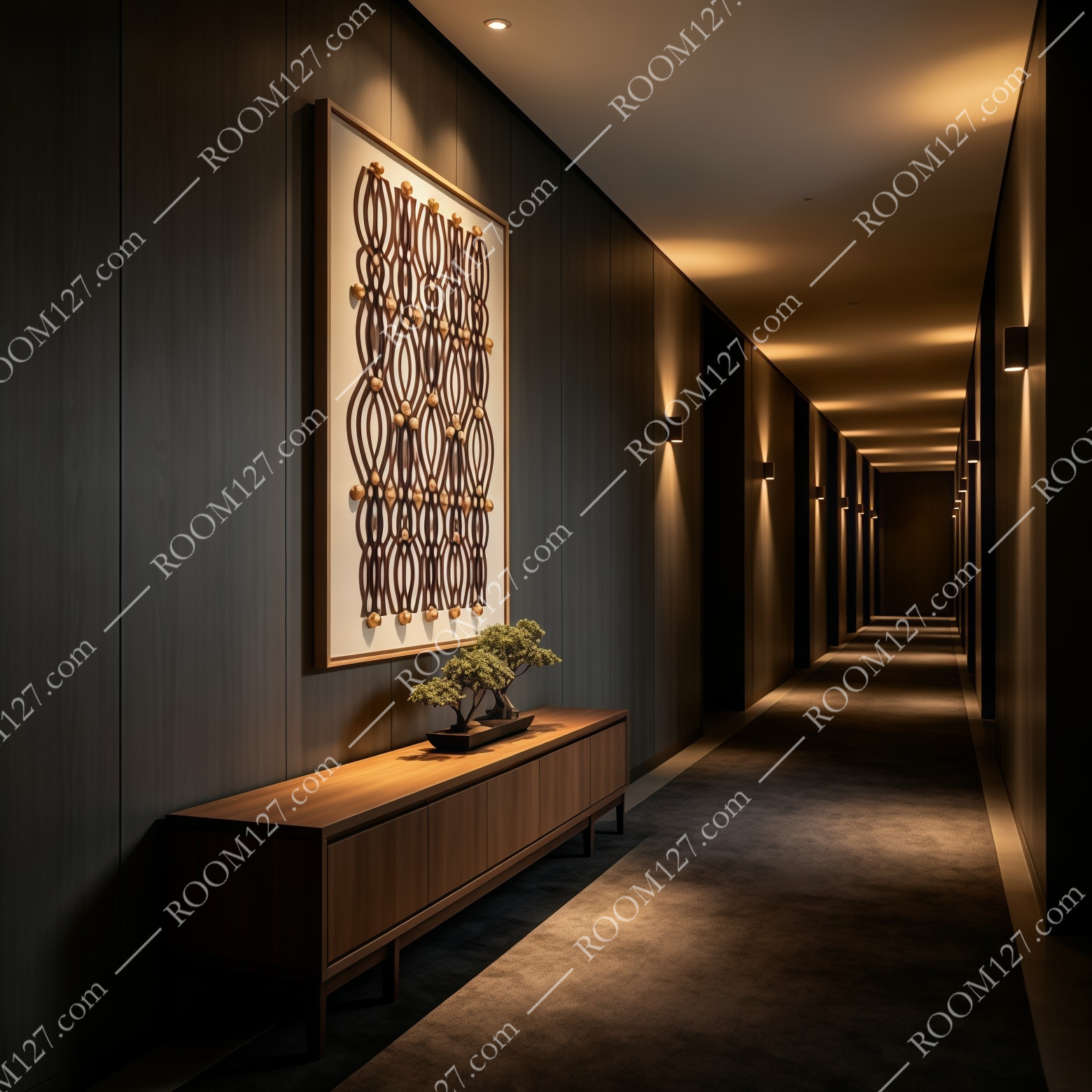
🚪 The dark wood hotel corridor
Deep walnut paneling, recessed wall lights, a long console. This is where the gold beads truly shine — in low, warm ambient light, each sphere becomes a tiny point of reflected warmth. The piece feels bespoke, hotel-grade, intentionally designed for a moody, intimate atmosphere.
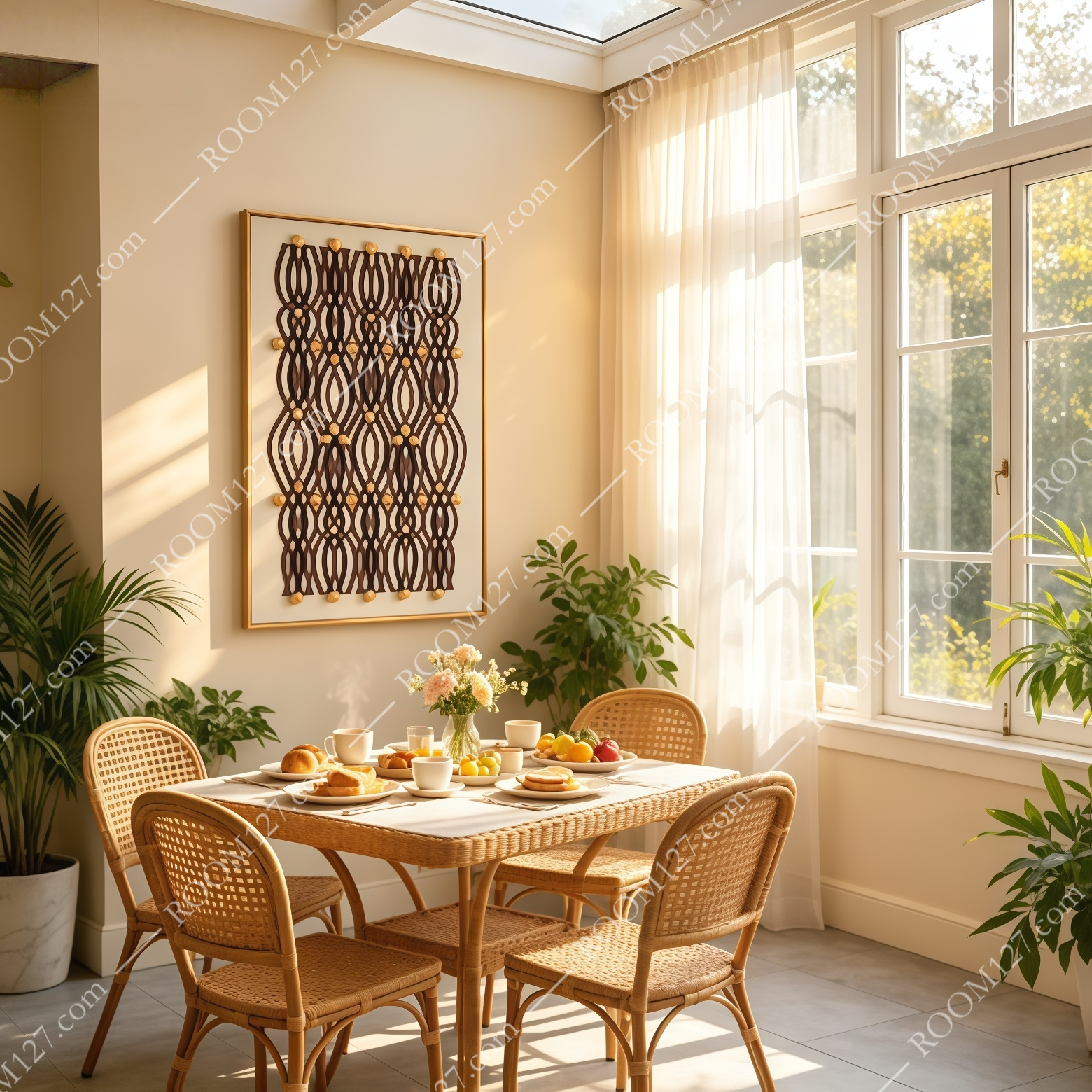
🍃 The sunlit breakfast nook
Rattan chairs, a white-clothed table, large windows with sheer curtains, potted palms. In bright natural light, the dark strips lighten to a warm espresso tone, and the gold beads become almost luminous. It bridges the bohemian rattan vibe with a touch of refinement — casual but not messy.
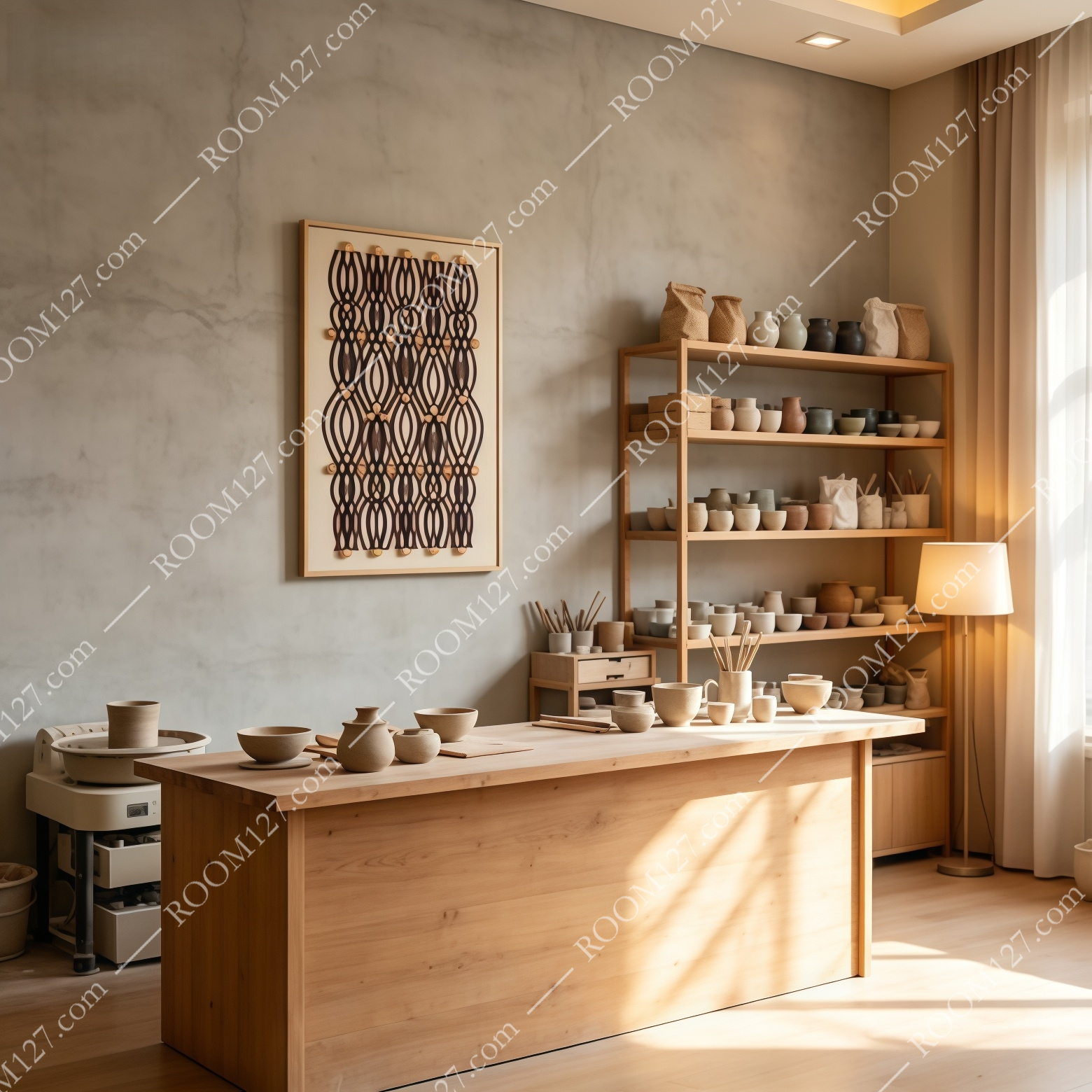
🏺 The artisan pottery studio
Tadelakt walls, a solid oak worktable, open shelving with raw clay vessels. The woven pattern echoes the handcrafted quality of the ceramics — both are about process, repetition, and tactile surfaces. In a space already full of handmade objects, this piece feels like it was made in the same spirit.
◆ Why Dimensional Art Is Replacing Flat Prints
If you've browsed home decor on Pinterest or Instagram lately, you've probably noticed the shift. Flat botanical prints and abstract canvases are being pushed aside by pieces that have real surface depth. Three reasons:
1. It reads as "designed" not "decorated."
A flat print says "I bought something to fill this wall." A relief piece says "I chose art with craft and intention." The dimensionality signals thoughtfulness.
2. Light does the work.
You don't need matching curtains or a throw pillow to make a relief piece look expensive. The shadow and highlight across its surface do that automatically. It's one of the highest-impact-per-dollar ways to upgrade a room.
3. It's gender-neutral and timeless.
No flowers, no animals, no trend that will look dated in three years. Pure geometry and texture. It works in a bachelor pad, a family home, a boutique hotel, or a restaurant.
◆ Hanging Tips Before You Order
PRO TIP
Hang it where it gets side light, not front light. A recessed spotlight from the side will make the relief shadows dance and the gold beads sparkle. A flat overhead light will make it read as a flat pattern. If you have a choice, position it so afternoon sun or a wall-grazing spotlight hits it at an angle.
The vertical format works best on walls that are taller than they are wide — hallways, stairwells, the narrow wall beside a sofa. The slim gold frame is already included, so you don't need to spend extra on framing. It arrives ready to hang.
"The best wall art doesn't match your sofa. It matches the light in your room." This piece understands that.