
magine walking into a room and the first thing you notice is a circle on the wall — not a rectangle, not a square.
It feels different immediately. More intentional. More designed.
That's not an accident. Circular wall art is having its moment in 2026, and this piece shows exactly why.
○ CHAPTER ONE
The Sphere on the Wall
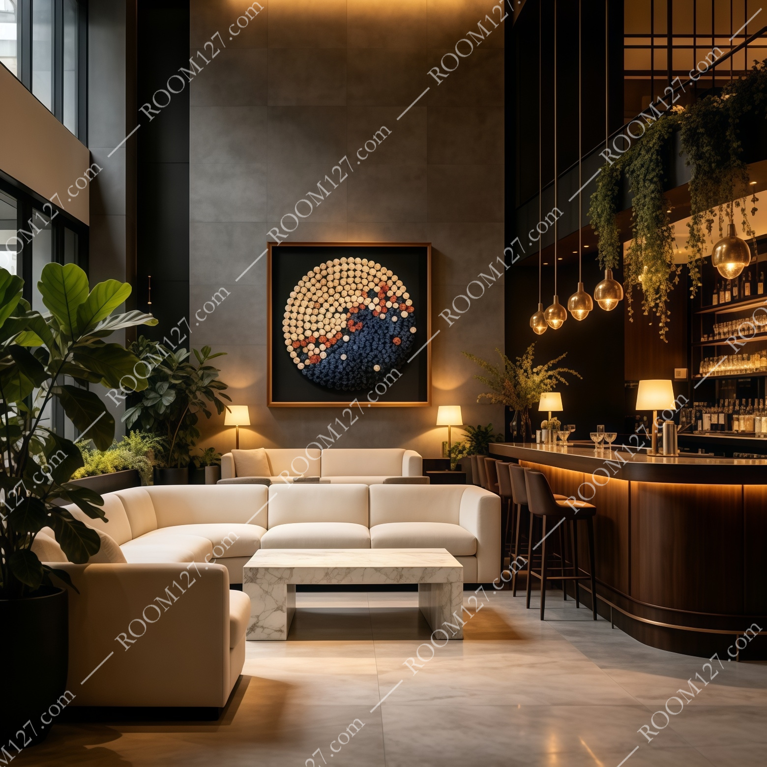
At its core, this is a circle composed of hundreds of tiny spirals. Each little spiral is a separate element — like a rolled scroll, a wooden button, or a paper quill — assembled one by one on a black ground. Step back, and from a distance the spirals blur into a smooth gradient: warm ivory at the top, brushed orange in the middle, deep indigo at the bottom.
It looks almost like a full moon photographed from orbit — the warm edge glowing, the dark side falling into shadow. Or a planet at dusk. That planetary quality is what makes it feel larger than life. It's not a pattern. It's an object.
○ CHAPTER TWO
What the Camera Doesn't Tell You
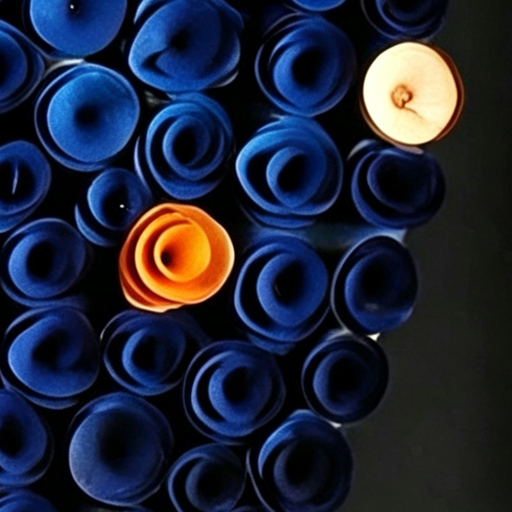
We photographed the surface at macro scale. Here's what the close-up reveals:
◉ The spiral elements.
Every dot you see is a three-dimensional curl. The ivory spirals are light-toned, almost like natural wood veneer; the indigo ones are saturated and deep. Where warm meets cool in the middle, a handful of burnt-orange spirals act as the bridge — they're the color transition made physical.
◉ The black ground.
The background isn't just a flat black. It's a deep, matte near-black that absorbs light. This is critical: the black is what makes the circle look like it's floating on the wall. It creates negative space, visual breathing room, and the illusion that the sphere is hovering.
◉ The thin gold frame.
A narrow metallic frame wraps the square outer shape, grounding the circle in a clean, modern border. It doesn't compete — it finishes.

○ CHAPTER THREE
Six Rooms, Six Moods
We placed it in six interiors with completely different energy levels:
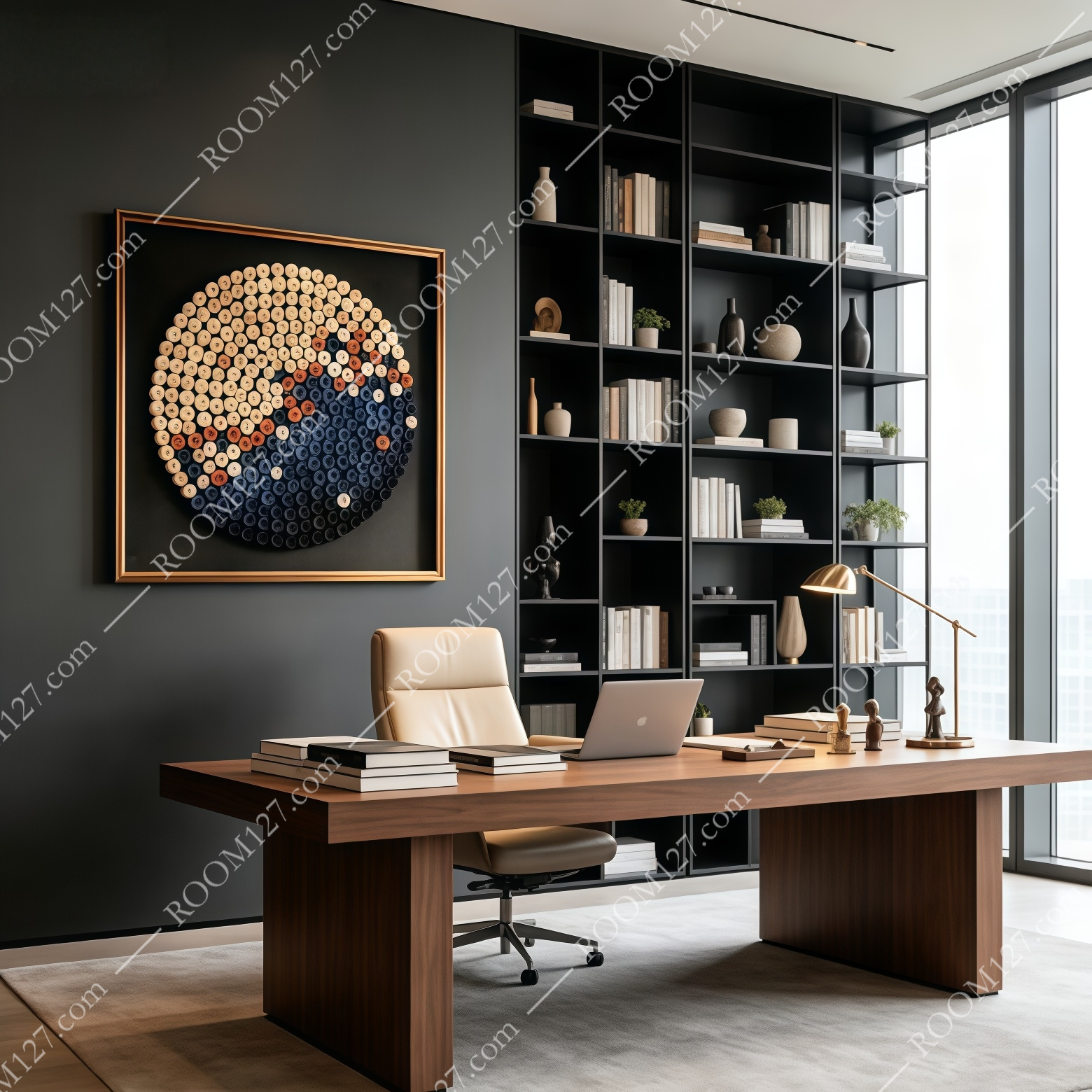
⬛ The executive office
Dark grey wall, walnut desk, leather chair, built-in bookshelves. The circle becomes the room's art piece — the warm ivory side catches the desk lamp, the indigo side disappears into the dark wall. It says "this is a serious space, but it has soul."
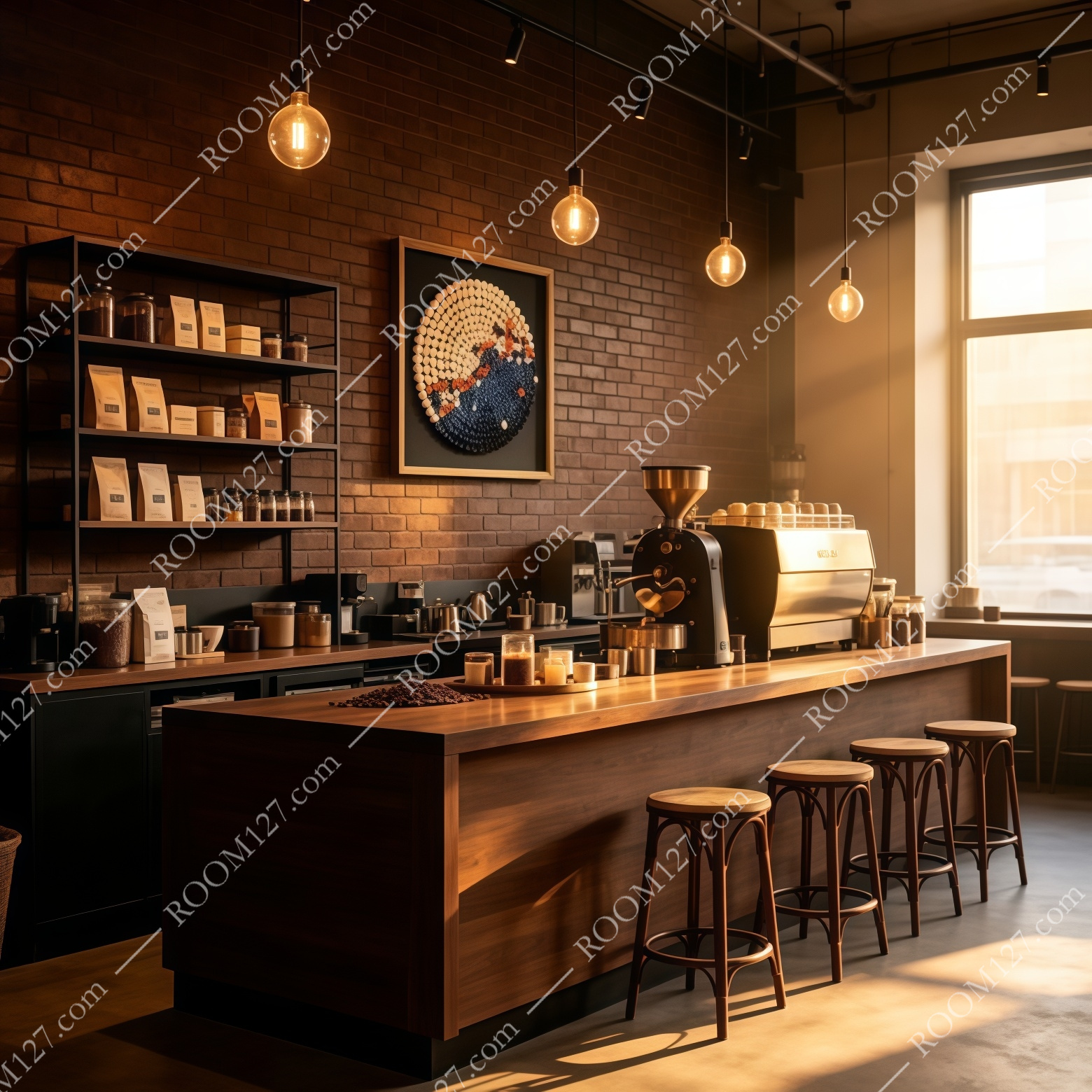
🟫 The industrial cafe
Exposed brick, Edison bulbs, wooden coffee bar, espresso machine. The warm orange tones in the painting directly echo the amber glow of the pendant lights. It looks like it was commissioned for the space — the textured surface rhymes with the brick, the dark side disappears into the shadowed corners.
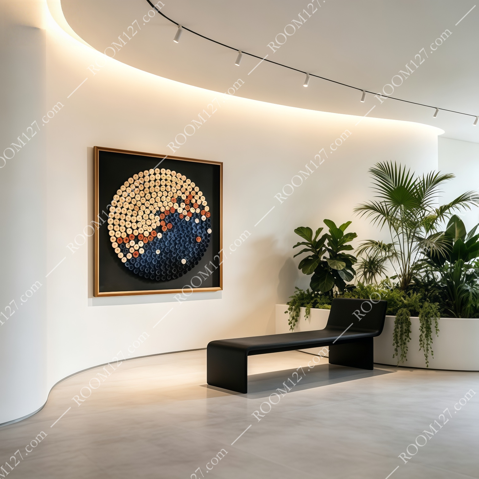
⬜ The white gallery lobby
Curved white walls, track lighting, a black bench, tropical plants. Here the black ground of the painting and the white wall create maximum contrast. The circle pops like a framed celestial object. This is where the piece looks most like contemporary art, not home decor.
🟤 The hotel lounge
Stone feature wall, cream sectional, marble coffee table, a bar in the background. The painting bridges the masculine stone and the feminine sofa — the warm ivory side complements the cream upholstery, the deep indigo side grounds the space.
🍳 The bright kitchen
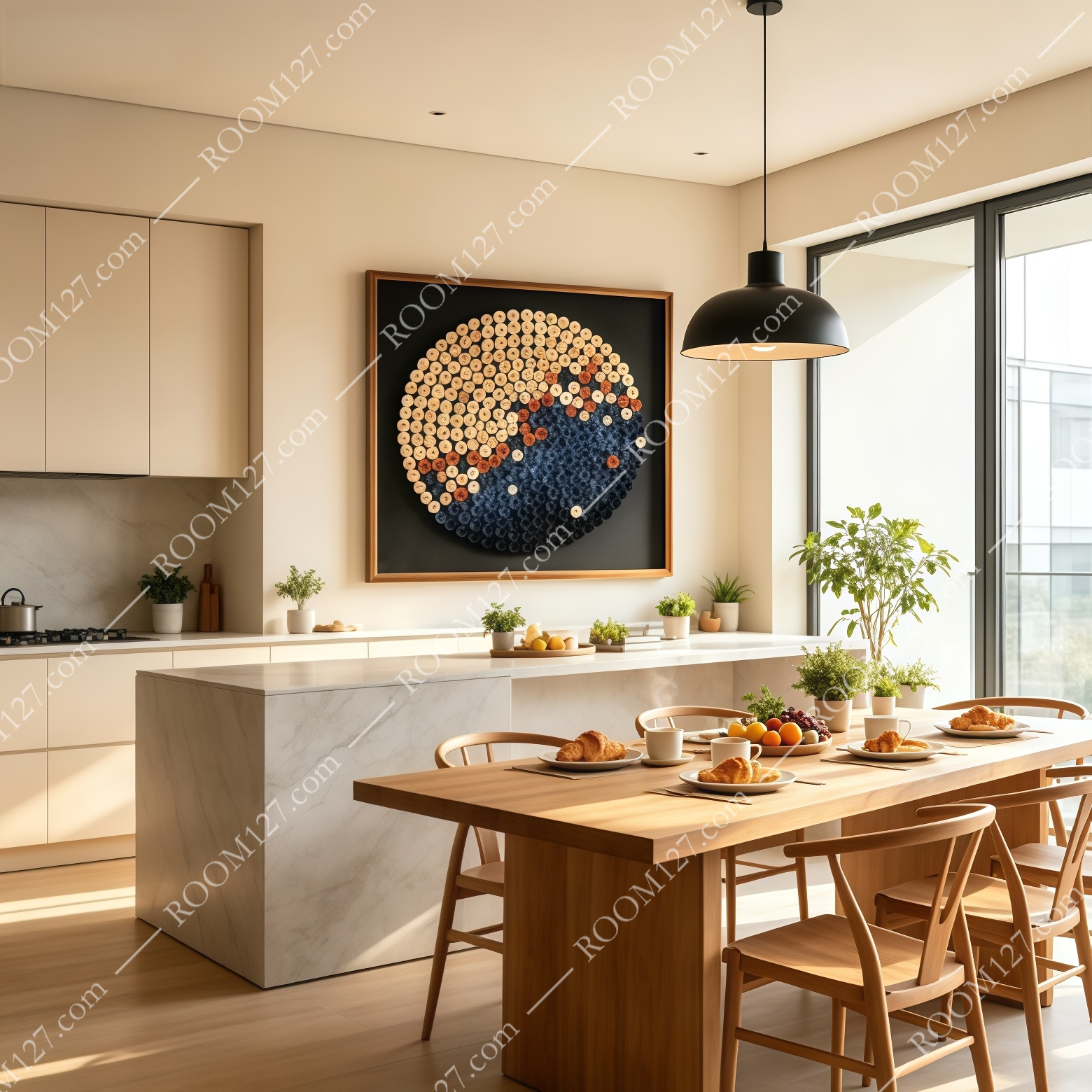
White cabinetry, marble island, wooden dining table, morning sunlight. On a light wall, the painting becomes a bold graphic statement. The black frame and indigo half anchor the bright space; the ivory half blends with the warm morning light.
🌃 The night bar
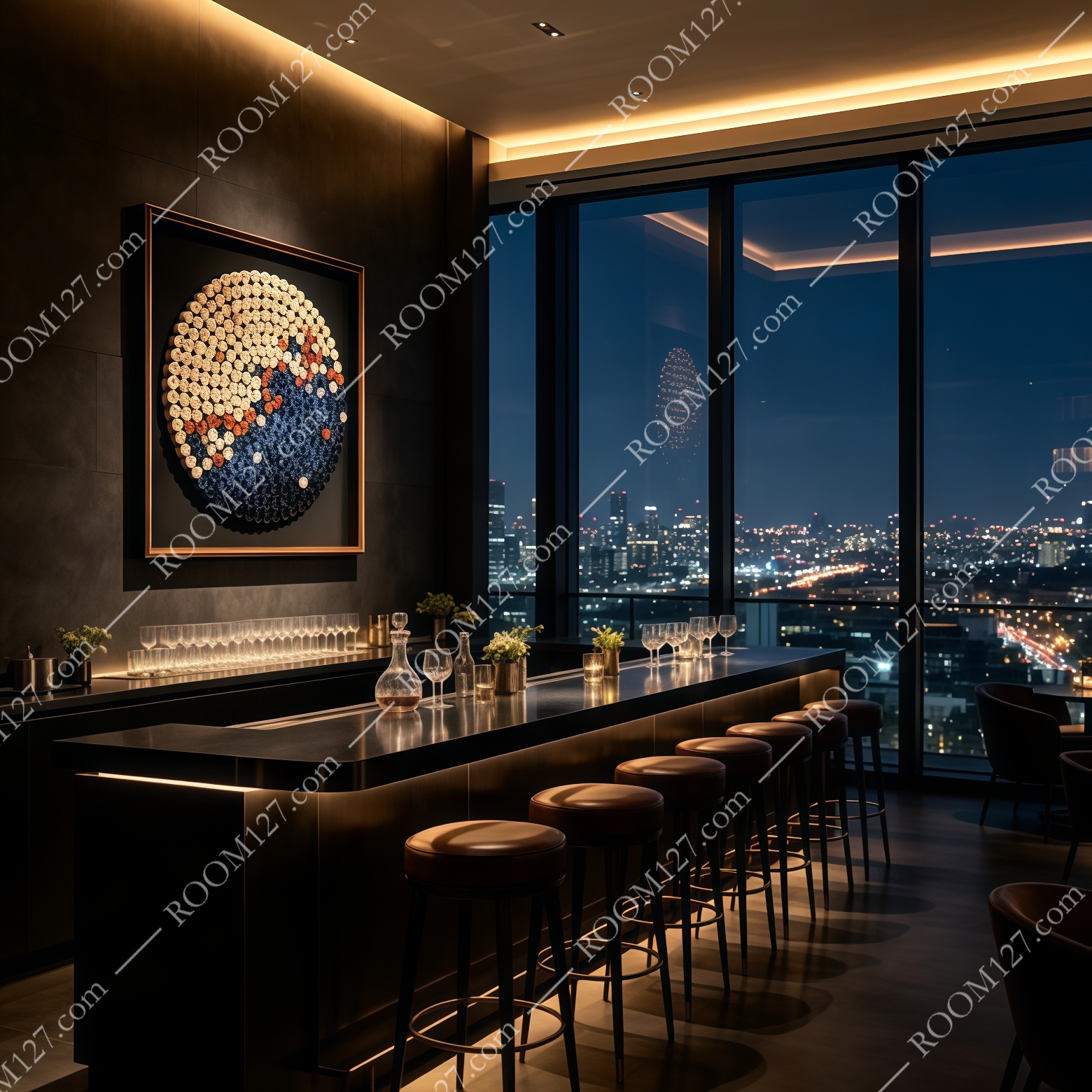
Floor-to-ceiling windows with a city view at night, dark bar counter, leather stools. Under low ambient light, only the warm ivory and orange half of the circle glows. The indigo half merges with the darkness. It looks like a window into another world.
○ CHAPTER FOUR
Why Circles Beat Rectangles
If you're used to rectangular art, the difference a circle makes is subtle but real:
1. It softens hard architecture.
Rooms are full of right angles — door frames, windows, desks, shelves. A circle on the wall introduces a shape that doesn't exist anywhere else in the room. It's a visual exhale.
2. The gradient does the decorating for you.
You don't need to match the wall color. The circle contains both warm and cool tones, so it works in a room with oak floors, a room with grey walls, a room with blue accents. It's self-matching.
3. It reads as a statement, not filler.
A rectangle in a frame can look like decoration. A textured circle on a black ground looks like art you chose deliberately. It signals design confidence.
Where to Hang It
The square format works best when you want the circle to be the undisputed center of a wall — above a sofa, above a desk, on a feature wall in a lobby or entry. Hang it where you have room to step back and see the full gradient: up close, it's texture; from across the room, it's a glowing orb.
Let the warm side face the light source — window, lamp, or spotlight. The ivory spirals will catch the glow and the indigo side will hold the shadow. That's when it looks most like a planet, not a craft project.
"Rectangles fill walls. Circles hold attention."