
Some rooms feel cold.
Not because of the thermostat — because of the walls.
Grey concrete, white tile, black steel furniture.
They look clean, but they don't feel warm.
That's where a piece like this comes in.
Warm art doesn't just decorate a wall. It raises the perceived temperature of the entire room.
◆ FIRST IMPRESSION
A Sphere of Warmth
This is a circle. But not a cool one. Instead of fading into blue or grey, the spiral elements warm up as they go — starting from ivory cream at the top, moving through burnt orange and terracotta in the middle, and deepening into wine red and dark chocolate at the bottom.
It's like looking at a sunset compressed into a frame. Or a campfire's embers. On a black background, the warm tones pop harder than they would on white. The dark ground doesn't compete — it makes the orange and red glow like they're lit from within.
◆ THE CRAFT
What the Close-Up Reveals
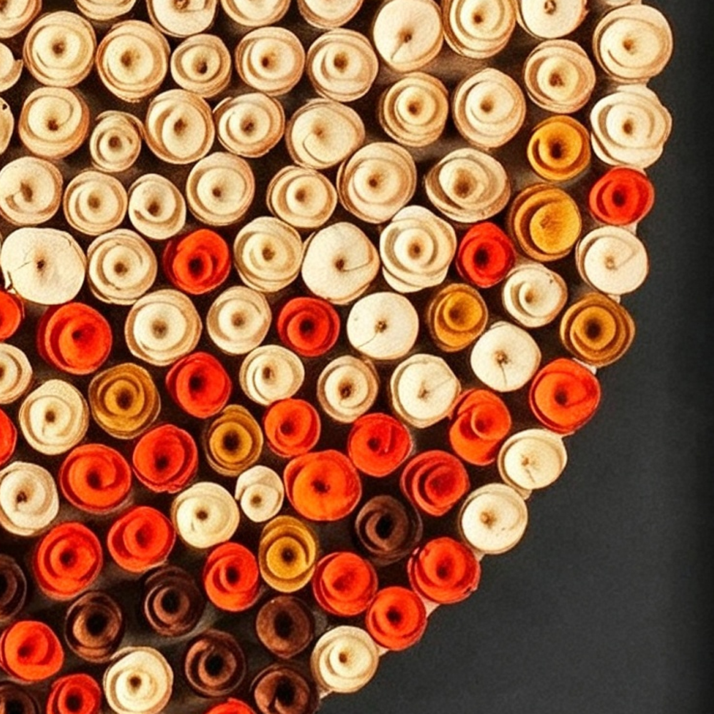
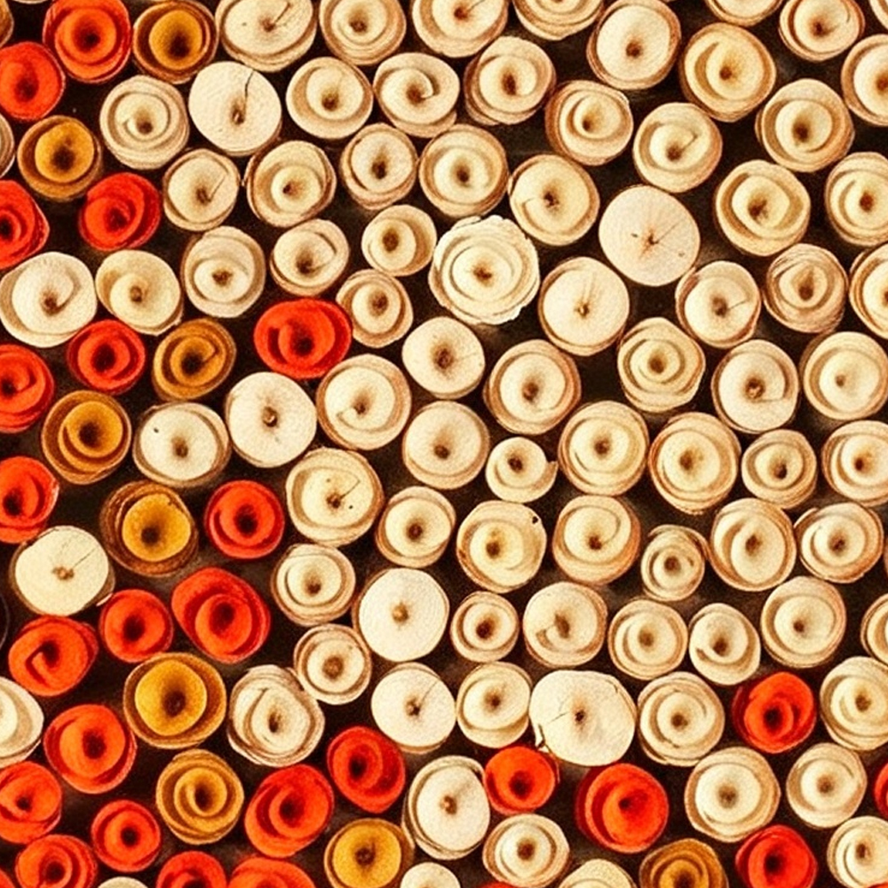
We zoomed in on the surface so you can see what makes this piece different from a printed canvas:
→ The spiral elements.
Every dot is a three-dimensional curl — like a rolled wooden chip or a paper quill. The ivory ones are light-toned, the orange ones carry a warm pigment, and the deep red ones are saturated and rich. Where the colors meet, they blend naturally, not in a hard line.
→ The gradient logic.
This isn't a random splash of colors. The warm tones are concentrated on one side, creating a visual weight that feels balanced. The eye moves from the lightest point to the darkest point naturally — like reading a sunset from the horizon up.
→ The black ground.
The deep black background is what makes the warm colors sing. On a white wall, these oranges would look bright. On black, they look intense — like they're radiating heat. It's the same effect as a fire on a dark night.
◆ PLACEMENT TEST
Where It Warms Up a Room
We placed it in six spaces to see how the warm tones actually work:
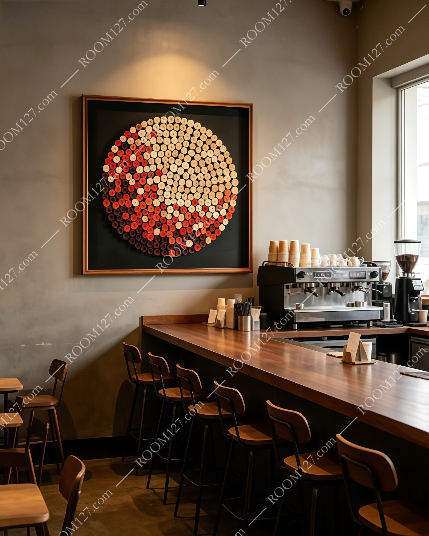
☕ The cafe bar
Dark grey wall, wooden counter, industrial pendant lights, espresso machine. The warm orange tones in the painting directly echo the amber glow of the pendant bulbs. It looks like it was made for a coffee shop — the textured surface rhymes with the wood counter, the dark side disappears into the shadowed corner.
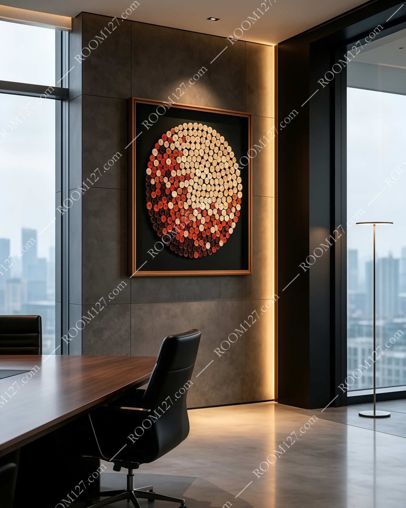
💼 The executive office
Dark stone feature wall, walnut conference table, black leather chair, floor-to-ceiling windows. In a masculine, dark space, this painting adds a warmth that prevents the room from feeling cold. The warm ivory side catches the natural light from the window; the deep red side grounds the dark stone.
🛏️ The hotel bedroom
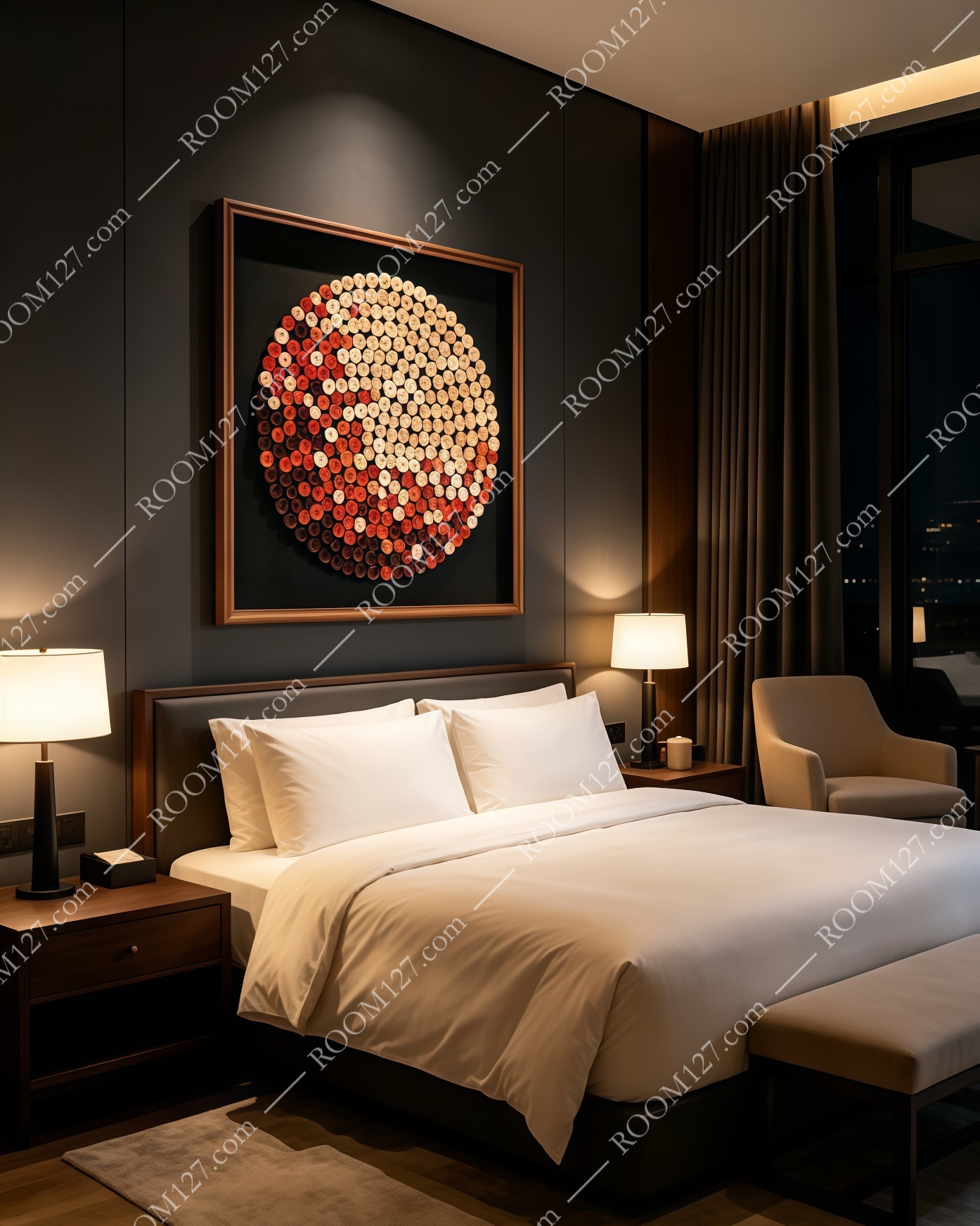
Dark grey headboard wall, crisp white bedding, wooden nightstands, wall sconces. Above the bed, this piece becomes the room's focal point. Under warm bedside lighting, the orange and red tones glow softly — it's the first thing you see when you wake up and the last thing you notice before you sleep.
🏢 The elevator lobby
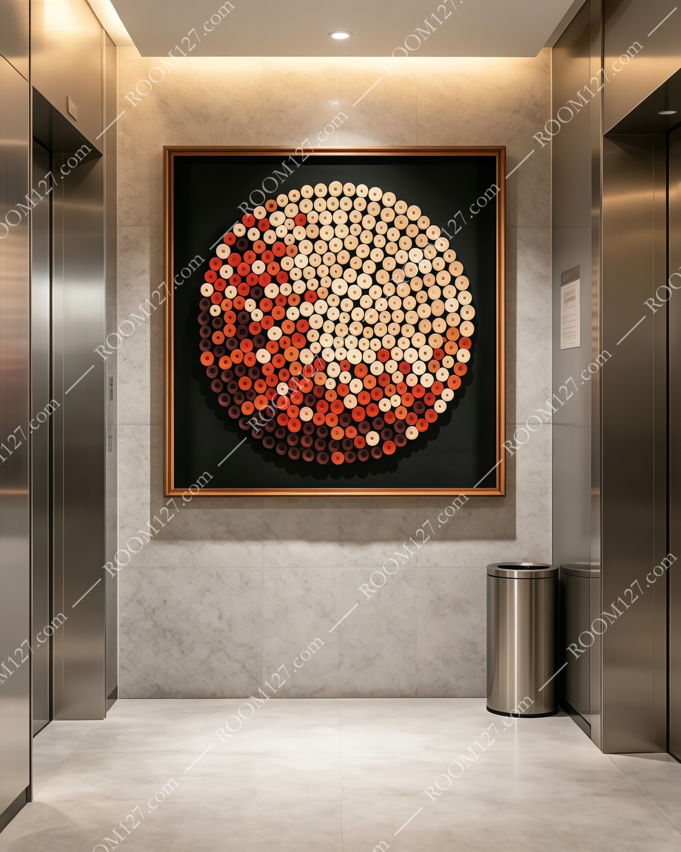
Light marble walls, stainless steel elevator doors, recessed ceiling light. On a light wall, the black frame and the circular artwork create a strong graphic statement. The warm tones stand out against the cool marble — it's the first thing visitors see when they step out of the elevator.
🍷 The bar lounge
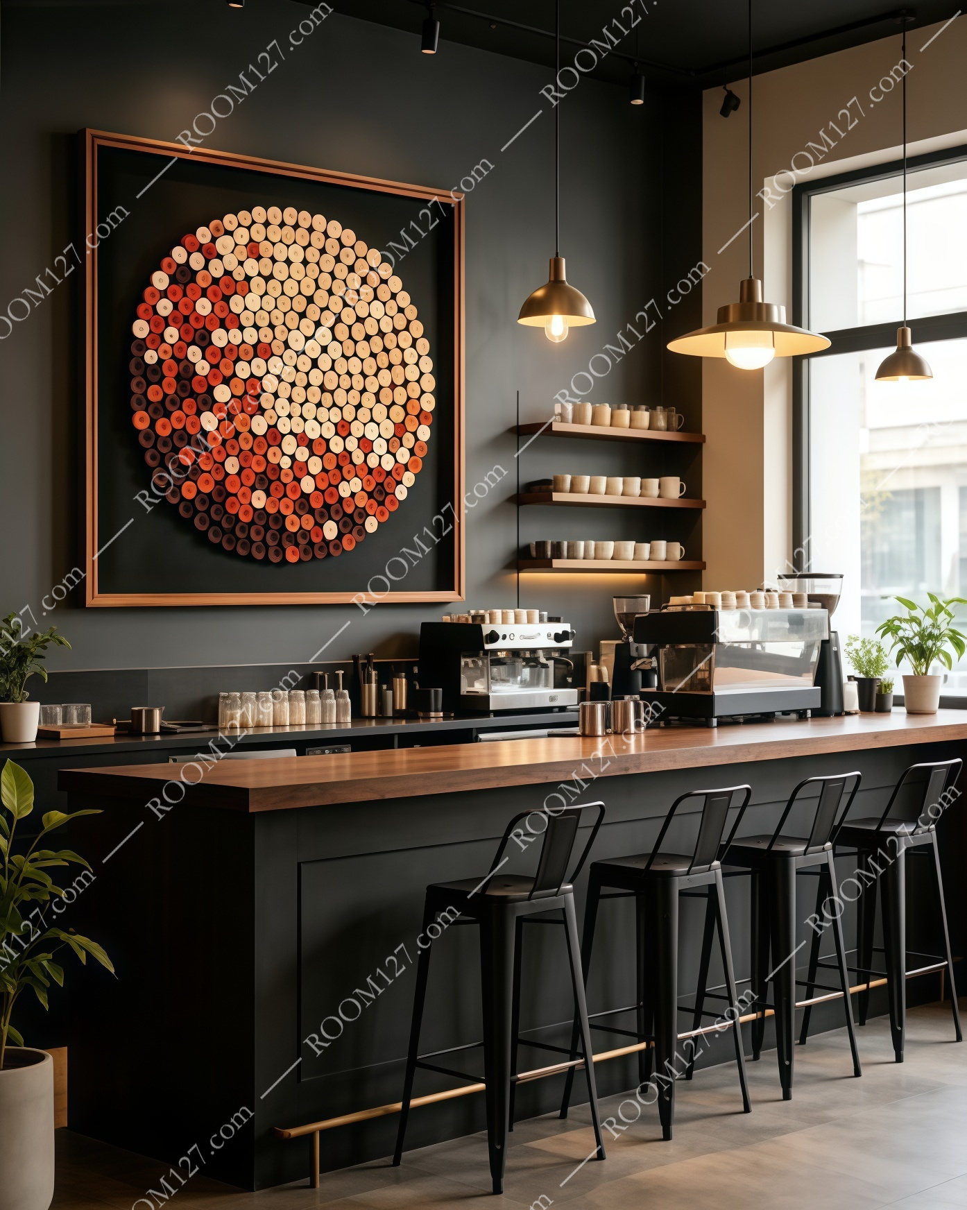
Dark walls, wooden bar counter, metal bar stools, pendant lights. In a dim, moody bar space, only the warm side of the circle glows. The deep red tones blend with the dark atmosphere. It feels like the room was designed around this piece, not the other way around.
🛋️ The living room sofa wall
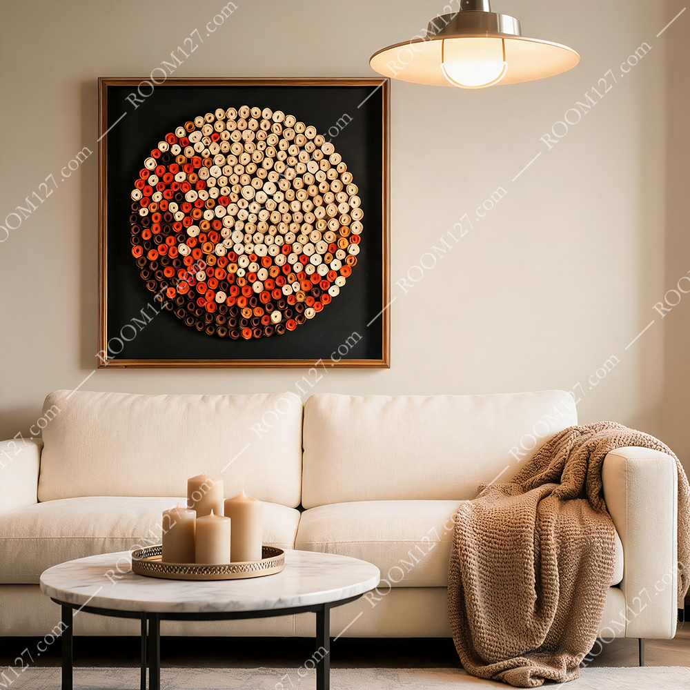
Beige sofa, marble coffee table, candles, a knit throw. On a light wall with warm furniture, the painting bridges the gap between "neutral living room" and "designed space." The warm tones match the beige sofa and the knit throw; the black frame adds structure.
◆ WHY IT WORKS
Three Reasons Warm Art Matters
1. It changes how a room feels, not just how it looks.
Research in environmental psychology shows that warm tones in interior space raise perceived comfort levels. You don't need to turn up the heat. The painting does it visually.
2. It pairs with dark walls better than light art does.
If you have a dark grey or charcoal wall, a light painting can look flat. A warm-toned piece on a dark ground has contrast and depth. It pops without being loud.
3. It's the easiest seasonal swap.
When autumn and winter arrive, you don't need to repaint the room. Swap out a light summer print for a warm autumn piece like this. The whole room feels updated for the season — without touching the walls.
◆ STYLING TIP
Hang It Where You Want Warmth
The square format works best as the main focal point on a wall — above a sofa, above a bed, on a feature wall in an office or cafe. Hang it where the warm side faces the main light source. The ivory side will catch the glow, and the deep red side will hold the shadow.
If your room already has warm wood tones, this piece will feel like it was born there. If your room is cool (concrete, steel, white), it's the single easiest way to add warmth without renovating.
"The right wall art doesn't just fill space.
It fills a room with feeling."