
I Hated Every Flat Print in My Living Room.
Then I Hung This Woven Jute Sculpture.
〰️ 〰️ 〰️
I'd been staring at that empty wall above my sofa for three months. Every print I ordered felt wrong — too generic, too glossy, too flat. My living room has rattan furniture, linen cushions, and a raw wood coffee table. Why was the art on the wall still looking like it came from a big-box store?
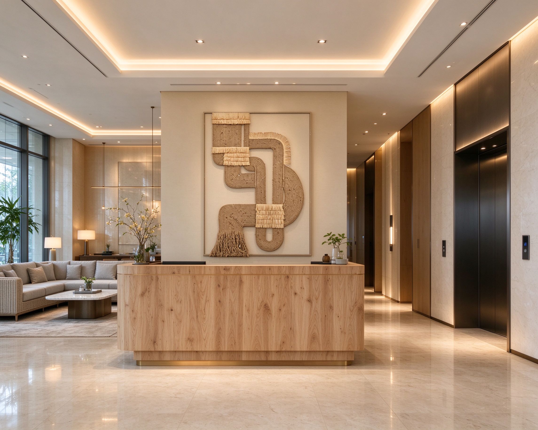
Then a friend sent me a photo of this. It's not a painting. It's not a print. It's a three-dimensional wall sculpture made from real jute rope, hand-coiled onto a linen backing, with raffia fringe and a hanging tassel.
I ordered it. It arrived in a long, slim box. I hung it on a Saturday morning. By Saturday afternoon, my whole living room felt different.
What It Actually Looks Like (No Filter)
Let me be honest: photos don't do this piece justice.
When it's hanging on your wall, the first thing you notice is the texture. The jute rope is thick and rough — you can see every twist in the fiber. It sticks out about half an inch from the wall, which means it casts real shadows when the light hits it. In the morning sun, the shadows are long and soft. At night, under a warm lamp, the rope looks golden.
The color is exactly what I wanted: warm oatmeal, not beige, not yellow. It matches my linen sofa, my jute rug, my oak floor — everything in the room has a similar earthy tone, so the art doesn't fight the furniture. It complements it.
The raffia fringe details — there are three horizontal bands across the composition — are lighter than the rope. They look like little woven strips, almost like something from a Mexican textile or a Moroccan wedding blanket. They add a pop of lighter color that stops the piece from looking too brown.
What to Pair It With (And What to Avoid)
This is the part I wish someone had told me before I bought it:
✅ Pair it with:
Rattan, wicker, or bamboo furniture — the natural fibers complement each other. Linen or cotton cushions in oatmeal, cream, or warm brown. Raw wood coffee tables. Ceramic or stone vases with dried branches. A jute or woven rug underneath. Warm LED lighting (2700K).
❌ Avoid pairing it with:
Glass coffee tables, chrome fixtures, shiny surfaces. This piece is matte and organic — it'll look wrong next to anything sleek and modern. Also avoid cool white walls (the blue undertones fight the warm oatmeal). Stick to warm grey, cream, or beige.
Which Rooms It Actually Works In
I've seen this piece in six different spaces now, and it works in all of them — but for different reasons:
🛋️ Above a sofa — this is the classic spot.
The vertical shape fills the wall above a three-seater perfectly. It's the first thing you see when you walk in, and it sets the whole tone of the room.

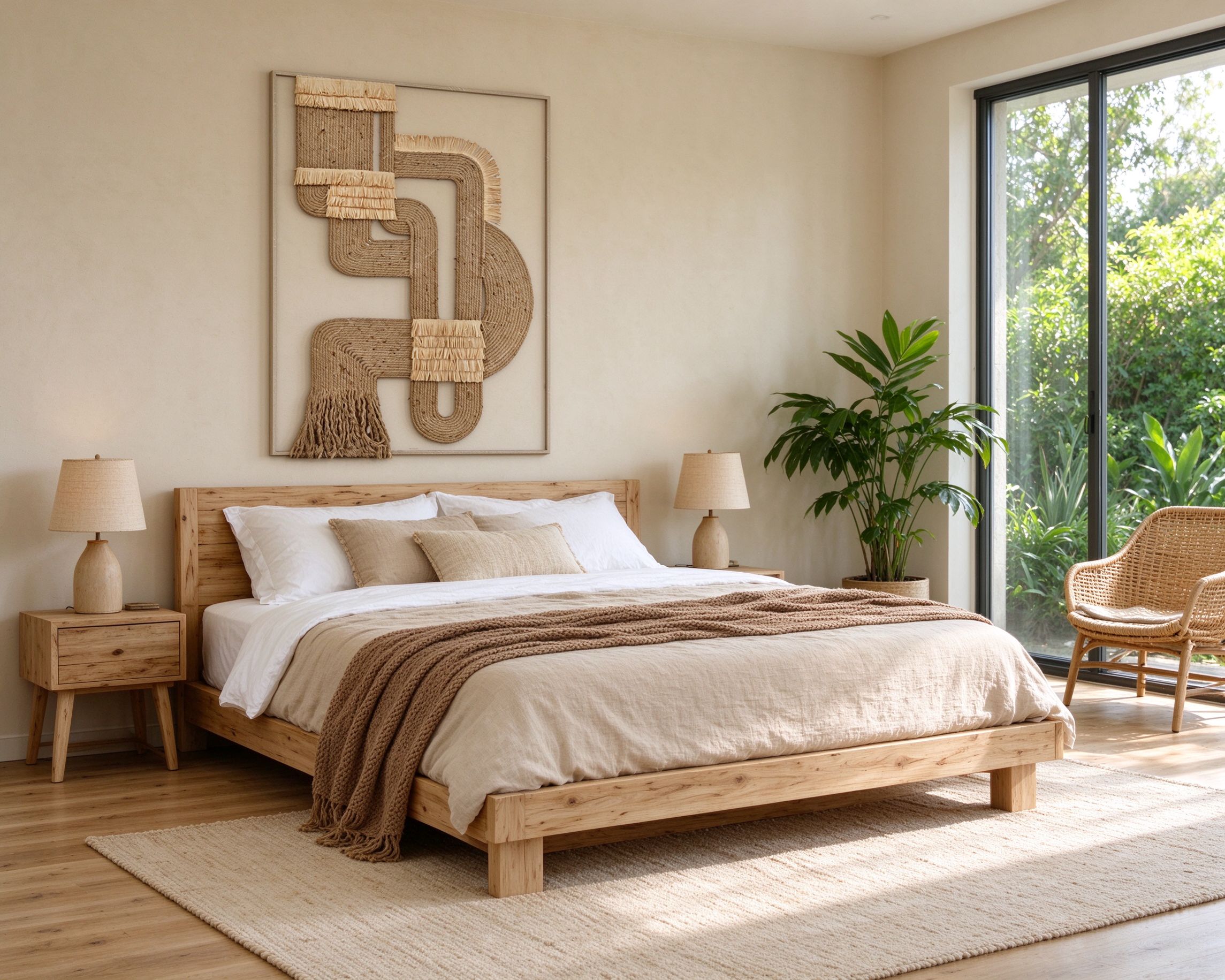
🛏️ Above a bed — my bedroom is next on the list.
In a bedroom, the warm tones feel calming. It's the last thing you see at night and the first thing you see in the morning. No harsh colors, no loud images — just soft texture.
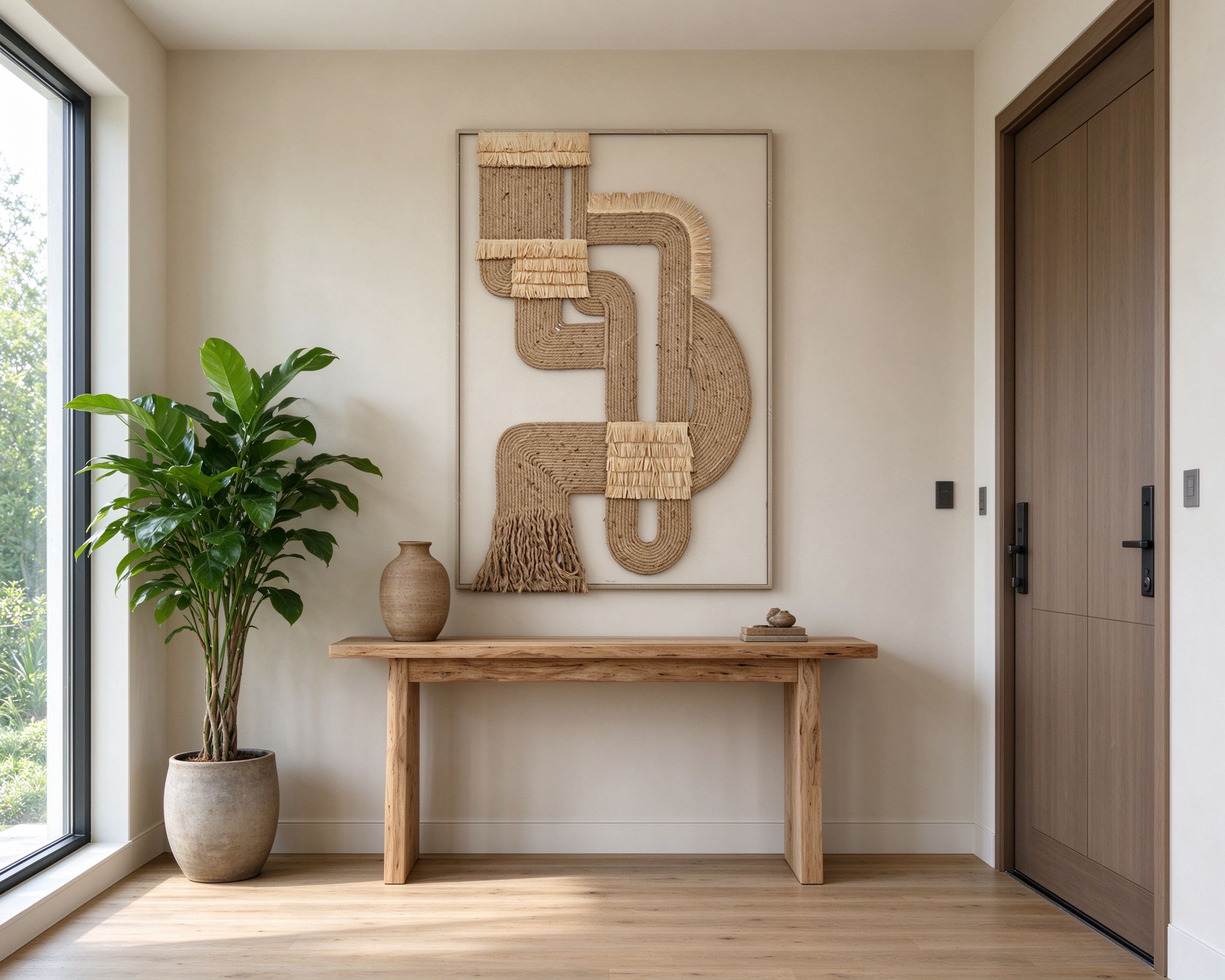
🚪 In a hallway or entryway — a narrow hallway with nothing on the walls feels like a corridor.
This piece adds texture and warmth to an otherwise blank space. Just make sure your hallway is wide enough — the sculpture sticks out a few inches from the wall.
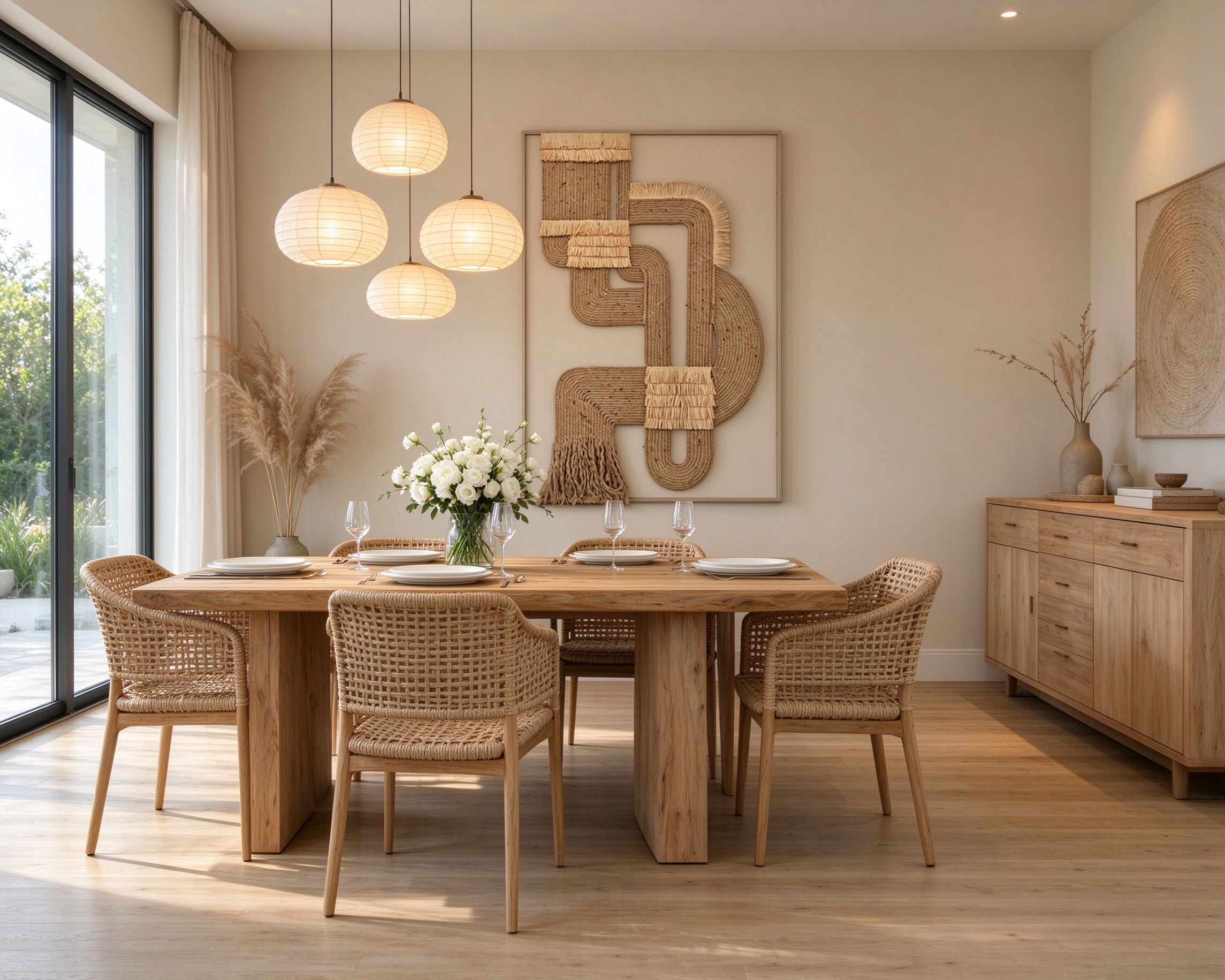
🍽️ In a dining room — I've seen it hung above a sideboard.
It makes the room feel intimate and relaxed, not formal. Guests always ask about it.
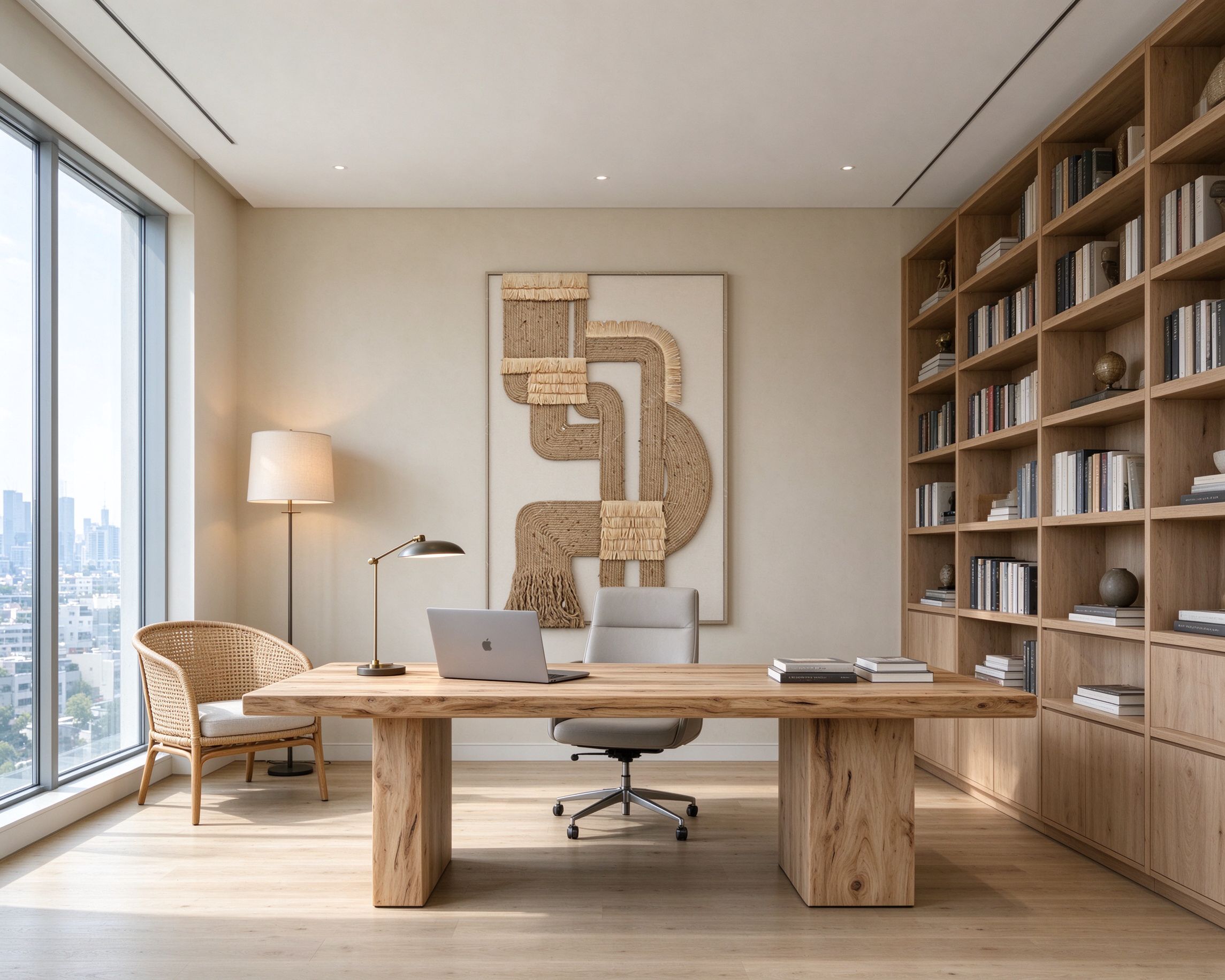
📚 In a home office — it's not distracting.
The organic shapes feel calming when you look up from your screen. Better than a motivational poster, honestly.
🏨 In a hotel lobby or boutique shop — I saw it at a small boutique hotel last month.
It was hung behind the reception desk, and it immediately made the lobby feel expensive and curated.
This piece does that — it looks like something a designer chose, not something you picked up at a chain store.
The Honest Part: Is It Worth the Price?
I'll be straight with you: this isn't a $49 print. It's a hand-assembled fiber sculpture, and the price reflects that.
But here's how I think about it: I've bought three prints in the last two years. I replaced all of them. They looked cheap after a year — the canvas sagged, the ink faded, the frame felt flimsy.
This piece is the opposite. The jute is natural fiber — it doesn't fade. The construction is thick and well-made. If you take care of it (dust it gently, keep it out of direct harsh sunlight), it'll look the same in ten years as it does today.
For me, that's the math: one piece that lasts a decade beats three cheap prints I'll replace next year.
📏 Size guide: The piece I have is the larger size — roughly 80×120cm. It fits perfectly above a three-seater sofa. If you're hanging it above a bed or in a smaller room, the 60×90cm size would be plenty. If you're using it in a commercial space (lobby, shop, restaurant), go bigger — the texture looks best when you can see it from across the room.
If your room feels finished but not cozy,
the missing piece is probably texture.