
The Large White Flower That Turns Any Wall
Into a Gallery Opening
❦ ❦ ❦
You walk into a room. The walls are fine. The furniture is fine. Everything is — fine. Then you look at the wall above the sofa, and there it is: one enormous white flower, its petals thick and raised, its background streaked with gold. The whole room stops being "fine" and starts being memorable.
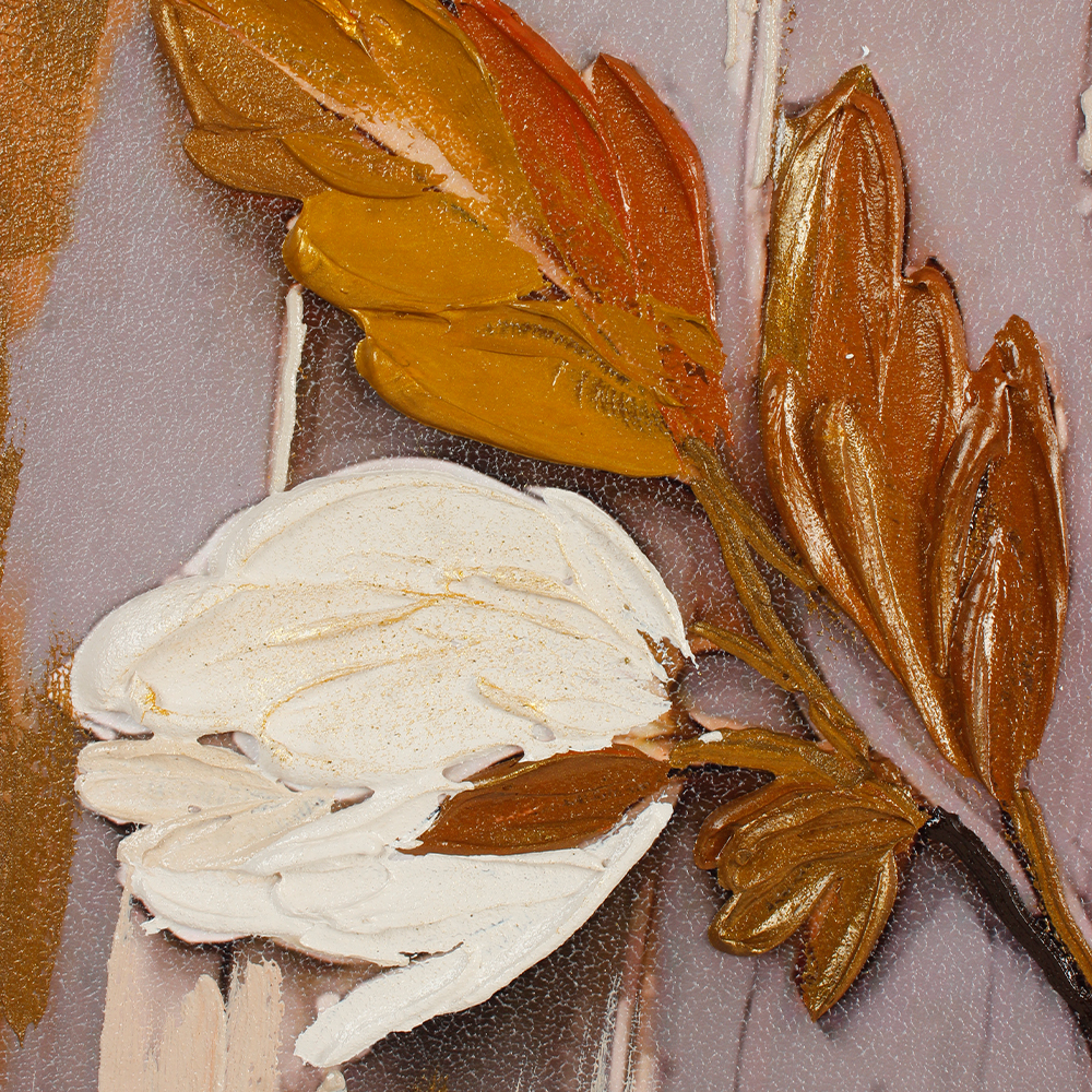
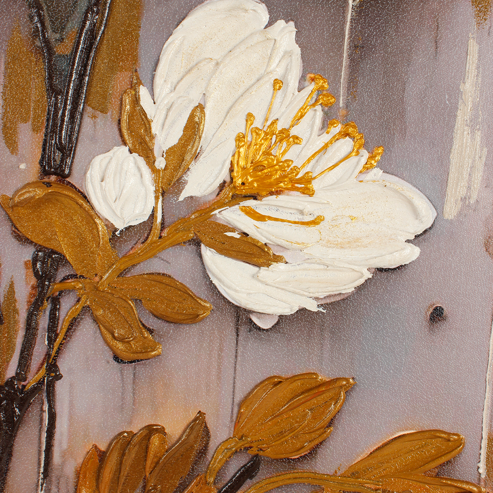
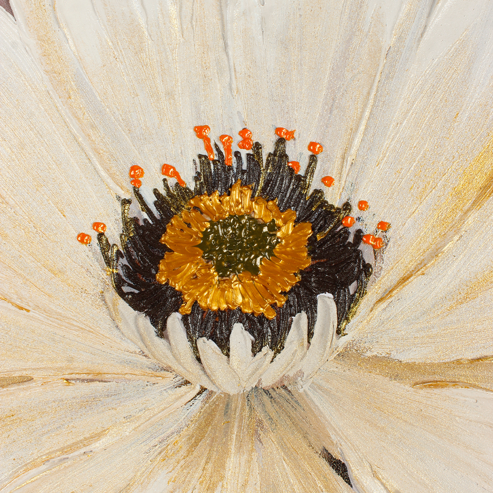
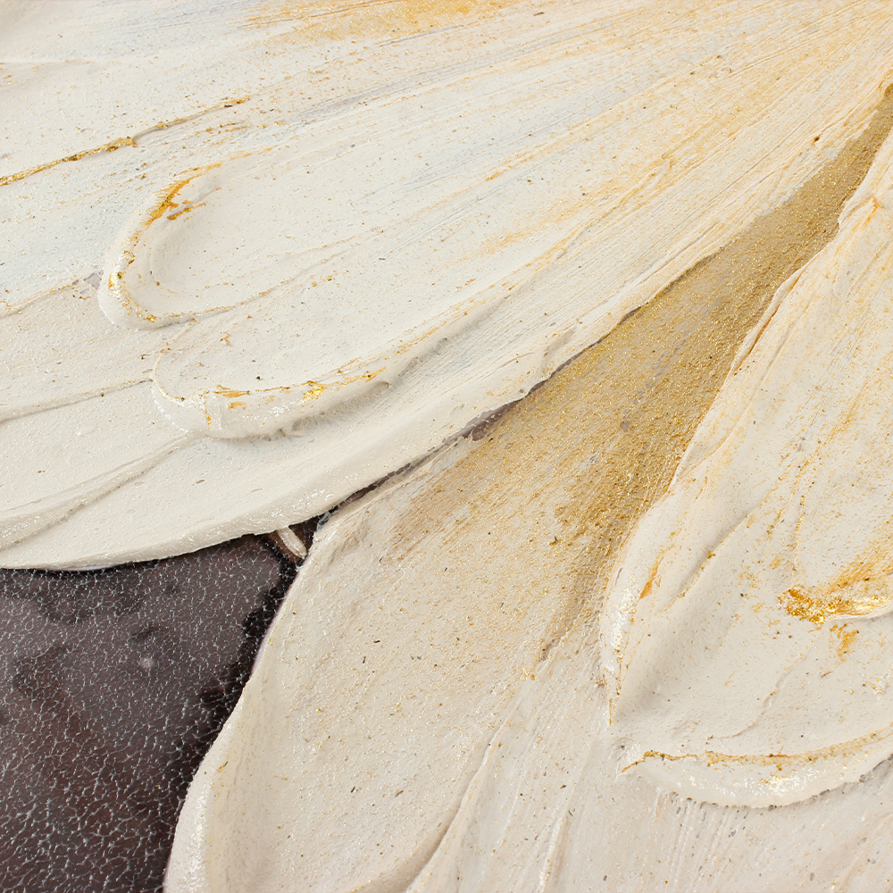
This isn't a printed flower. This is an impasto painting — the petals are built up with layers of thick paint, so thick you can see the brushstrokes, so textured you'd want to reach out and touch them. The center is a deep amber-gold, like a sunflower's disk. The background is a wash of grey and gold leaf, abstract and fluid.
It's the kind of painting that works in a dark wood-paneled study and in a bright all-white living room. That's rarer than you'd think.
📖 A true story from last month:
An interior designer friend of mine texted me a photo. She'd just hung this painting in a client's all-white living room — cream sofa, white marble coffee table, floor-to-ceiling windows. The client walked in, stopped, and said: "It finally feels like a home."
That room had everything. The furniture was from a high-end store. The light was perfect. But it felt like a hotel lobby — not a place someone lived. One painting — one thick, textured white flower with streaks of gold — changed that. A week later, the client texted: three guests had already asked where it was from.

Why the Thick Texture Matters
Most flower wall art is flat. A photograph of a flower, printed on canvas, varnished. It looks nice from across the room, but up close, it's just ink.
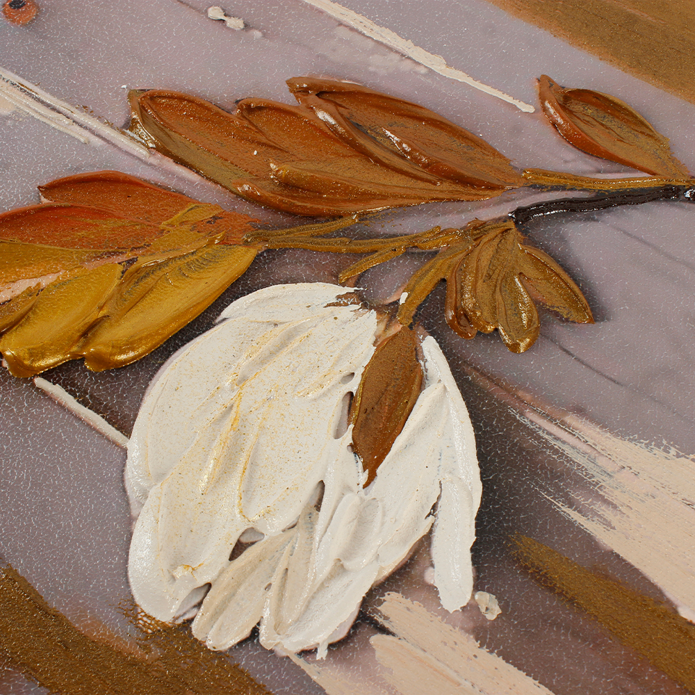
This painting is different. The petals are built up with a palette knife, layer by layer. Run your eye across them and you can see the ridges — each petal has dimension, each layer casts a tiny shadow. The paint is so thick that in some places, it's almost sculptural.
That's what changes a room. A flat print disappears into the wall. A textured painting comes forward — it catches the light differently throughout the day. In the morning, the raised petals glow. In the evening, under a warm lamp, they cast soft shadows that make the flower look alive.


The Gold Background Isn't Just Decorative
Look at the background. It's not a solid color. It's a fluid, abstract wash — grey, taupe, and streaks of gold leaf that run vertically, like rain or like light.
That gold does two things. First, it makes the white petals look even whiter — the warm gold next to the cool cream creates a contrast that makes the flower pop. Second, it ties the painting to any gold hardware in the room: a brass lamp, a gold-framed mirror, a metal coffee table. The painting doesn't fight your fixtures. It echoes them.
And the small details — the tiny white buds on the stems, the bronze-gold leaves — they're painted with the same thick texture. They're not afterthoughts. They're part of the composition, balancing the enormous main flower so the painting doesn't feel top-heavy.
Where It Lives
We hung this piece in five very different spaces. It worked in all of them:
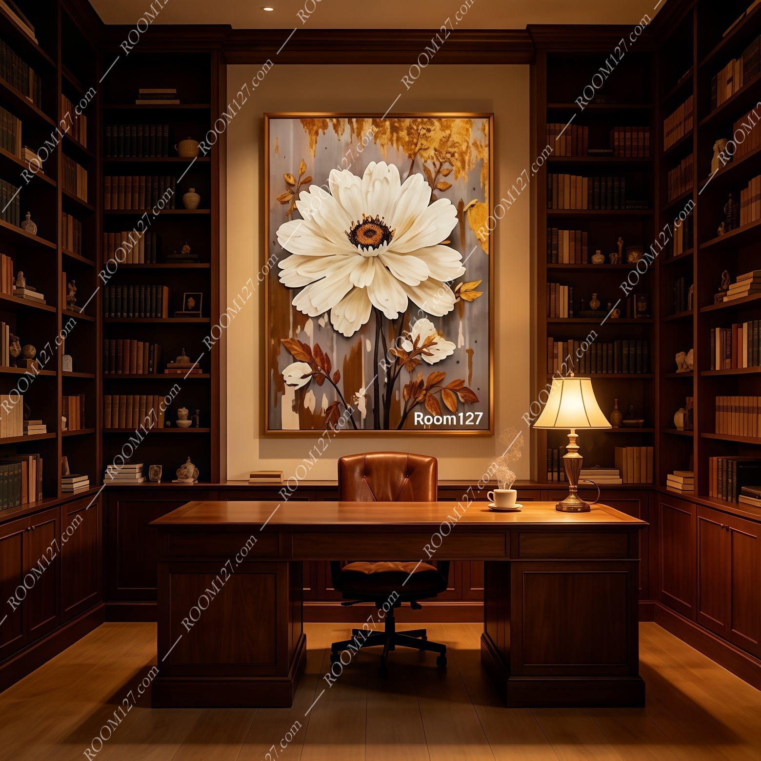
📚 The Wood-Paneled Study
Dark mahogany bookshelves, a leather chair, a heavy oak desk.
The painting on the wall behind the desk. The gold background warms up the dark wood.
The white flower is the first thing your eye lands on when you sit down. It makes a serious room feel cultivated, not cold.
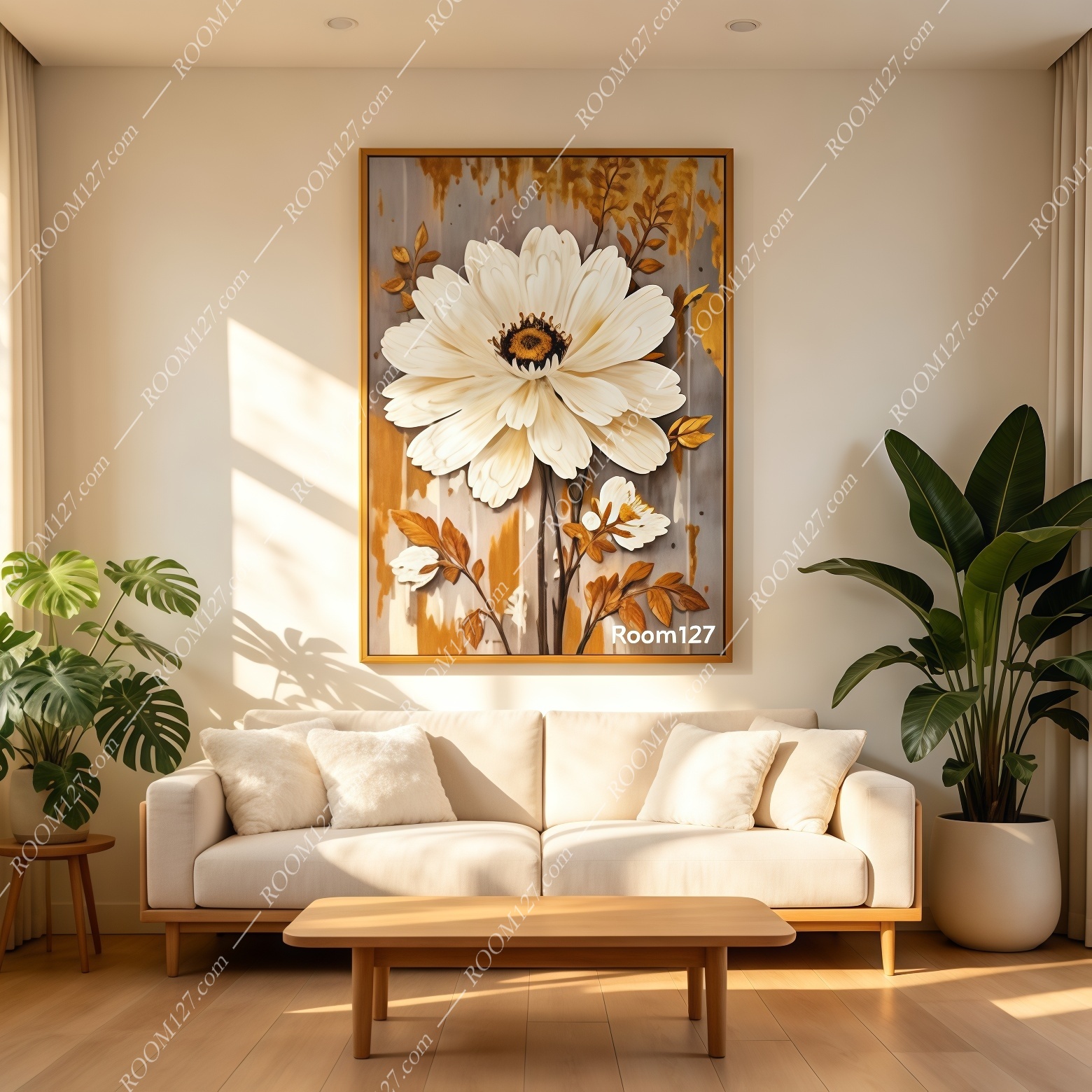
🛋️ The All-White Living Room
Cream sofa, white coffee table, a fiddle-leaf fig in the corner.
The painting above the sofa.
In a bright, neutral room, this isn't just decoration — it's the one piece that gives the room personality.
Without it, the room is a showroom. With it, the room has a center.
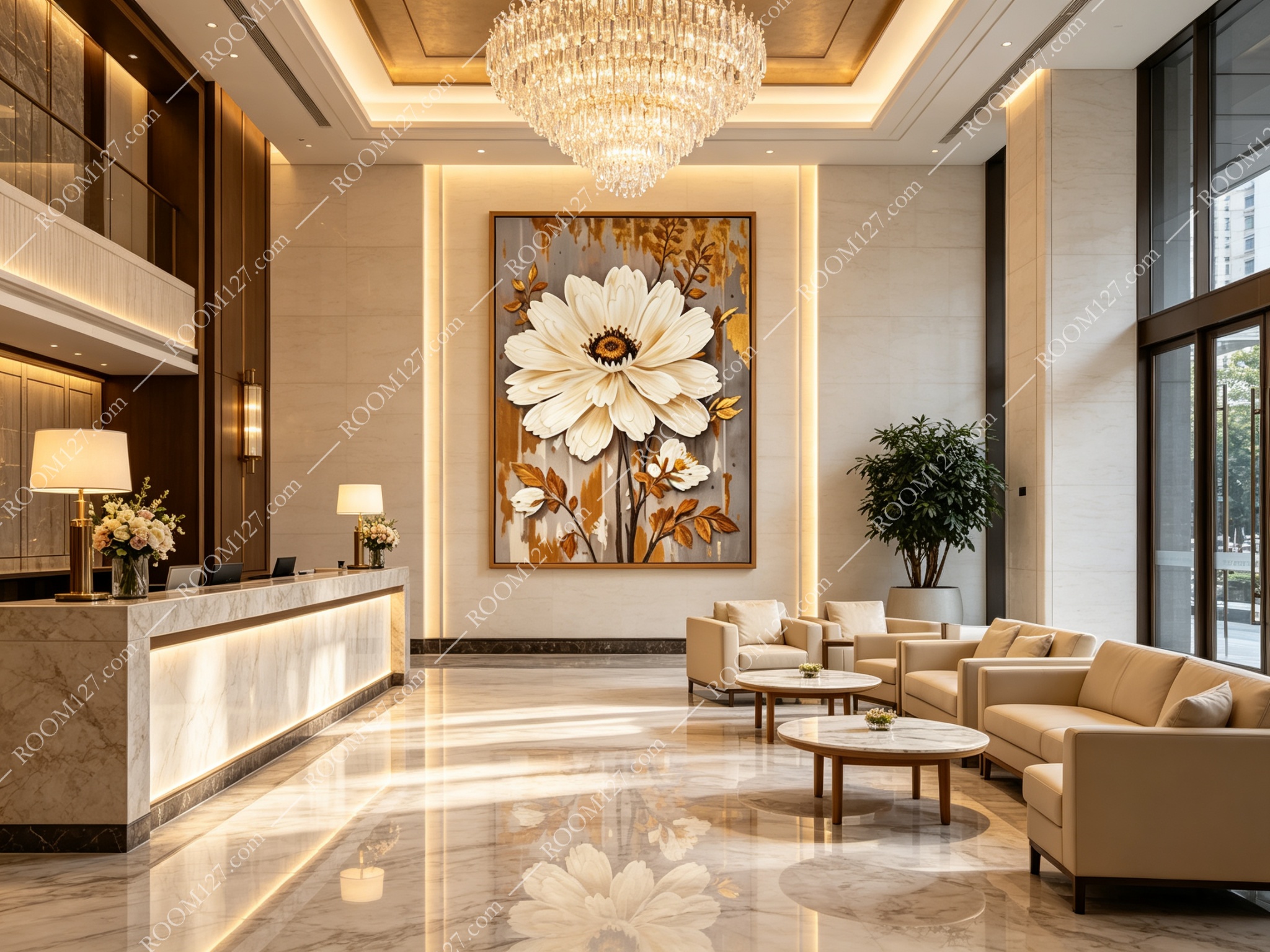
🏨 The Hotel Lobby
Marble floors, crystal chandelier, cream armchairs.
The painting centered on the wall behind the reception desk.
Guests see it the moment they walk in. The gold background catches the chandelier light. It says: this place pays attention to detail.
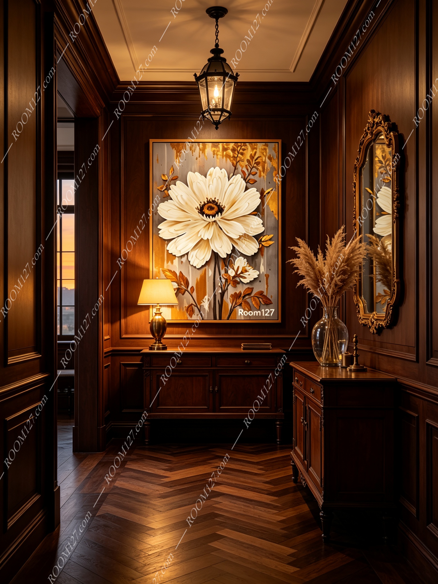
🚪 The Retro American Entryway
A wood bench, a vintage mirror, a brass coat rack.
The painting on the wall. In an entryway — the first room people see — this piece sets a tone: warm, collected, designed. It doesn't shout. It welcomes.
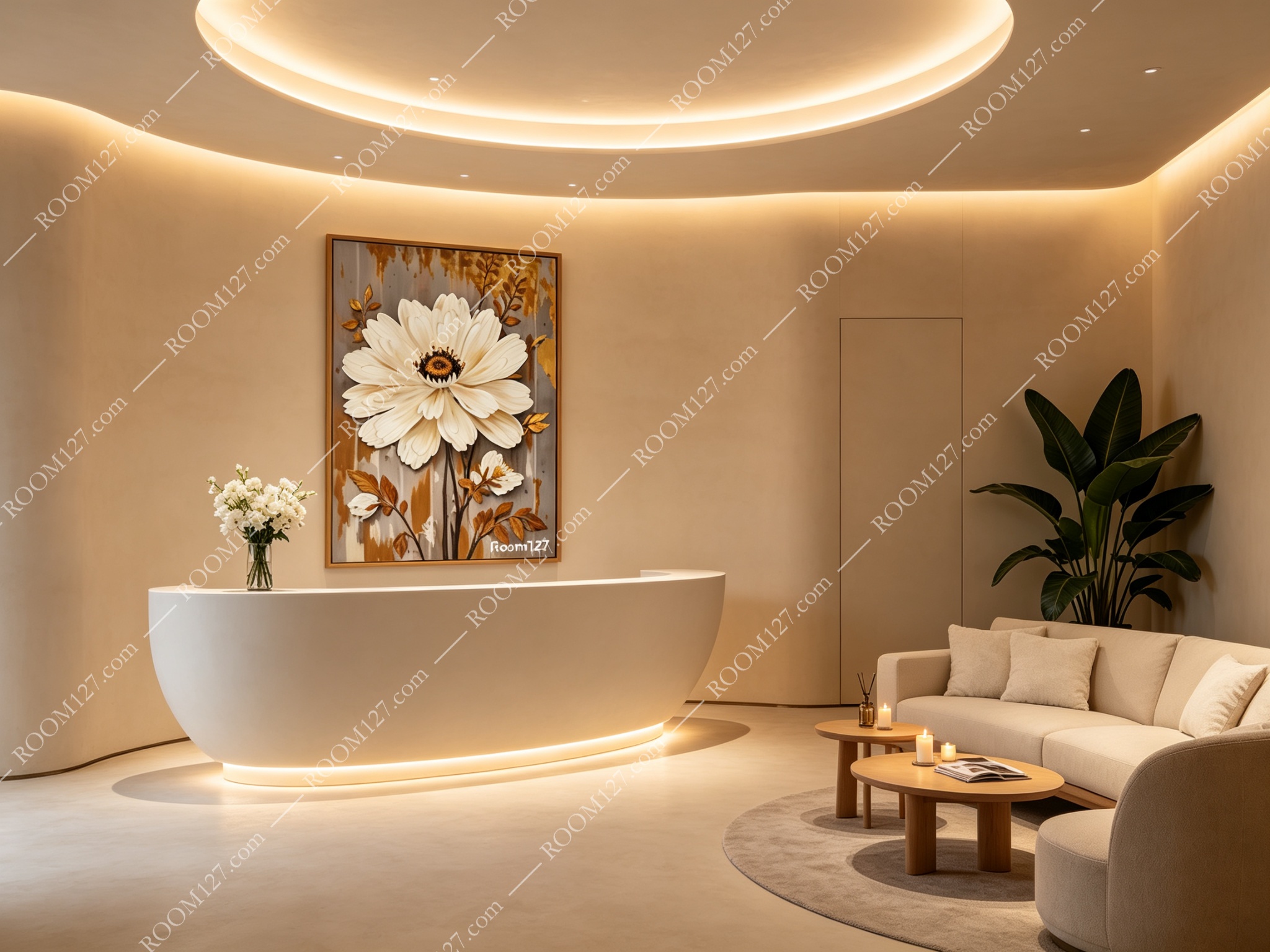
💆 The Spa or Beauty Clinic
Soft lighting, neutral tones, a reception desk.
This painting on the wall. The white flower feels calming, almost meditative.
The gold adds a quiet luxury. Clients notice it while they wait. They comment on it. They feel like they're in a thoughtful, high-end space.
One Styling Tip
🌼 Give the flower space.
Don't crowd it with other art.
This piece is meant to be a solo — one painting on one wall, with breathing room on either side.
Hang it so the flower is at eye level when you're standing. If you put it above a sofa, the bottom of the frame should sit 15–20cm above the sofa back.

💡 Light it warmly.
A small picture lamp above the frame brings out the texture in the petals.
Cool white light will make the gold look dull. Warm light (2700K) makes the gold leaf glow.
Not every wall needs a flower.
But the right wall will know.