
Many people love portrait wall art, yet the final result feels out‑of‑place after hanging
Different from abstract paintings, portrait pieces are heavily influenced by tone, mood and dimension, which directly shape the whole atmosphere of a room. Taking this hand‑painted ballet‑girl back‑view oil painting as an example, we break down replicable styling principles. These tips work well both for private residences and commercial venues.
✨Understand your artwork before styling
Mood: gentle and understated, focusing on subtle atmosphere rather than bold visual impact
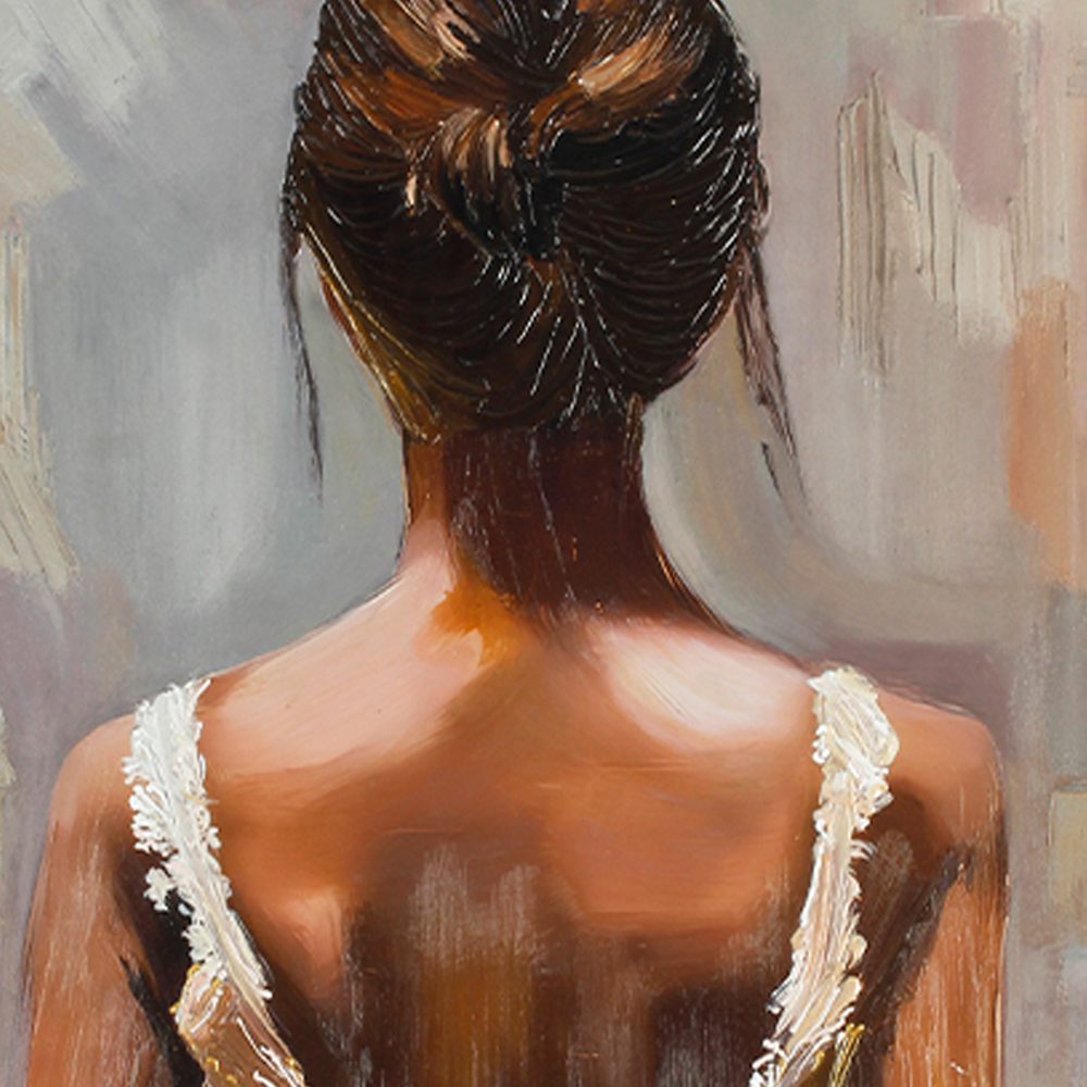
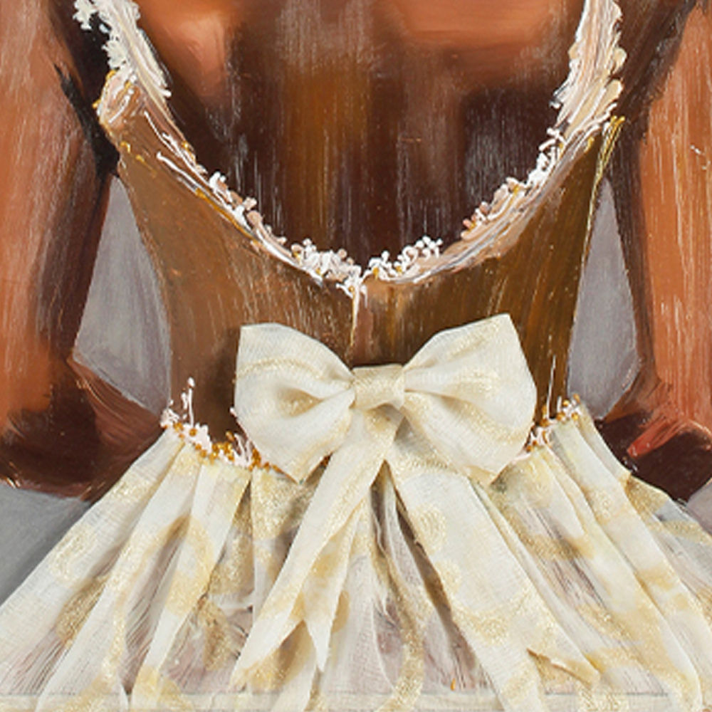
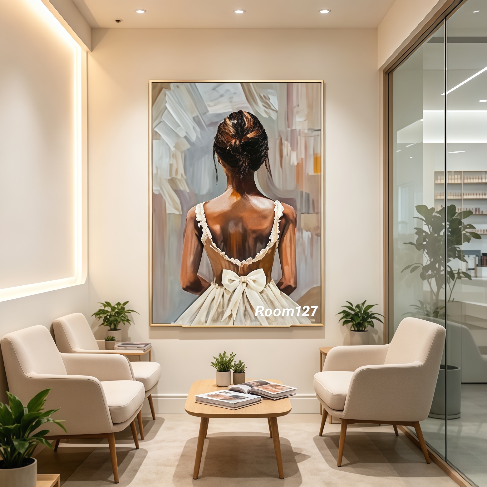
This painting captures a ballet girl viewed from her back, with neat updo, lace‑trimmed slip dress and a large bow at the back of her skirt. Thick textured brush‑strokes define the oil‑painting surface. Since no facial features are shown, the artwork feels non‑intrusive and fits a wide range of interior styles.
The palette mixes deep warm skin tone, off‑white, cream‑gold and muted grey. Low‑saturation earth tones ensure the painting will not overpower your existing furniture.
💡Important note:
Portrait art without bright neon colors adapts to far more spaces than heavily saturated figurative works.
📐3 Practical Styling Rules📸
1. How to pick the right size
✅ Small wall (beside armchair, narrow entry wall): 60‑80cm height, acts as soft accent piece
✅ Large background wall (sofa wall, store front wall): vertical format 90‑120cm recommended. Vertical portrait art lifts visual ceiling height.
❌ Common mistake: Oversized painting in tiny room creates oppressive feeling. Too small artwork on huge blank wall looks weak and empty.
2. How lighting affects oil‑portrait display
🪔 Natural daylight:
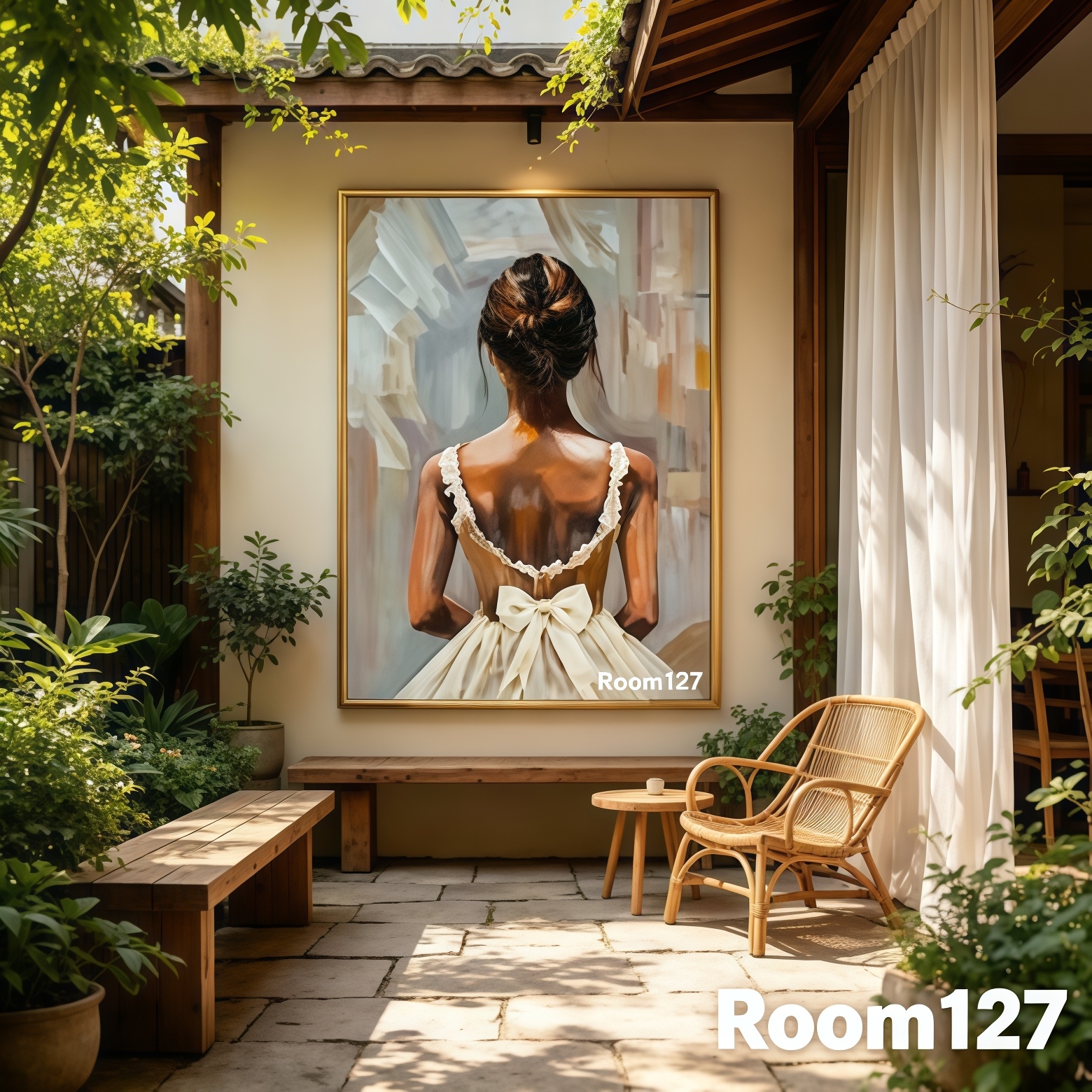
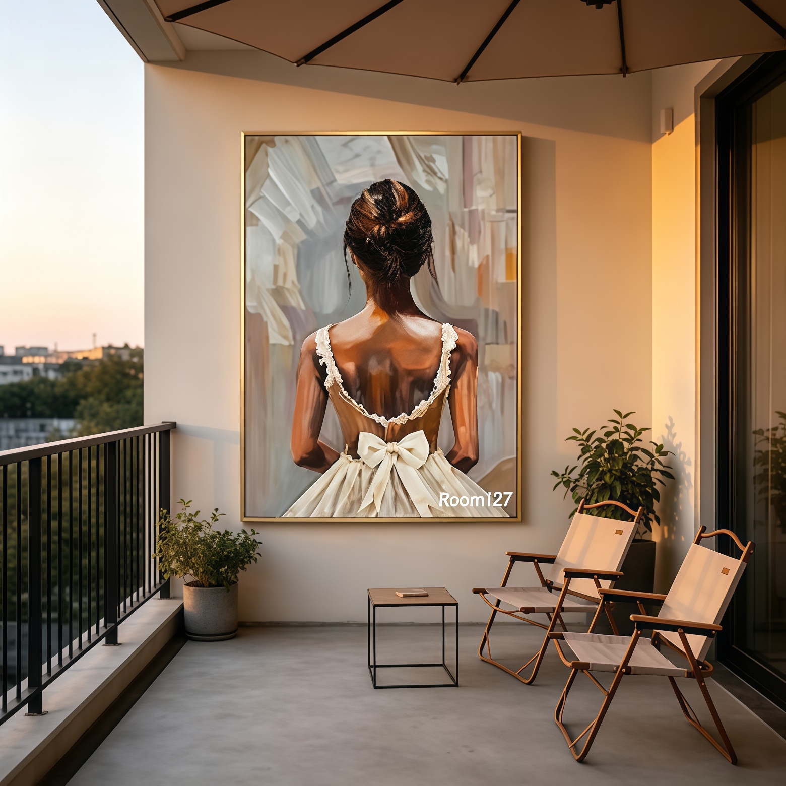
Courtyards and balconies show off rich paint texture under natural light, perfect for semi‑open zones.
💡Spotlight in commercial space:
Cafés and boutiques can use warm spotlights to highlight brush texture. Avoid overly bright lights; harsh direct light will fade oil paint over time.
🏠Soft ambient indoor light:
Living rooms and waiting lounges look great under general room lighting, extra spotlights are not mandatory.
3. Frame selection to match interiors
🟤Thin golden‑wood frame (default for this artwork)
Delicate vintage warmth. Works for wood‑tone home, patio, café, fashion boutique and beauty salon. Most versatile option.
⚫Thin black frame: Suits minimalist modern interior, sharpens figure outline for cool‑toned commercial projects.
⚪Off‑white frame: Ideal for cream‑toned & French‑style homes, frame blends softly with wall.
💐Space‑by‑space styling reference🏡
🪴Home courtyard & balcony terrace
Lush green plants plus rattan furniture pair beautifully with this ballet painting. Plant vitality balances the quiet mood of portrait art. For semi‑outdoor terrace, choose moisture‑resistant canvas, keep away from direct rain.
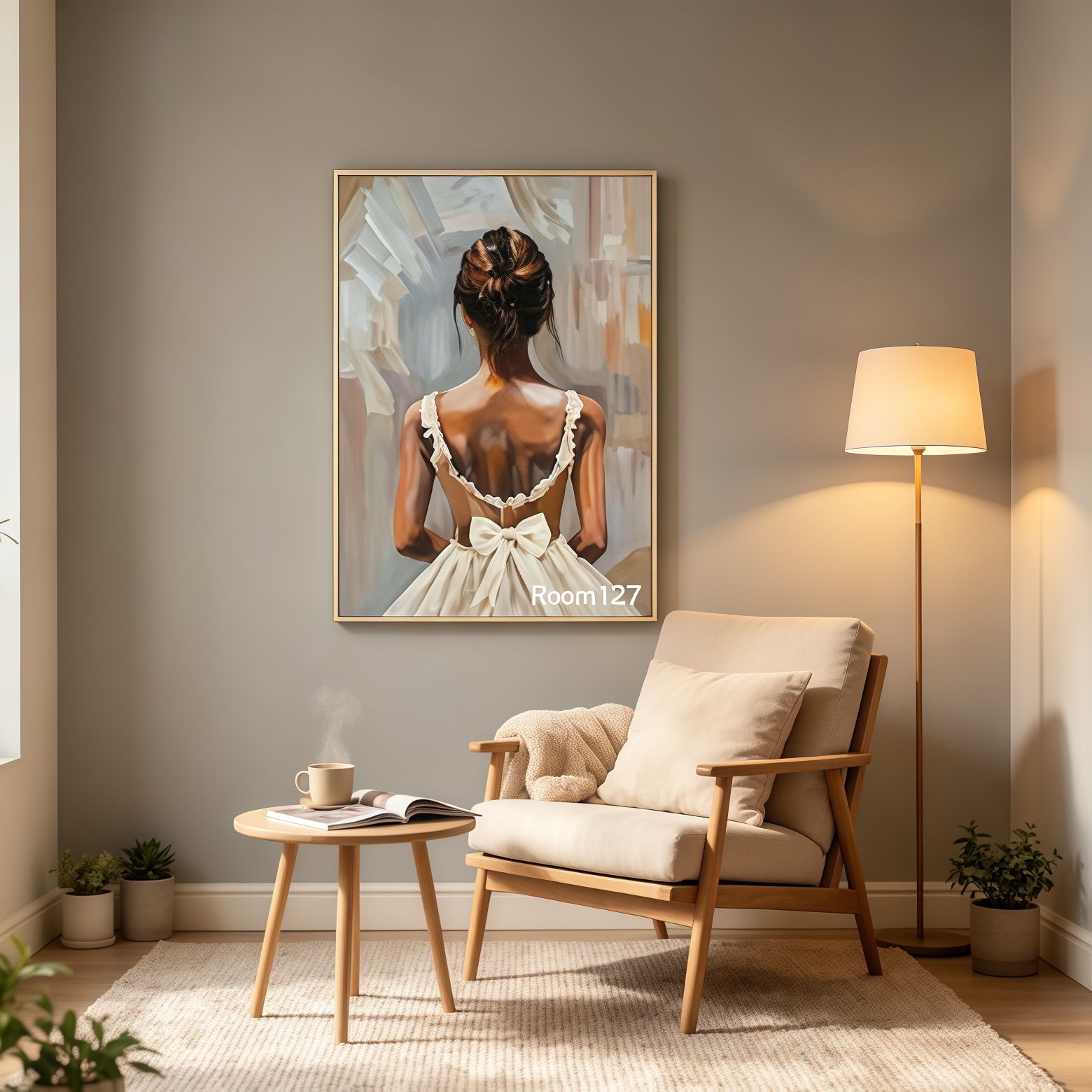
🛋️Living‑room reading nook
Light grey wall paired with wood furniture.
Portrait art serves as wall focal piece next to lounge chair and floor lamp.
Back‑view figure brings calm vibe without uncomfortable eye contact.
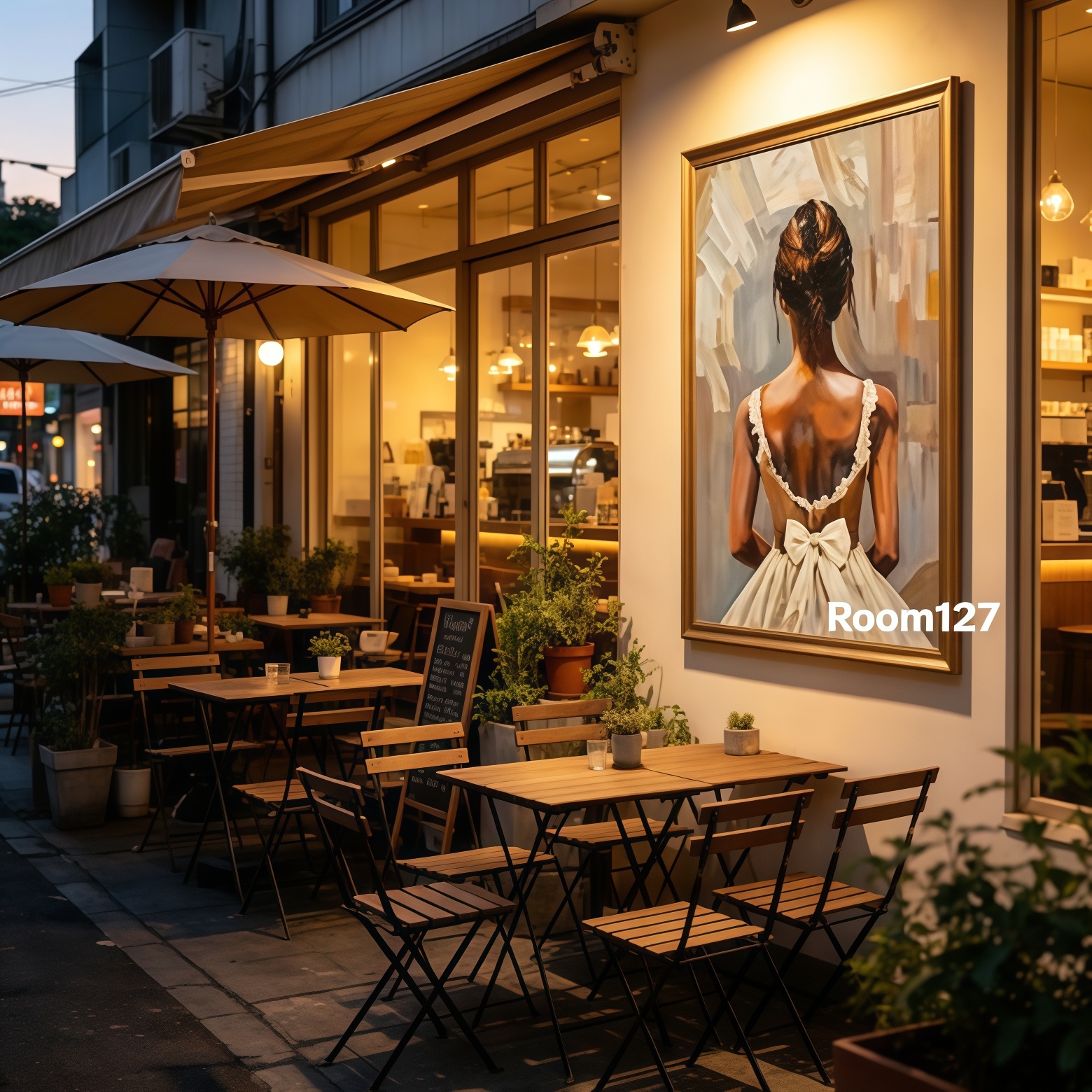
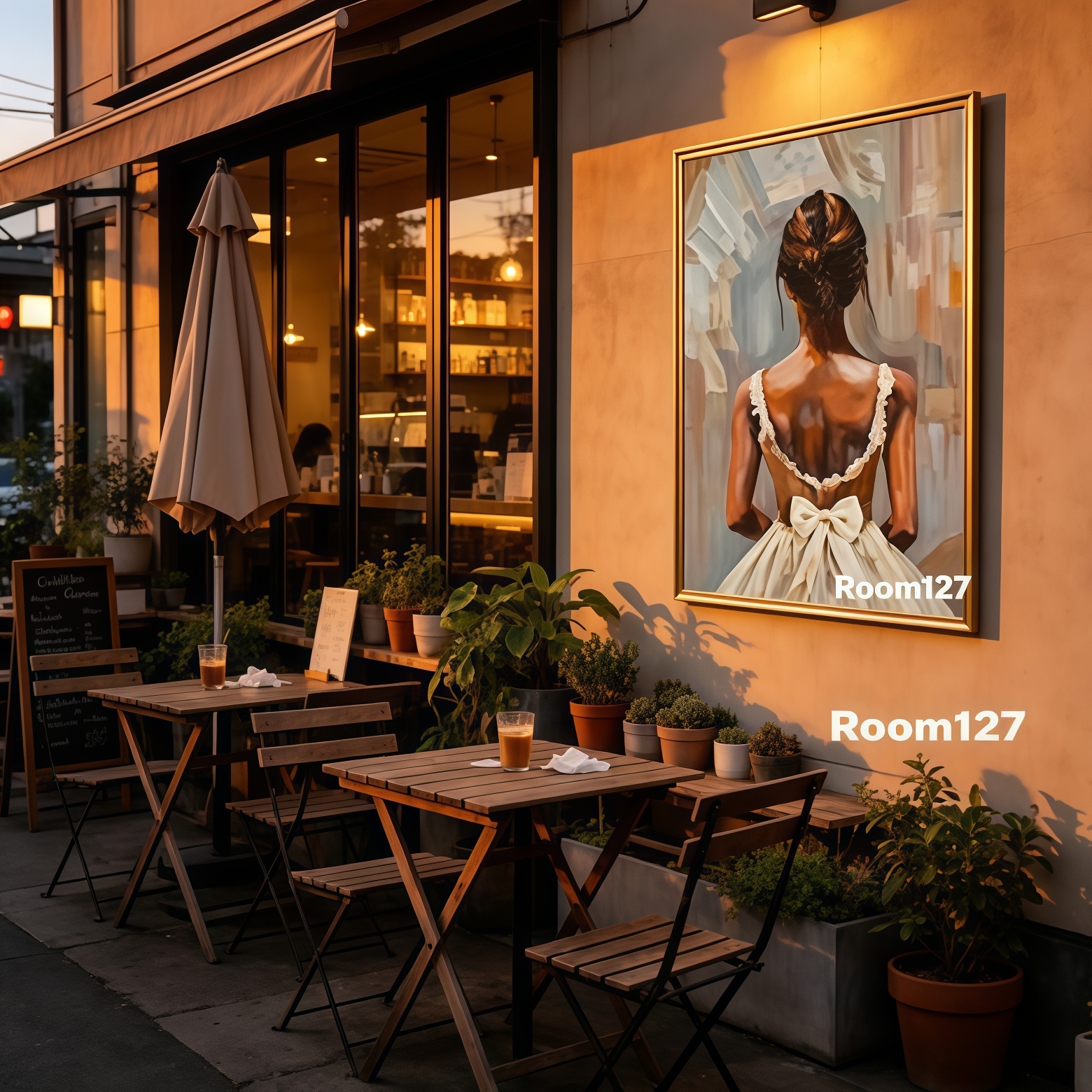
☕Café & bistro commercial interior
Hang behind booth seating in vintage‑style restaurants.
Warm oil‑painting tones harmonize with wooden furniture and vintage lamps, boosting aesthetic value for customer photo‑taking.
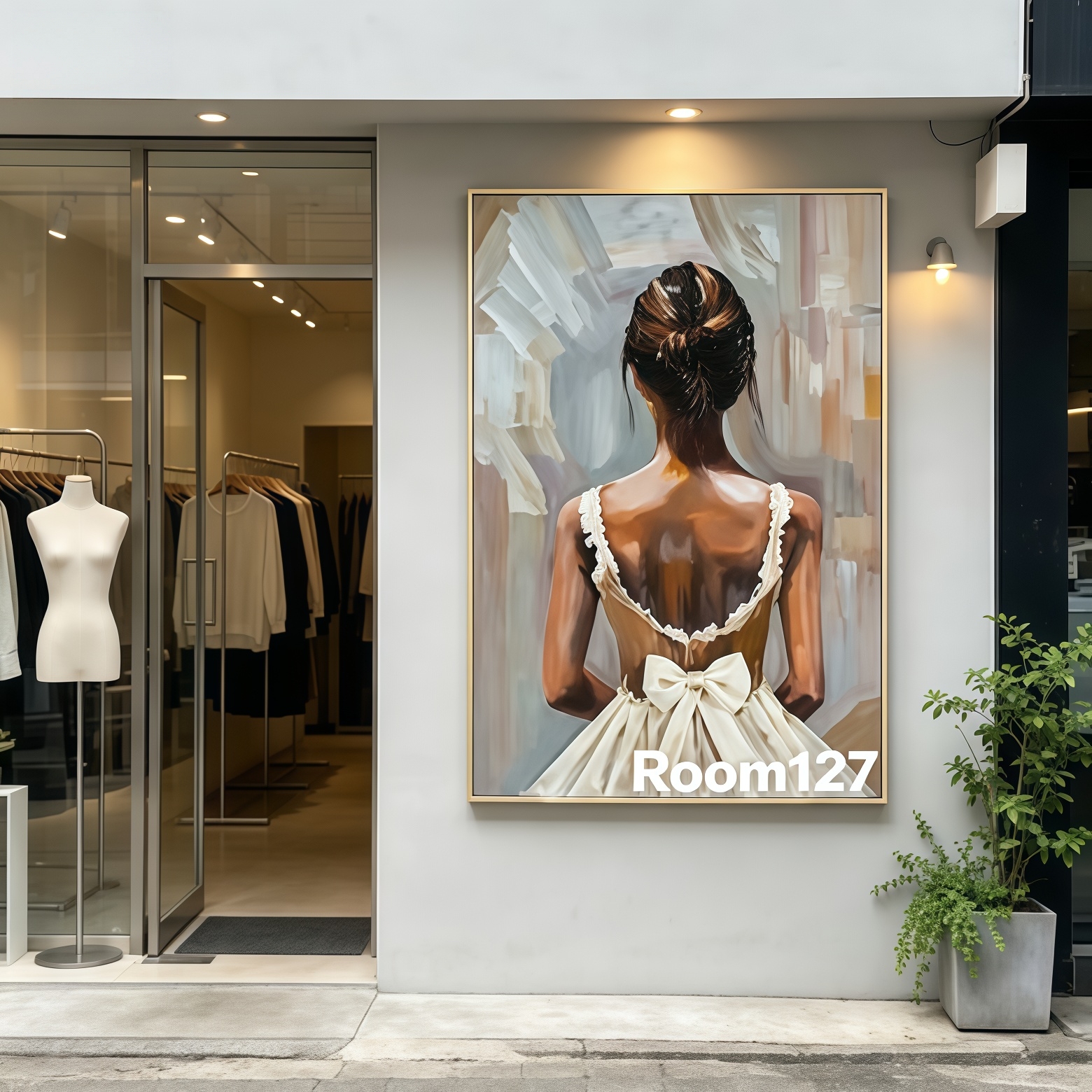
👗Fashion clothing boutique
Ballet theme matches fashion aesthetics.
Golden frame elevates store sophistication, catches eyes of passers‑by on storefront wall.
💆Beauty & nail salon waiting lounge
Soft muted portrait helps visitors relax while waiting, builds calm premium commercial atmosphere.
❗General portrait‑art pitfalls to avoid
1.Do not hang portrait art extremely low directly above sofa, which creates pressure. Keep artwork center at 145‑155cm from floor, matching natural human eye‑level.
2.Pull colors from the painting for surrounding soft furnishing: off‑white, brown, muted grey. Select cushions or rugs within this palette for cohesive interior look.
3.Do not hang oil paintings inside persistently humid areas, high moisture will damage canvas.
✨May every wall in your home hold its own unique story ✨