
If you could only buy one piece of wall art for your home, and it had to last ten years — what would you choose? Not a trendy color. Not a seasonal pattern. Something that works with whatever furniture you buy next, whatever paint color you switch to, whatever style you lean into. The answer is almost always black and white.
What Makes This Piece Different
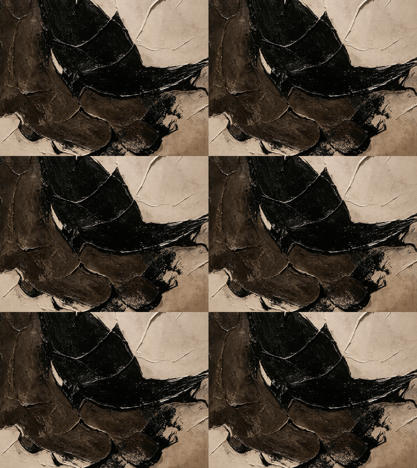
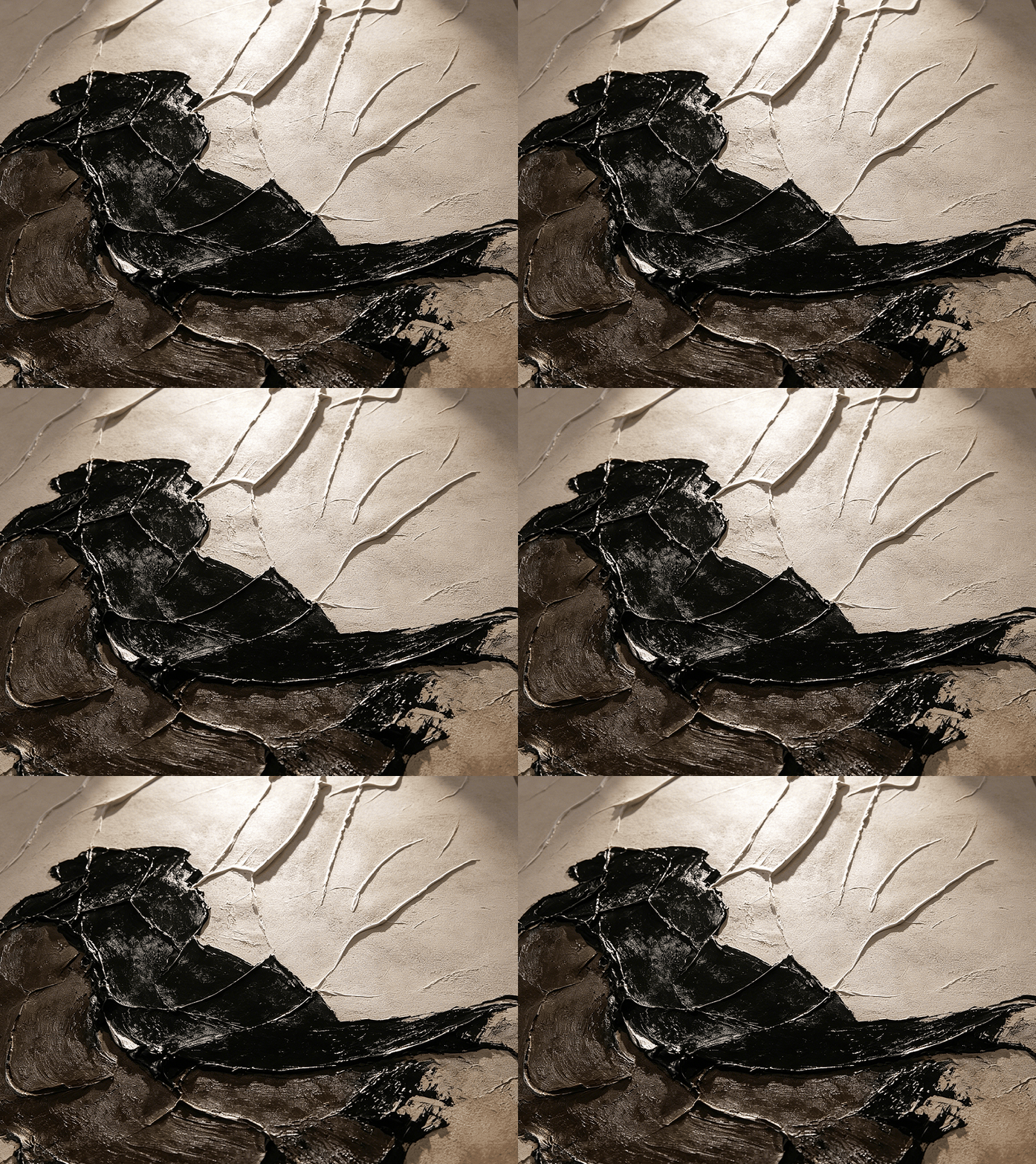
Most black and white art is flat. A print on canvas, a black shape on white, a simple ink wash. This one isn't. It has real physical depth:
The upper half is a cream-colored ground with raised, textured lines that run across it — like cracks in plaster, like dried riverbeds, like veins of light. They catch the light and cast tiny shadows. They're not painted on; they're built up.
The lower half is heavy black brushwork — thick, painterly, almost sculptural. It looks like ink absorbed into stone, like dark water pooling. The contrast between the light, delicate upper lines and the dark, solid lower mass is what makes the painting work. It's not just black on white. It's a conversation between light and weight.
Why Monochrome Is the Smartest Choice
There's a reason interior designers keep coming back to black and white art:
It goes with everything.
Grey walls, wood floors, beige furniture, dark accents — a monochrome piece doesn't fight any of it. It sits in the room like a neutral anchor. You can change your entire furniture arrangement and the painting still works.
It reads as "expensive."
There's a reason luxury hotels and high-end lobbies use black and white art. It looks refined, considered, uncluttered. It doesn't scream for attention — it commands it quietly.
It doesn't date.
A colorful abstract might feel right in 2026 and look tired in 2032. A black and white textured piece? It looks right in 2026 and it'll look right in 2040. It's the safest long-term investment in wall decor you can make.
Where It Shines — Six Spaces
We placed it in six concrete-walled interiors:
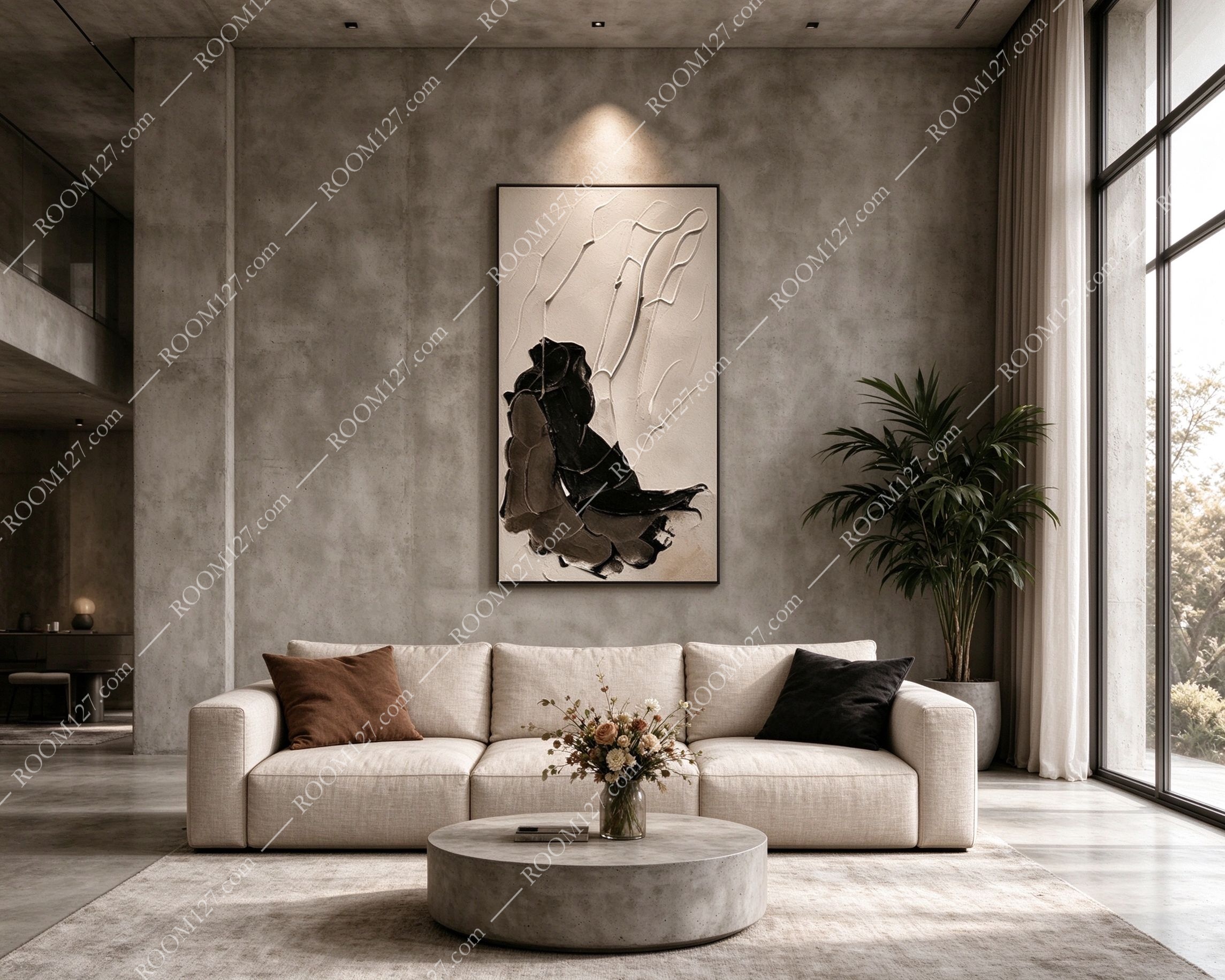
🏠 The wabi-sabi living room
Exposed concrete walls, a beige linen sofa, a round concrete coffee table, a tall palm in the corner. The painting above the sofa becomes the room's focal point. The black and white tones match the concrete wall perfectly — it looks like it was always part of the architecture, not added later.
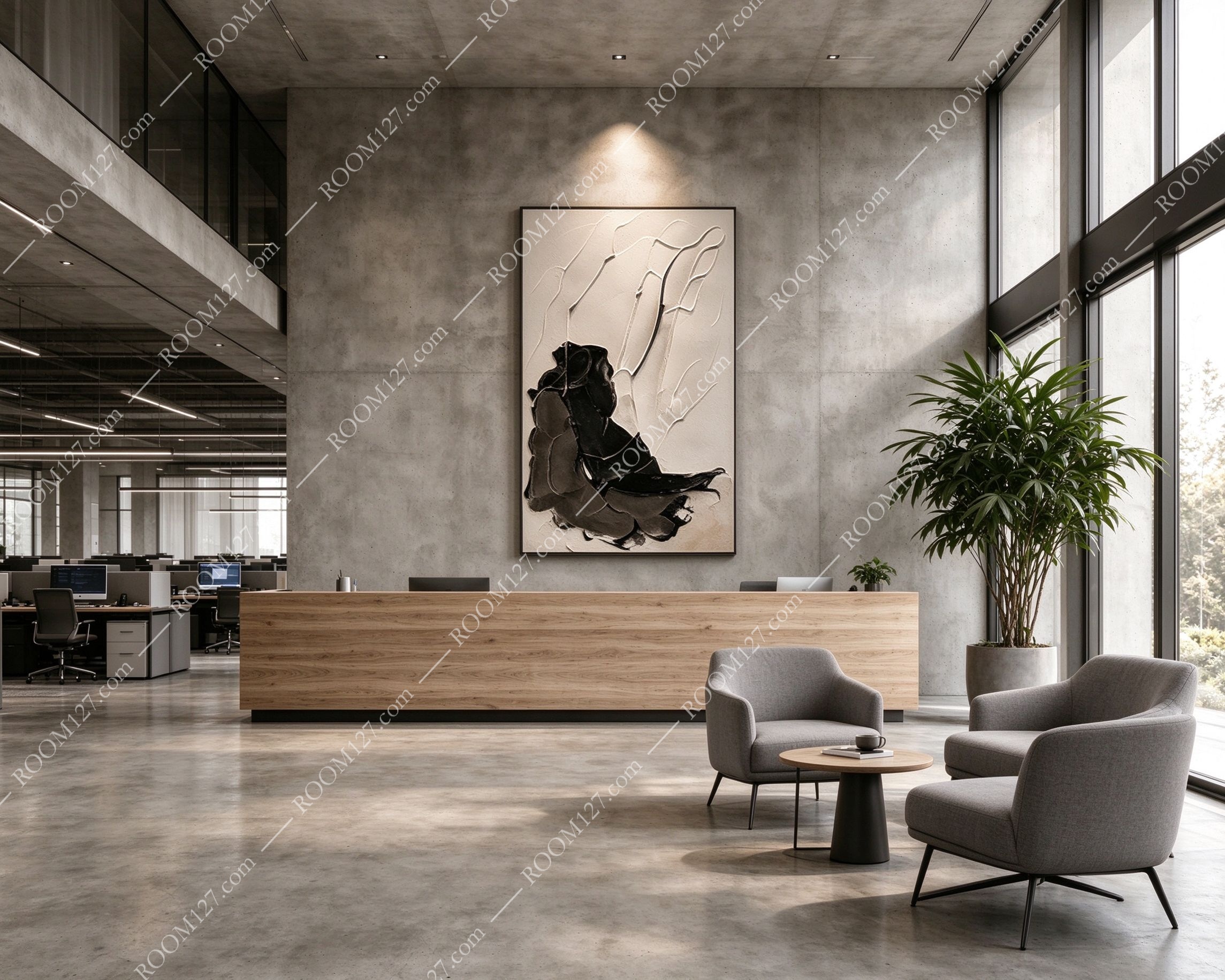
🏢 The office reception desk
Concrete wall, a long wooden reception desk, grey armchairs, an open office behind. Above the desk, the painting sets the tone for the entire space. It says "we're professional but we have taste." Clients walk in and their eye goes straight to it.
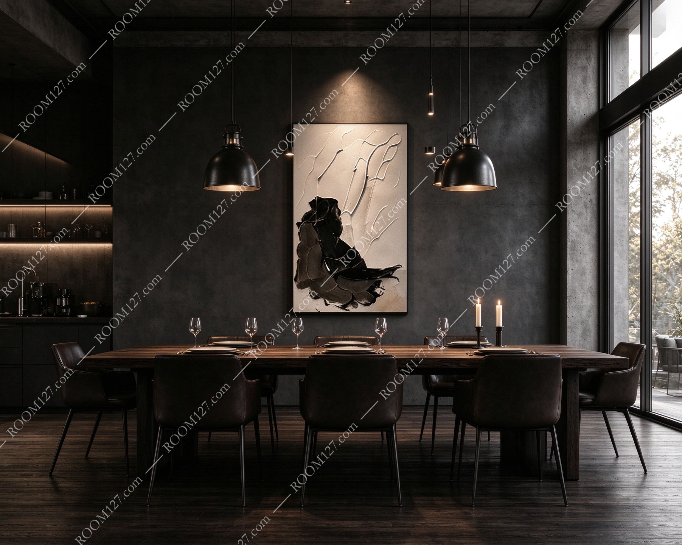
🍽️ The industrial dining room
Dark grey walls, a solid wood table, leather dining chairs, black pendant lights. Under the warm pendant light, the black brushwork takes on a deep, rich quality. The cream upper half glows softly. It's the perfect backdrop for an intimate dinner — moody but not depressing.
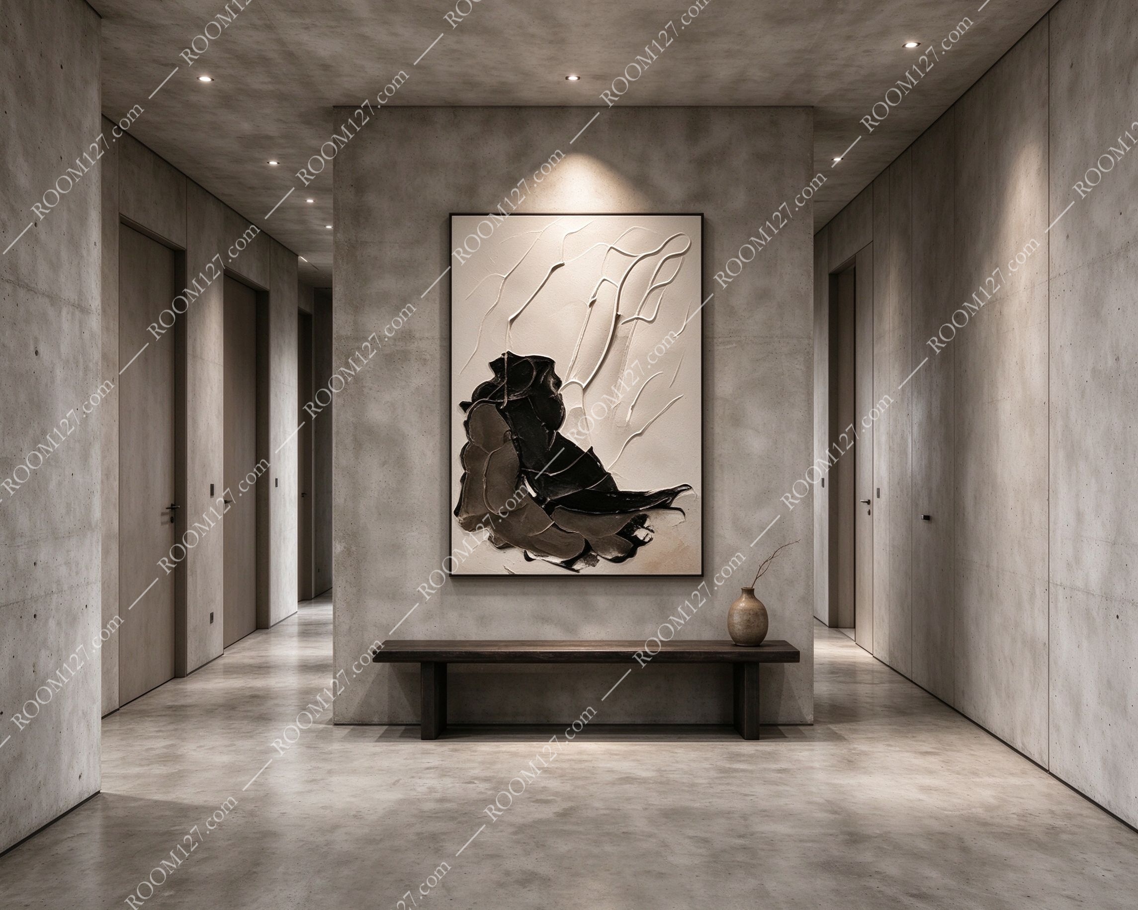
🚶 The minimalist corridor
Concrete walls on both sides, a wooden bench below, a ceramic vase. On the end wall of a narrow corridor, the painting is the visual destination. The vertical format fills the wall perfectly. It turns a forgotten hallway into a gallery moment.
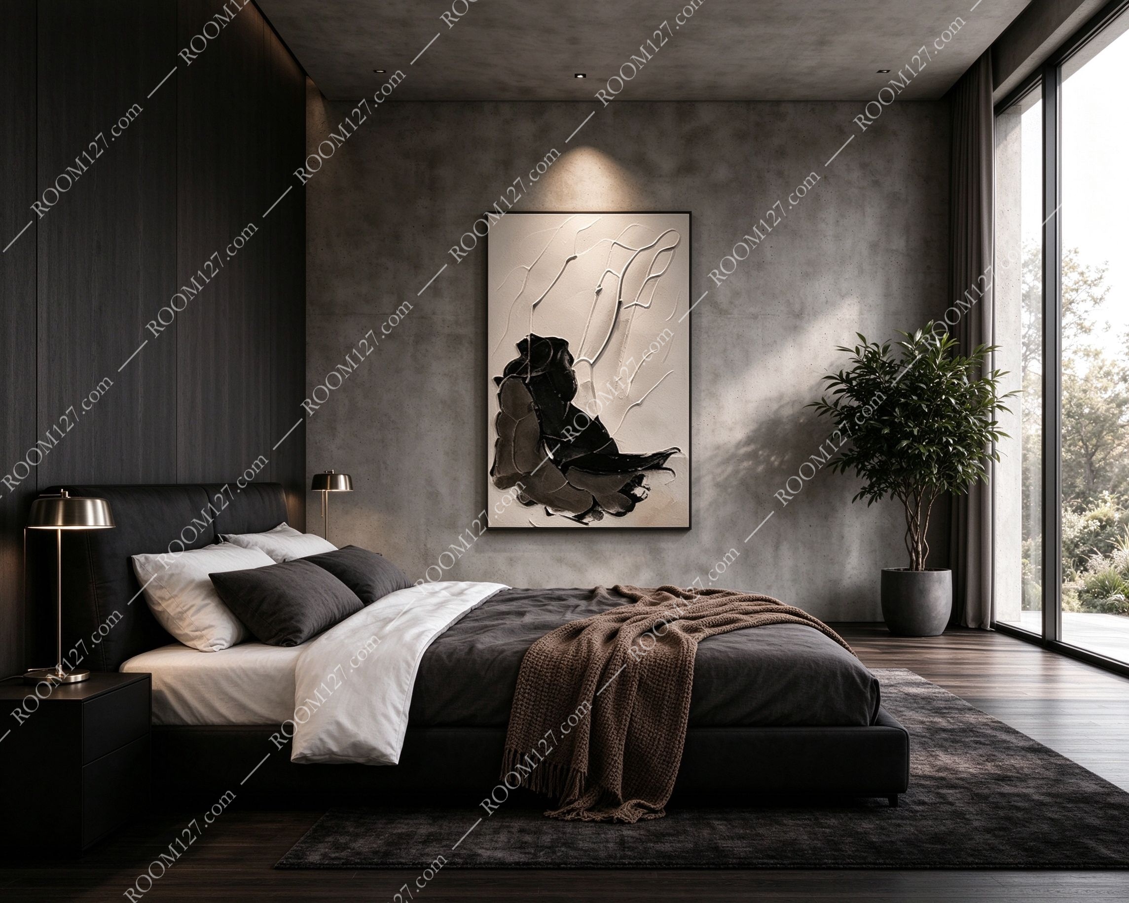
🛏️ The minimalist bedroom
Dark wood wall behind the bed, black bedding, brass bedside lamps, a dark rug. Above the bed, the painting anchors the dark room. The cream side catches the lamp light; the black side blends with the dark headboard wall. It's the first and last thing you see every day.
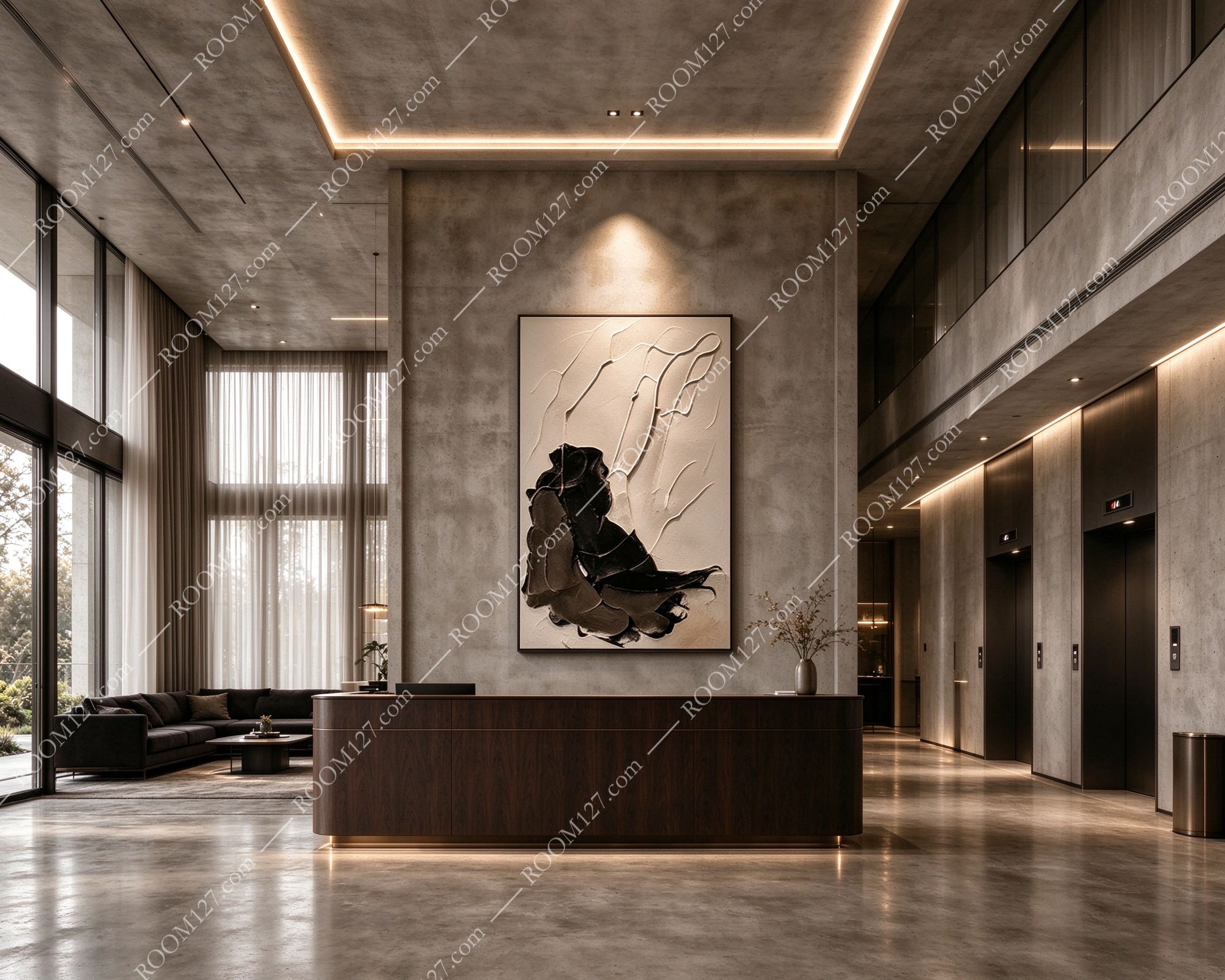
🏨 The hotel lobby
Double-height concrete wall, a dark wood reception desk, a seating area, elevators to the side. In a tall, double-height space, the large-format painting fills the wall without overwhelming it. It's the kind of detail that makes guests stop and take a photo.
The Detail You Can't See in Photos
Photos don't capture the texture. When you're standing in front of it in person, you notice:
The raised lines. They're not flat ink lines. They're built up with thick paint — like impasto, like plaster relief. Run your eyes across them and you see the shadows they cast. It's a 3D surface, not a 2D print.
The brushstrokes in the black. Look closely at the dark lower half. You can see every stroke, every direction, every layer. It's not a solid black block — it's a painted surface with movement and depth.
The light shift. Under a spotlight, the cream side glows. In flat daylight, the contrast is starker. It changes character depending on how you light it — which means it works in every room, from bright living rooms to moody dining spaces.
"
Great black and white art doesn't need color.
It has something better: contrast that makes you stop.