
Look at the painting. Your eye goes straight to one thing: that curve.
A warm, glowing line — golden, amber, almost luminous — that runs vertically through the composition, separating deep green from warm brown.
It's the first thing you see. It's the thing you remember. And it's the reason this painting works in so many different rooms.
THE CURVE
Most abstract art lives or dies by its colors. This one lives or dies by one line.
On the left:
deep teal green — like a forest seen from above, like deep water, like shadow. It's painted with visible brushstrokes that fade and feather into white as they move right.
On the right:
warm earth brown — like sand, like clay, like dry land. The bottom right corner has thick, raised white textures that look like ridged earth, like sand dunes, like the contours of a coastline.
And between them:
the glowing curve. It's not painted on. It's built into the composition — a warm, amber line that seems to emit its own light. It looks like sunset through a window. It looks like a river catching the last sun. It looks like a path.
WHY IT FEELS LIKE NATURE
You don't need to be an art critic to feel what this painting is about. It's abstract, but it references something real: a landscape.
The dark green on the left is forest. The warm brown on the right is land. The glowing curve in the middle is water — or light — or the edge between them. The textured white area on the lower right? That's the shore.
This is why it works in so many spaces: it doesn't fight with your furniture. It reads as organic, natural, grounded. It brings the feeling of being outside — of forest and earth and light — into rooms that might otherwise feel flat, corporate, or sterile.
SIX SPACES, ONE PAINTING
We hung it in six very different spaces. Here's what happened:
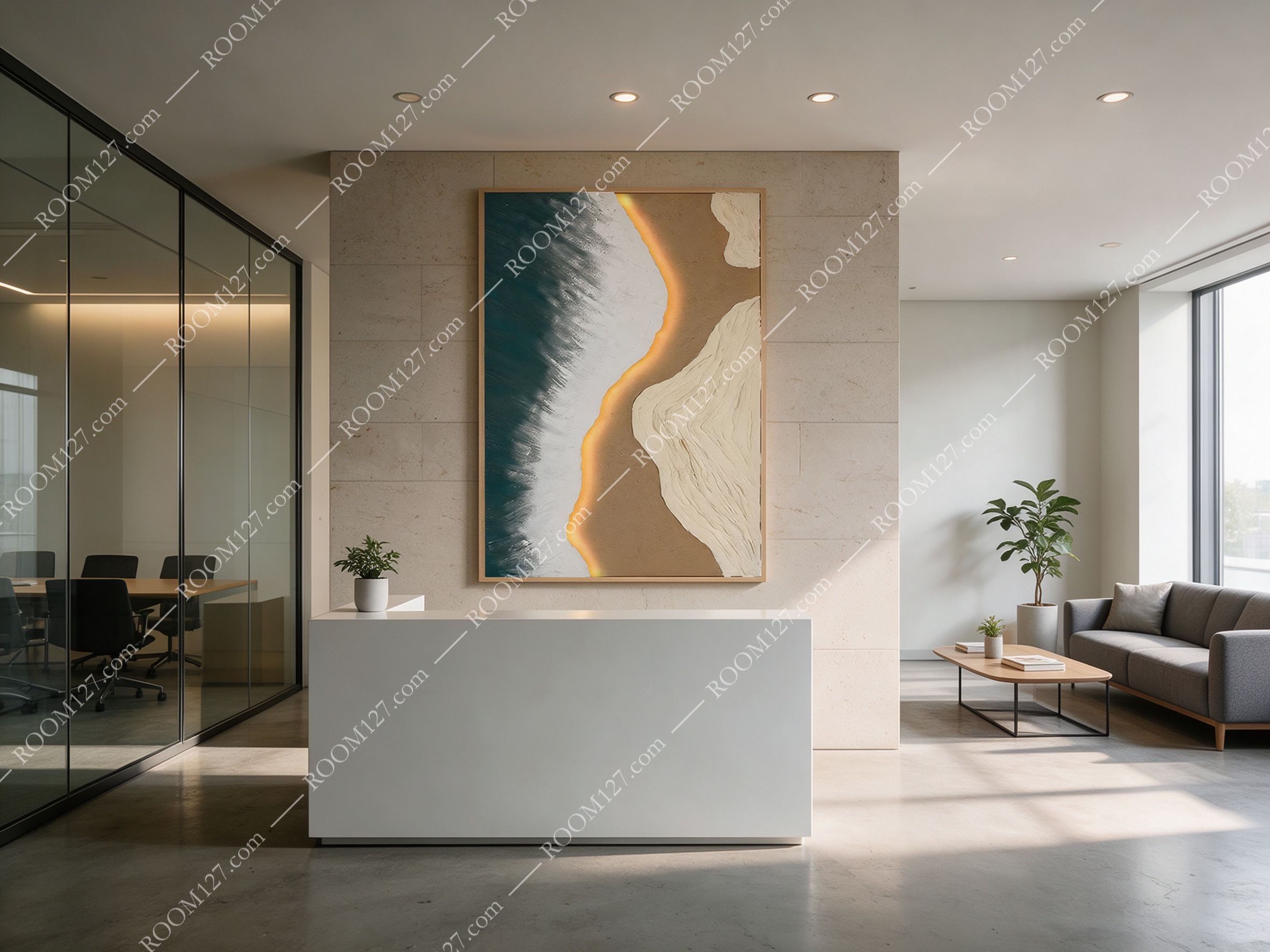
🏢 Corporate reception
White reception desk, stone feature wall, glass-walled meeting room to the left. The painting hangs dead-center on the stone wall. The deep teal grounds the bright, modern lobby. The warm curve adds a human touch. Clients walk in and feel: professional, but warm.
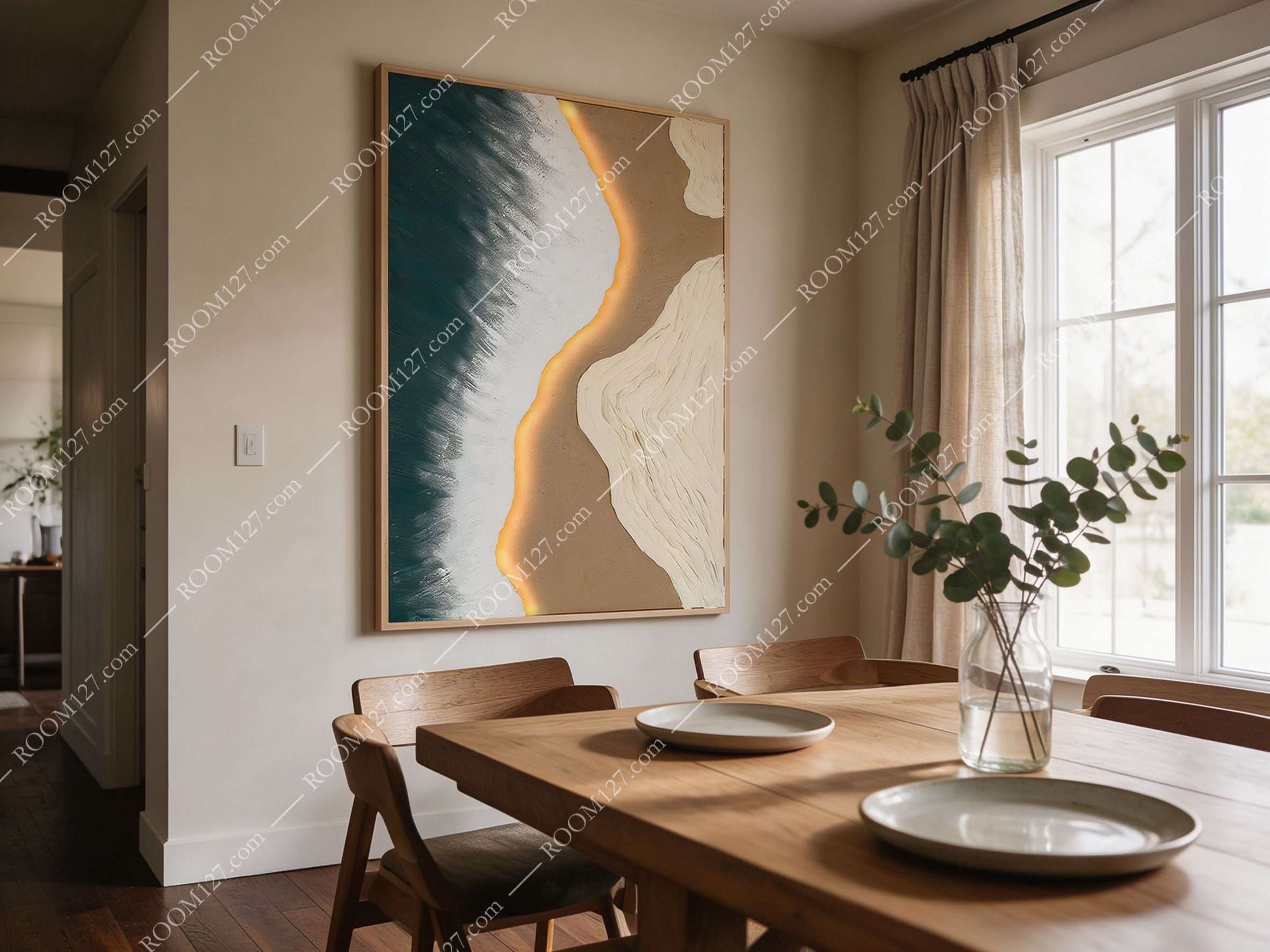
🍽️ American dining room
Wooden table, simple chairs, beige walls, linen curtains. Above the table, the painting adds depth to a neutral room. The warm brown tones match the wood. The dark green adds contrast without being loud. It's the kind of painting that makes dinner feel intentional.
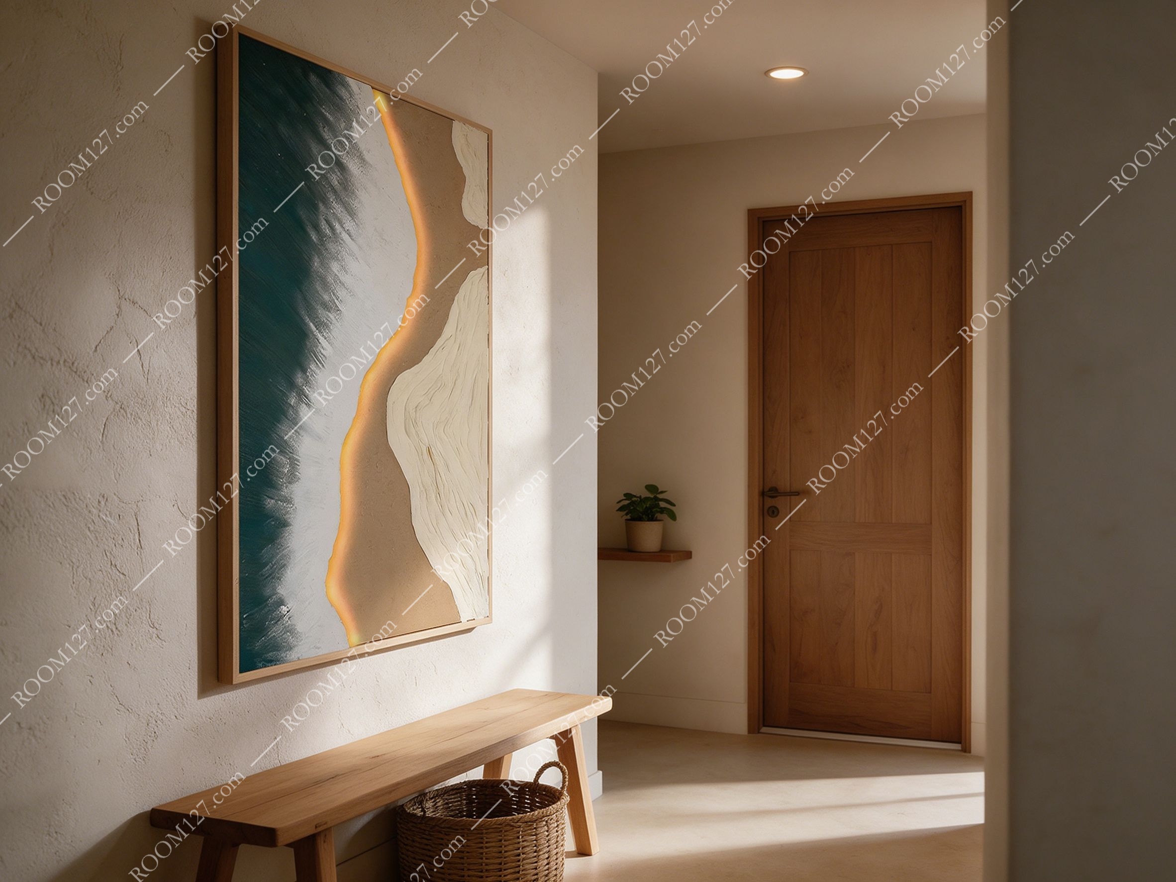
🚪 Japandi entryway
Textured beige walls, a wooden bench, a woven basket below, a solid wood door. In the morning light, the glowing curve looks like sunlight hitting the wall. It's the first thing you see when you come home — a quiet welcome.
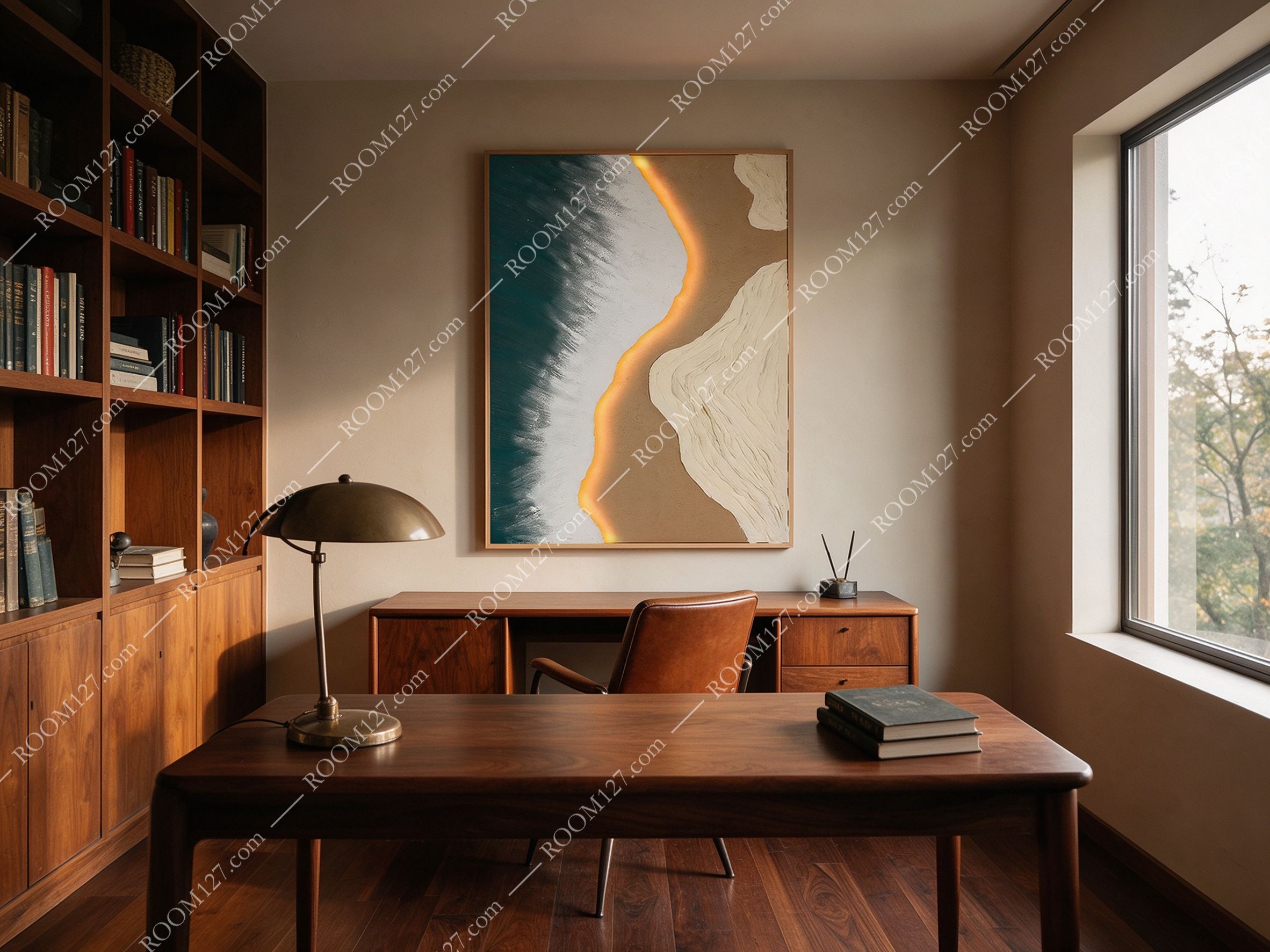
📚 Mid-century study
Dark walnut desk, leather chair, floor-to-ceiling bookshelves, a brass desk lamp. Above the desk, the painting anchors the room. The deep green complements the dark wood. The warm curve adds a touch of warmth to a traditionally dark, masculine space.
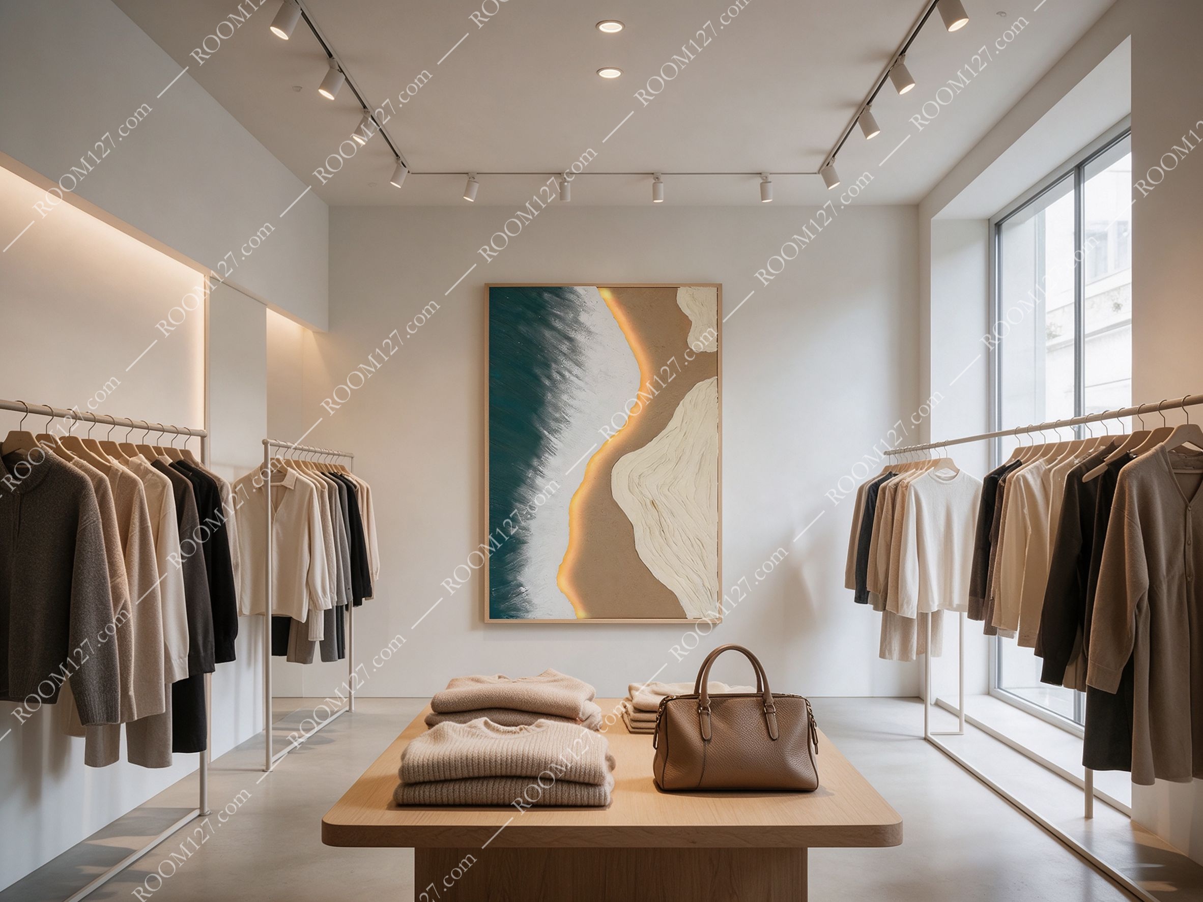
👔 Boutique clothing store
White walls, track lighting, neutral-colored clothes on racks, a wooden display table with folded sweaters and a leather bag. The painting hangs on the back wall. It reinforces the store's calm, sophisticated brand. Customers linger — the art makes the space feel curated, not just stocked.
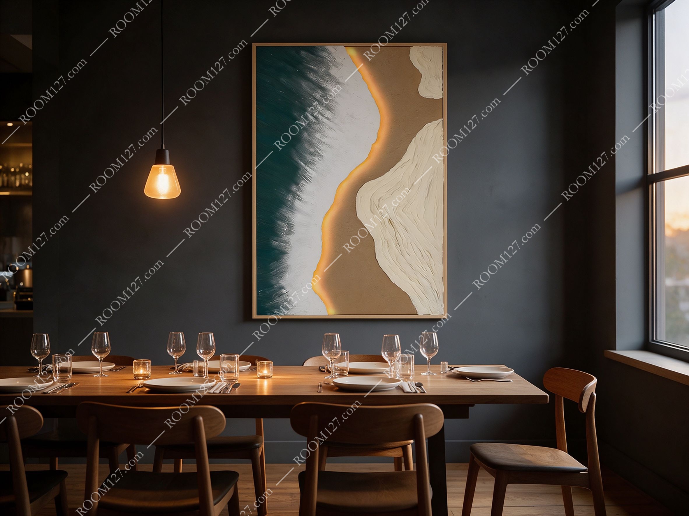
🕯️ Private dining room
Dark grey walls, a long wooden table, a single pendant light, candles on the table. Under the warm pendant glow, the golden curve in the painting seems to light up even more. The dark green blends with the dark walls. It's moody, intimate, sophisticated — perfect for a private dinner.
THE DETAILS
Photos don't capture the texture. When you see it in person:
The raised textures.
Look at the lower right — the white area. It's not flat paint. It's thickly built up, like plaster, like ridges of earth. Run your eyes across it and you see the shadows. It's a 3D surface.
The feathered edges.
Where the dark green meets the white in the middle, it's not a hard line. It's brushed, feathered, like mist. It softens the composition and makes the transition feel natural.
The light shift. Under spotlights (like in the boutique), the glowing curve catches the light and seems to glow. In soft daylight (like in the dining room), the contrast is softer. It changes character depending on how you light it.
The frame.
Slim oak frame — light, natural, understated. It lets the painting be the focal point without competing.
"Nature doesn't decorate. It simply is.
This painting brings that same quiet confidence to your wall."