
Almost every question I get about this painting is the same question, and it has nothing to do with the painting.
Where do I put it? Not "is it nice" — people can see that it's nice. They stand in front of a two-and-a-half-metre horizontal canvas and their brains quietly stop working, because they know the sofa is 1.8 metres wide, the room is 4 metres wide, and the painting is neither. It doesn't obey any of the numbers they already have memorised.
So this article is mostly a hanging guide. The painting is worth writing about on its own terms — and I'll get to the gold, the trunk, and the empty lower edge — but the wall is the thing that will make or break this piece in your house, so the wall comes first.
✦ Two walls, one painting
A client hung this exactly where I would have hung it — an entrance hall, above a slim travertine console, dead centre of the wall. It looked wrong, and it took us both a minute to work out why.
The painting was 200cm wide. The console underneath was 140cm. So the canvas overhung the furniture by 30cm on each side, and once you noticed it you couldn't stop noticing it — the art was reading as a banner hung above a smaller object, not as a piece belonging to the room.
We moved it into the living room, over a 240cm sofa. Same painting, same wall colour, same light. Instantly it became the calm, anchored thing it was designed to be — because now it sat inside its furniture instead of spilling past it.
That's the whole lesson, and it's measurable: a wide canvas wants to be between 60% and 75% of the width of whatever sits under it. Below 60% and the furniture looks stunted. Above 75% and the painting looks like it's moving out.
Three numbers that fix it
1 · The 60–75% rule.
Measure the thing the painting will live over — sofa, sideboard, console, bed, bench — and take 60–75% of that width. For a 200cm sofa, you want a canvas of 120–150cm. For a 200cm canvas, you want furniture of 265–330cm. The painting should never be the widest object in the group.
2 · Centres at 145–150cm.
From the floor to the middle of the canvas. Not the top, not the bottom — the middle. Above a sofa, the clearance from the sofa back to the bottom edge of the frame should be 20–25cm. If your sofa is deep and low, take the lower number; a deep sofa already pushes the wall away.
3 · Keep 40cm of wall beside it.
This is the one nobody tells you. A wide painting with 5cm of wall either side looks like it's been jammed between two door frames. It wants air at both ends, ideally at least 40cm, and never less than 20cm. If your wall can't give it that, the painting is too wide for the wall, not the other way round — take the next size down rather than making it fit.
And the practical trick, which costs nothing: before you buy, cut a cardboard template or run masking tape on the wall at the exact dimensions. Stand back. Live with it for a day. Every single person who skips this step and hangs a wide canvas by intuition ends up moving it twice.
What's actually on it
🌳 The trunk on the left is the whole composition. Thick, dark, slightly leaning, branching low and then dividing four or five ways. Everything else in the painting is organised around it — the canopies hang off its direction, the empty sky is on the right precisely because the tree is on the left. Remove it and you don't have a landscape, you have wallpaper.
🍂 The right-hand tree is nearly bare.
A thin trunk, branching high, with a small head of pale foliage and a lot of open branch showing. It's the counterweight. A forest of two equally full trees would be static; one heavy and one thin makes the eye move across the width, which is what a panoramic format needs.
✨ The canopy is granular, not painted foliage.
Up close, the leaves are thousands of separate gold and bronze marks — stippled, dabbed, flecked, in some places built up so thickly the surface has its own relief. Step back and they fuse into a single mass of gold with a green-grey undertone in the shadows. This is the same trick as an Impressionist landscape, done in metal.
☁️ The sky is patchy and unfinished, on purpose.
Not a smooth gradient — irregular cream fields with torn edges, a few warm tan blotches where the ground colour shows through. Those gaps are what stop a fully gold canvas from feeling heavy. They give your eye somewhere to rest between the trees.
🤎 The bottom edge is left almost empty.
The lowest band of the canvas is bare cream. It reads as ground shadow, and it does something practical: it stops the painting from feeling bottom-heavy when it hangs above a sofa, so the visible weight sits high and the piece feels light.
🖼️ The frame is a whisper — light natural wood or antique gold, barely two centimetres.
On a panoramic canvas a substantial frame eats the width you paid for. This one doesn't; the painting simply ends, cleanly, and lets the trees run right up to the boundary.
Six rooms, six different walls
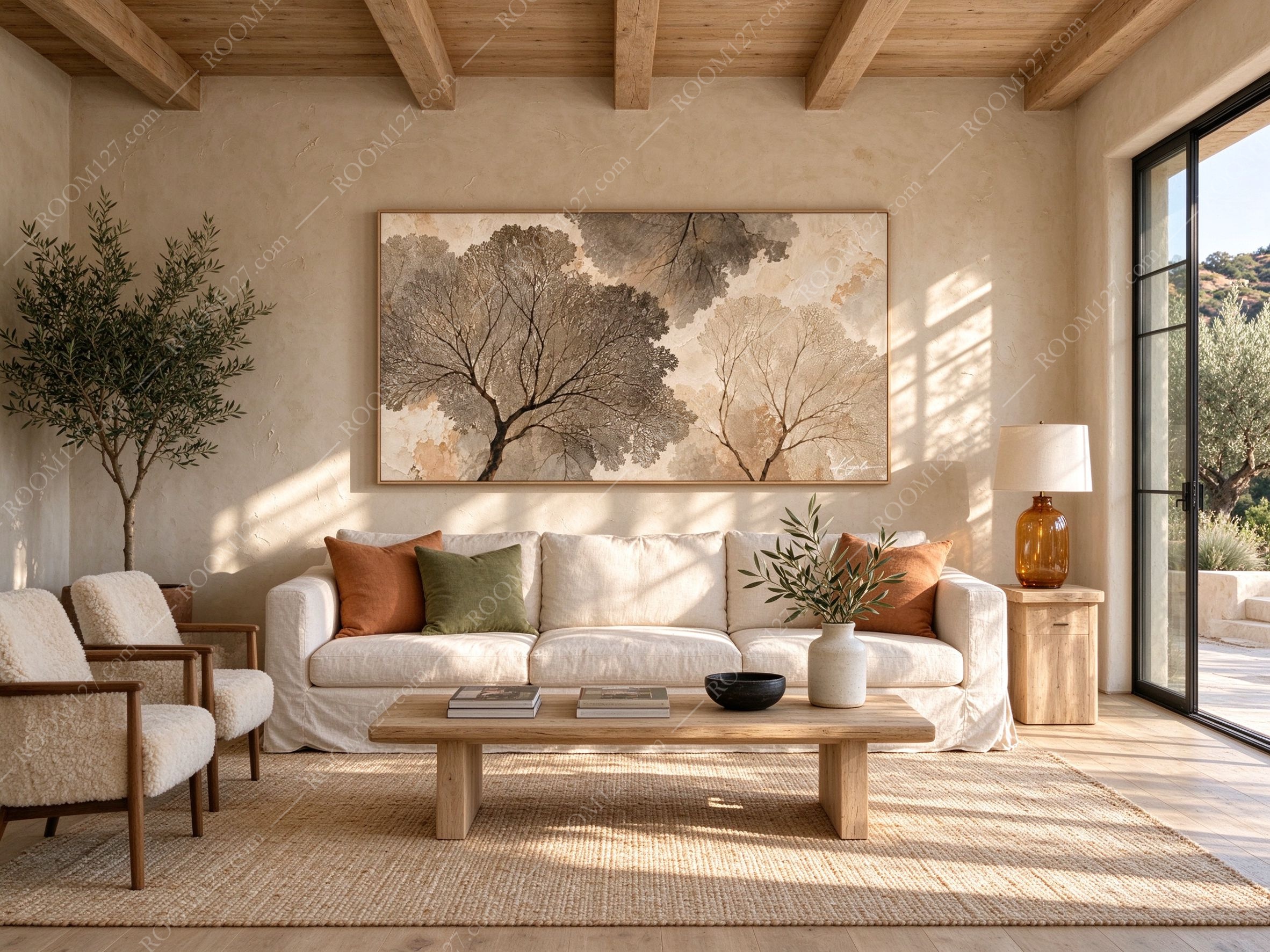
🌾 A hillside villa in California.
Limewash the colour of thin cream, exposed timber beams overhead, an olive tree in a clay pot by the door, two sheepskin armchairs on wooden frames, a deep slipcovered linen sofa with one rust cushion and one olive cushion, a low plank coffee table with two books and a black bowl, a stoneware jug of olive branches, a jute rug, and one amber glass lamp on a pale wood side table. You walk in from the terrace at four and the painting is already the colour of the room — the gold in the canopy and the gold in the wall are the same temperature, which is why it looks like it grew there.
🧱 A loft in New York.
A wall of hundred-year-old red brick, green cast-iron columns, steel-framed windows, a buttoned cognac leather chesterfield, a deep green velvet armchair, an iron coffee table with a rusted drawer, a rug the colour of wet pavement. This is the hardest test in the set and the best result: gold next to brick is the oldest pairing in the book, and the warmth of the canvas pulls the red in the wall toward amber instead of terracotta. On brick, this painting stops being a landscape and starts being a window placed in a factory.

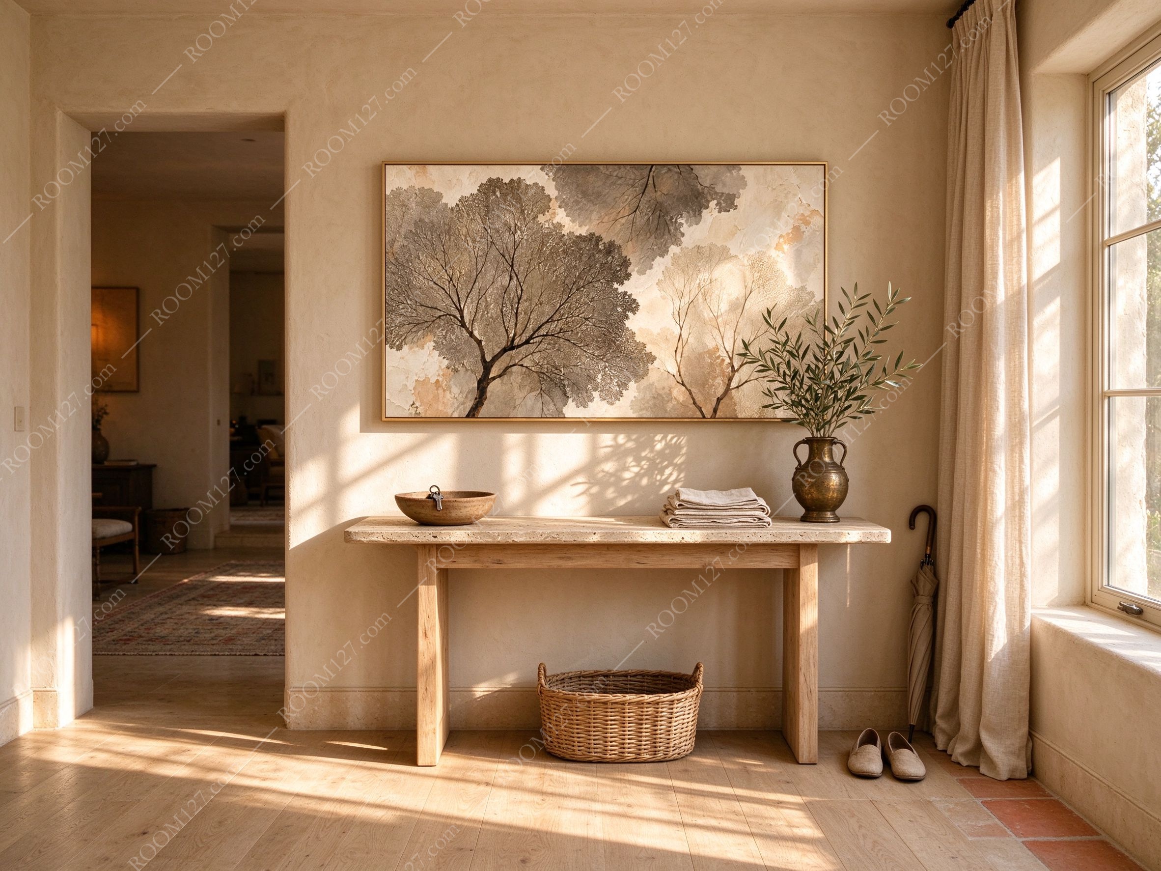
🚪 A villa entrance hall.
Plaster walls, pale oak floor, a rough travertine console, a wooden bowl with keys, a stack of folded linen, a brass jug of olive branches, a wicker basket below, a pair of slippers by the door, an umbrella, and a doorway through to a room with a rug and older furniture. Here the painting is the first thing you see, and the light comes in low from the window on the right — which means the gold shows at an angle, not flat on. Entrance halls are where this format earns its money.
🪴 A garden conservatory.
A glass roof with white glazing bars, whitewashed plaster walls, wicker armchairs and a wicker sofa with linen cushions and a throw, a glass-topped rattan table with a clay jug and two glasses and a book, terracotta pots of olive and fig, dried leaves on the stone floor. This is a strange one, and it works: the painting's trees are gold and the garden's trees are green, and the contrast makes both look deliberate rather than decorative.

🌊 A cliffside loggia in Greece.
Stone arches, whitewashed walls, a built-in bench with blue-and-white striped cushions, a low wooden table with a bowl of lemons and a brass jug of dried pods, a huge terracotta urn, a woven basket of oranges, sandals on the concrete floor, and the Aegean beyond the arch. Which raises the obvious objection: why put a painting of trees on a wall that already has the sea? Because the gold holds its own against blue — and at sunset, the one place the wall isn't white-hot is the spot behind the painting.

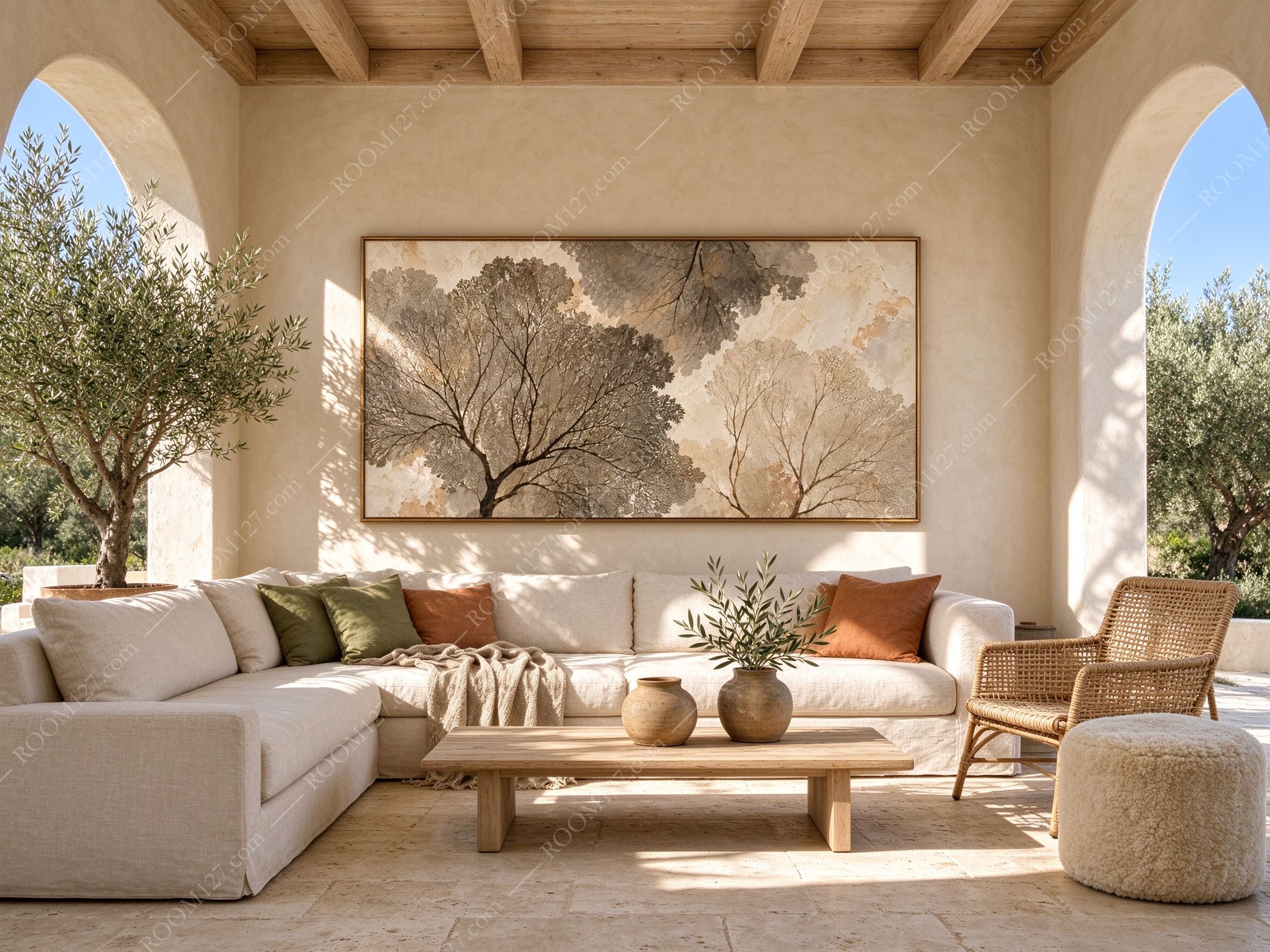
☀️ A sunlit living room with arches. Two arches framing sky and olive trees, timber beams, travertine floor, a big L-shaped linen sofa in oatmeal with olive and rust cushions, a rattan chair, a shearling pouf, a low oak table with two stoneware pots and an olive branch. In this room the wall is broad and low and the arches cut it into sections — the only place the painting can breathe is between the two arches, and that's exactly where it is. The wide format belongs between vertical interruptions, not beside them.
Sizing, light, and what to avoid
Sizes.
120×48cm for entrance halls, narrow side walls, and above a 160–180cm console. 160×64cm above a sofa of 215–265cm — this is the size in most of these photographs. 200×80cm for long living-room walls, hotel lobbies and restaurant walls, where the wall is 300cm or more and you can honour the 40cm breathing room at both ends.
Light. This is a
light-coloured, gold-dominant canvas, which means it behaves beautifully in daylight and badly under a single hard downlight. A long picture light above the frame, 2700–3000K, angled slightly toward the wall, is the best possible setup — with a canvas this wide, one small lamp in the middle will leave the ends dark, so match the light to the width or use two. Avoid direct west sun: the cream field will yellow unevenly and the gold will lose contrast against it.
What to put around it.
Limewash, plaster, travertine, linen, raw oak, terracotta, rattan, aged brass, brick. Warm and matte, all of them. Keep it away from a wall of the same cream as the sky — if the wall and the painting are identical, the painting dissolves and only the frame is left. It needs either a deeper wall (stone, brick, olive, clay) or a clearly lighter one.
The gallery-wall warning.
Do not put this in a cluster. A wide canvas in a group of five frames becomes one stripe among five; on its own above a sofa it becomes the room's horizon. If you want company for it, give it one small object below — a bowl, a branch in a jug — and nothing to its left or right.
Before you buy
✅ Yes if you have a long wall and a wide piece of furniture to sit it over. Measure both before you order; this is the one product where a tape measure genuinely decides the purchase.
✅ Yes if your room is low-ceilinged. A wide, shallow canvas adds width without adding height — the standard trick for rooms that feel cramped.
✅ Yes if you want a forest without a green room. The palette is gold, cream and umber; it will sit happily in a neutral house and still read as trees.
✅ Yes if you're fitting out a restaurant, a hotel corridor or a long office wall. Panels this wide do the work of three framed prints with none of the alignment problems.
❌ No if your wall is shorter than the painting plus 80cm. Squeezing it in undoes everything the format does.
❌ No if it will hang over a narrow console, a small desk or a single armchair. The overhang will read as a mistake no matter how good the art is.
❌ No if you want it above a bed with a tall headboard. Wide formats and tall headboards fight — pick a vertical for that wall and keep this one horizontal.
A vertical painting fills a room.
A wide one stretches it — but only if the wall
is wide enough to hold the stretch.