
Golden Valley
From the front it's a brown mountain.
Two steps to the left, and the ridges catch fire.
Hang this canvas flat to a wall and stand directly in front of it, and you are looking at a brown painting. Deep umber foothills, grey-cream cloud, a pale ridge line near the top. Beautiful, but quiet. A few people will walk past it and not notice it at all.
Now take two steps sideways. The whole lower half of the picture lights up — a broken chain of gold along every ridge crest, glowing like the last twenty minutes of daylight. Same canvas. Same wall. A completely different painting, and all it cost was a change of position.
That's the thing nobody tells you when you buy gold-leaf art online. The photograph on the product page was shot from one angle, in one light. Your room is a different angle in a different light. If those two don't line up, you'll open the box expecting gold and find brown — and the painting will spend the next four years being blamed for it.
✦ The return that wasn't a return
A man in his sixties bought a gold-leaf landscape for a house he'd just finished building on a ridge outside Bergerac. He emailed me four days after delivery. His message was three lines long and I still remember it: "It's brown. It's a very nice brown. But I paid for gold."
I asked him for a photo of the wall. He sent one, taken straight on, at noon, from the sofa, with the ceiling downlights on. Every single one of those choices was the worst possible one.
I told him to turn the downlights off, close the shutters on the west side, and come back at five with a single warm lamp held at shoulder height, pointing along the wall rather than at it. He sent another photo eighty minutes later. No message. Just the photo.
He kept it. It's in the same room. He told me later that guests walk in, see it, and then physically walk around to the side of it, because from the door it looks like one thing and from the fireplace it looks like another, and they want to know which one is real. Both are.
▲ Why the gold does that
Gold leaf is not paint. It's metal, hammered to a fraction of a hair's thickness and laid onto a surface that was still tacky. Which means one thing matters more than anything else in the composition: it has a direction.
Light that hits it straight on passes back to your eye as a flat, dull brown-gold. Light that comes in at a shallow angle — from the side, from above and along the wall — bounces off the flakes and goes out at the mirror angle, so it arrives at your eye a hundred times brighter. Same gold. The difference is not the material, it's the geometry.
And here's the part that makes this painting work rather than just sparkle: the gold is only on the edges. Not the mass of the mountain, not the whole slope — just the crests, in a broken line that runs across the canvas and stops. When the light is right, you don't see gold patches. You see a contour, drawn in light, tracing the shape of the valley. When the light is wrong, you see almost nothing at all, and the painting reverts to being a very calm brown landscape — which is also a legitimate thing to own, but not the thing you were sold.
So the honest buying instruction for any gold-leaf piece: expect to spend a few evenings getting the lamp right. Ten minutes with a torch and a piece of tape will save you a return.
▲ What's actually on the canvas
🟨 The gold chain.
Follow it across the lower third: a thin, broken, slightly irregular band that sits exactly on the ridge line, thick on the props and thin in the gaps. Where the ridge turns, the gold turns with it. There are four or five major segments and a handful of flecks below the main line, like dust that fell while the leaf was being laid. That irregularity is what you're paying for — machined gold stripe is perfectly even and completely dead.
☁️ The sky is built, not painted.
Look at the upper third. It's dozens of separate knife-loads of cream, greige, pale grey and champagne, stacked and scraped. There is no blended gradient anywhere in it. The cloud shapes are actual ridges of paint you can see the edges of from two metres away, and they cast small shadows when a light is above the frame.
🌫️ The mist bands are drawn with the side of the blade.
Between the front slopes and the far peaks there are three horizontal smears of pale cream, each one dragged sideways and left to dry. They do the job that mist does in a real valley: they separate the layers and tell your eye how far away the back ridges are.
⛰️ Depth is handled with temperature, not detail.
The nearest slopes are the darkest and warmest — umber, burnt brown, almost black in the crevices. Move back one ridge and the brown goes greyer and lighter. Move back again and it's cream. There's no drawing of trees or rocks anywhere; the distance is entirely coded in colour. This is why it survives being looked at from close up.
🩶 One cold peak, upper right.
A small, sharp, silver-grey summit with a suggestion of snow, sitting above the warm gold. It's the only cool note in the painting, and it's there for contrast — without it the whole canvas would be one continuous warm blur.
🖼️ Slim bronze frame, roughly two centimetres.
Dark and matte, closer to aged bronze than to bright gold — deliberately, because a bright gold frame next to gold leaf forces the leaf to compete with metal that reflects better than it does. The dark frame makes the leaf look like the only precious thing in the room.
▲ The five-second test
If you're looking at a gold-leaf canvas in a shop, a gallery or a friend's house, do this before you decide anything. Turn the room light off. Put your phone torch on. Hold it at shoulder height, arm's length to one side, and move it slowly along the wall.
Real leaf will stay dark for most of the sweep and then flare once, hard, when the angle lands — and it will flare unevenly, in patches, because the flakes are laid by hand. Printed metallic ink flares too, but it flares evenly, across the whole surface at once, like foil on a birthday card. If the entire gold area lights up together, you're looking at a print pretending to be leaf.
This takes about five seconds and it is the single most useful thing anyone can tell you about buying metallic art. Do it in the shop, do it in your own room the day the box arrives, and if it doesn't flare, don't blame the painting — move the light.
▲ Six rooms
🌿 A hillside villa in California.
Limewash, exposed timber beams, an olive tree in the corner, two round bouclé chairs, a slipcovered linen sofa with one rust cushion and one camel one, a raw travertine coffee table with magazines and a black bowl, a brass jug of olive branches, a jute rug, and one amber glass lamp on a stump table. You come in from the terrace with the sun behind you and the room is already warm; the gold in the canvas is the same gold as the late light on the plaster, so for a moment the painting doesn't look like an object — it looks like a window someone forgot to frame.

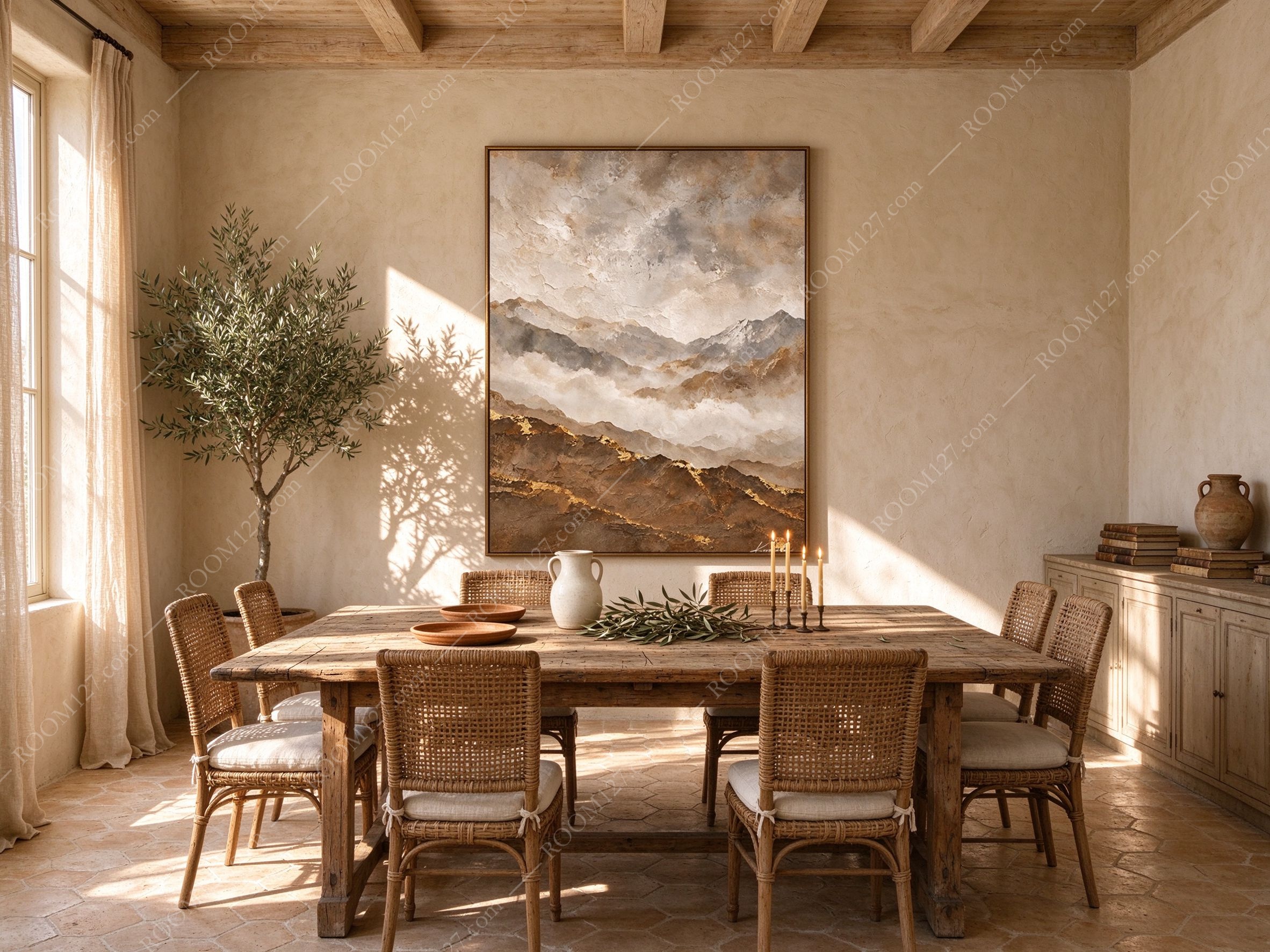
🍋 A Mediterranean dining room.
Beams overhead, plaster that's been patched a dozen times, a long scrubbed oak table, rattan chairs with linen seat pads tied at the back, a white jug, two terracotta bowls, a scatter of olive cuttings, a black iron stand with four candles, terracotta hexagon tiles underfoot. The canvas hangs between the olive tree and the sideboard, and at four in the afternoon the tree's shadow crosses the wall behind it — branches moving over a painted mountain range while the real one sits outside. At night, with the candles lit, the gold ridge picks up the flame and the whole lower third of the painting goes warm orange.
🛏️ A Mediterranean master bedroom.
Linen headboard, white cotton sheets, one camel throw pulled off the end, two pale wood nightstands, a terracotta lamp with a paper shade on the left, a stoneware pot on the right, a rough wooden bench with dried branches against the far wall, and a slider open onto a terrace with an olive tree. Above the bed, in low evening light, the gold drops away and the painting becomes a soft grey-brown mass — which is what you want at eleven at night. The gold only performs when you turn the bedside lamp toward it, and then it's a small, private reward.

📚 A reading corner.
A low open shelf of books with a stoneware pot on top, a rattan armchair with a linen cushion and a throw over one arm, a matching footstool, a drum table with a copper lamp, a cup of coffee, a pair of glasses, and a tall vase of bare branches by the window. This is the room where the painting is appreciated most, because a person sitting in that chair is at exactly the wrong angle to see the gold — and every time they look up, they catch it. That intermittent flash is the whole point of gold leaf. It's not a colour, it's an event.

🗝️ An entrance hall.
Plaster walls, wide oak floorboards, a rough travertine console, a wooden bowl, a stack of folded linen towels, a brass jug of olive branches, a woven basket underneath, a pair of slippers, a dark wood chair, an umbrella, and a doorway through to a terracotta-tiled corridor. Entryways are where gold leaf makes the most sense commercially — guests arrive, the light is low, and the first thing they register is a line of gold. It reads as expensive before anyone has seen the rest of the house.

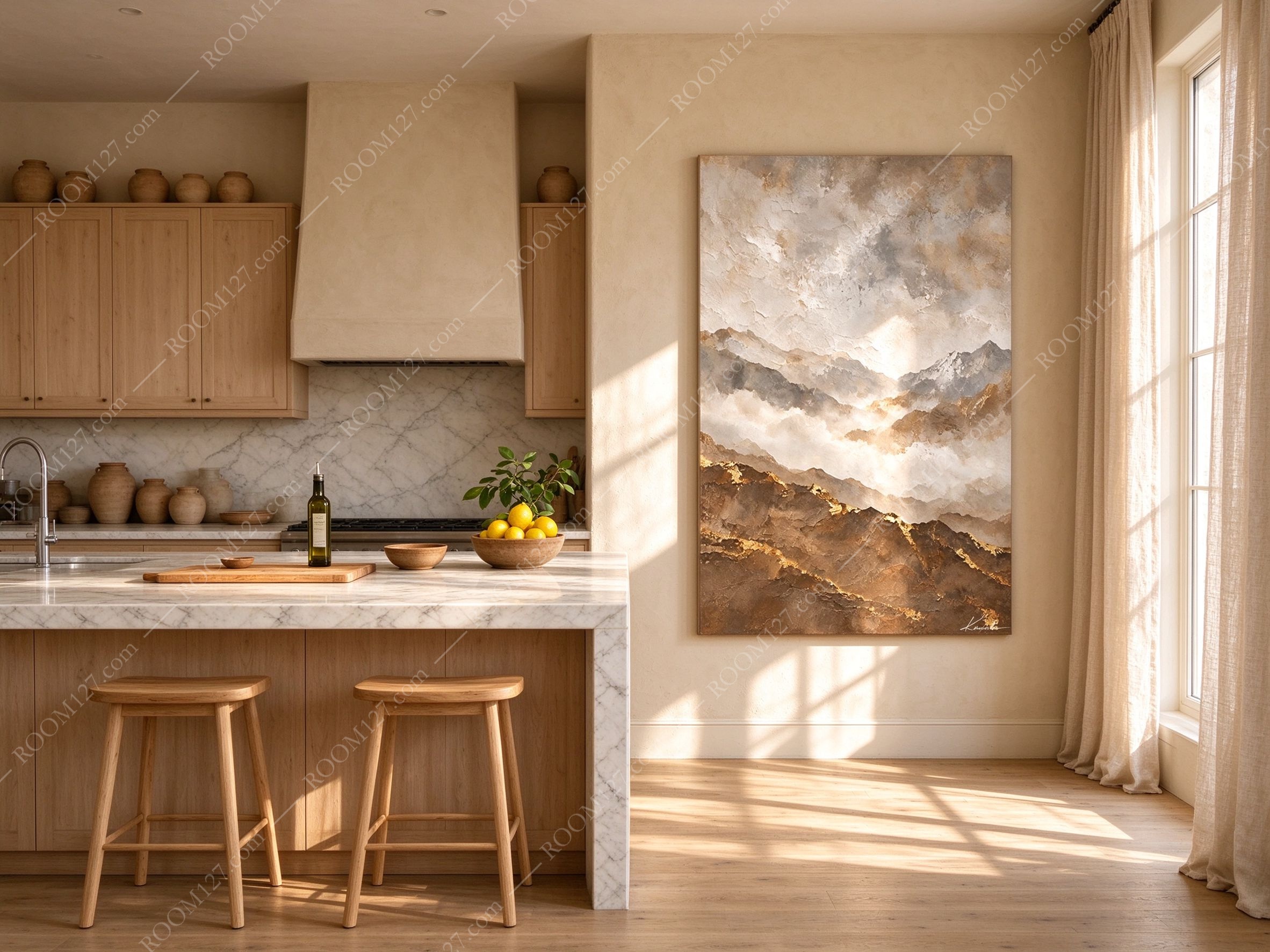
🍳 An open kitchen breakfast wall.
Pale oak cabinets, a plaster range hood, a marble backsplash, a marble-topped island with a butcher block, a bowl of lemons, a bottle of oil, two oak stools, and a shelf of pottery above. Hung on the plaster between the window and the island, the painting is the only thing in the room that isn't a functional object — and at eight in the morning, with the low sun coming through the window on the right, you get the strongest flare of the whole day. People who claim artwork "doesn't work in kitchens" have never hung a gold-leaf landscape next to a source of morning light.
▲ Light, height, size
Light.
2700–3000K, warm, from above, at roughly 30–40 degrees to the wall — raking, not straight on. A picture light 20cm above the top edge of the frame is the ideal. Three things will kill it: ceiling downlights directly overhead (flat, dead brown), uplighting from a floor lamp (flattens the texture and lights the underside of the frame), and direct sunlight from a west window (the leaf will be fine but the plaster in the room will make the painting look grey by comparison). Daylight from a north or east window is genuinely enough — you just won't get the flare, and you'll get a calm, quiet, expensive-looking brown instead.
Height.
Centred at 145–150cm on a blank wall. Over a sofa, 20–25cm above the back. Over a sideboard, 20–25cm above the top. Above a bed, 25–30cm above the mattress — and if it's a tall headboard, line the bottom of the canvas up with the top of the headboard rather than measuring down from the ceiling. Never hang it where the top of the canvas is directly under a ceiling downlight; you'll get a hot spot on the frame and a dark band across the sky.
Size.
60×90cm for entrance halls, narrow walls, and above a console. 80×120cm for living rooms, dining rooms and bedrooms — this is the size in nearly all the photographs here. 100×150cm for double-height walls, hotel lobbies and restaurants, where the gold needs to be visible from six metres away and the impasto needs the extra surface area to hold up.
What to put around it.
Limewash, plaster, travertine, linen, raw oak, olive wood, terracotta, rattan, aged brass. All of those are warm and matte, and all of them let the gold be the only shiny thing in the room. Keep it away from high-gloss white walls, chrome, polished nickel, and black lacquer — every one of those out-reflects the leaf and makes it look like dull brass.
▲ Before you buy
✅ Yes if you have a warm, matte wall — plaster, limewash, travertine, or a good warm white. This painting is designed for those surfaces.
✅ Yes if you can put a light above it, or if there's a side window. That's the difference between a brown canvas and a gold one.
✅ Yes if you're furnishing a rental, a guest house, a restaurant or a hotel where the entrance does the selling. The gold reads at three metres, in low light, to people who aren't looking.
✅ Yes if the room already has olive, rust, camel, clay or umber in it. The palette is already in your house; this just concentrates it.
❌ No if your wall is brilliant white or cool grey. The cream will read as yellow and the gold will read as dirt, and no lamp will fix a colour clash that fundamental.
❌ No if it will hang in a corridor of ceiling downlights with no side light. You'll own a brown rectangle and wonder why.
❌ No if you want gold to be obvious from every seat in the room. Metallic work is deliberately unreliable — that's the trade. If you need constant, even shine, buy a print with a gold border and be happy.
Gold leaf doesn't glow.
It waits for you to stand in the right place.