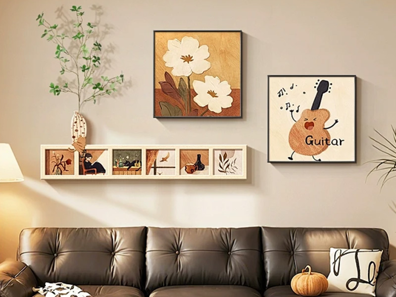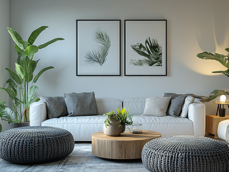
Three principles guide frame color selection: tone matching for harmony, contrasting color for emphasis, and neutral color for universal matching. Frames of similar tones coordinate softly with artwork. Contrasting frames highlight paintings and form visual focal points. Neutral frames including black, white, light wood and champagne gold fit most artworks and interior styles. Match frame color with furniture, lamps and hardware to maintain consistent space aesthetics.
Space atmosphere and artwork content cannot be ignored. Artworks with rich and complicated colors are better paired with simple slim solid frames to avoid clutter. Low-saturation abstract paintings and minimalist landscapes can be upgraded with textured metal or solid wood frames. The frame should conform to home style: dark wooden frames suit new Chinese style, gold/silver metal frames match modern light luxury style, and slim black & white frames are ideal for minimalist interiors.