
A woman walks away along the water — and the room starts to breathe.
Look at her feet. You can't see them — the dress swallows them and the sand is only a smudge of ochre. But you know exactly which way she is walking.
She is on a shoreline at the end of the day. Her hair is pinned up and coming loose. The dress is white and thin and moving: it wraps her back, gathers at the waist, then breaks into long ribbons that stream off to the right and out of the frame. Behind her the water is a pale horizontal strip. Across it, a dark line of land. Above it — most of the canvas — a sky of cream, champagne and pale blue, laid on with a knife in flat flakes.
There is no house. No boat. No path. There is wind, and there is a woman walking into it.
And then there is the room it hangs in, which — for a reason you can feel before you can explain it — stops feeling enclosed.
📖 The apartment with no view
A woman in Manhattan had a one-bedroom on the fourth floor. The only window looked at a brick wall six feet away. She'd stopped opening the blind.
She hung this painting on the wall opposite her bed, because it was the only wall with nothing on it. The first morning after, she woke up before her alarm, saw a pale gold rectangle out of the corner of her eye, and — for about two seconds — thought she'd left a window open.
That's what a horizon does to a room. It doesn't matter that the sea is painted. Your brain processes "horizontal line, wide sky, low light" before it processes "canvas, ink, frame".
The painting
One figure.
One shoreline.
One direction of wind.
It's a vertical canvas — roughly two by three — and the composition is doing something deliberate. The horizon sits low, in the bottom third. That leaves two thirds of the painting given over to sky and to the moving dress. You are not looking at a seascape with a woman in it. You are looking at a woman with an enormous sky behind her.
The figure is small enough to leave the landscape alone, but large enough to give it a scale. That's the hardest thing to get right in figure-in-landscape painting, and it's the reason this one doesn't look like a stock photo with a person pasted into it.
And the motion is real, not decorative. Her hair pulls left. The dress pulls right. The dry shrubs in the lower left lean with her. Three separate directions of movement in one still image — which is why your eye keeps traveling instead of settling.
Detail
What shows up
when you stand
close enough.
👗 The dress is painted as ribbons, not fabric.
Follow the hem. It breaks into four or five long strips of white with grey undersides, each laid down in one or two knife strokes. Where the strips thin out, the ochre ground shows through — she is wearing something translucent, and the painting actually renders translucency instead of just describing it.
🌾 The shrubs are scratched, not painted.
Lower left, those dried branches are thin lines dragged through wet paint with the corner of a blade. They look like calligraphy. They also do structural work: they weight the bottom corner, give the figure a scale reference, and keep the whole composition from floating.
🌅 The sky is flaked, not blended.
Up close the sky is dozens of separate flat dabs — cream, champagne, a hint of dusty blue. There is no soft gradient anywhere. Step back three metres and they merge into haze. This is why the painting photographs so well and why it doesn't look like a printed gradient.
🧍 Her hand is barely described.
Look at where her arm falls. There's a suggestion of fingers, nothing more. It's the detail that keeps her from reading as a mannequin — a fully rendered hand would have made the pose look deliberate, and she is supposed to look like she's leaving.
🖼️ The frame is slim antique gold.
About two centimetres, matte, with a faint warm patina rather than a bright polish. It picks up the champagne in the sky without competing with it. On the green study wall, it is the only line of metal in the room.
Why it works
A vertical canvas
with a horizontal
promise.
Most wall art in a modern apartment fights the architecture. The room is a box; the art is a rectangle in the box. This painting does the opposite — it opens the box.
Three mechanisms are at work. The horizon gives your eye somewhere to travel to, which is the visual equivalent of a deep breath. The low placement of the figure keeps the majority of the canvas as sky, so the painting reads as air rather than object. And the directional wind implies space beyond the frame — the dress is moving out of the picture, which means the world continues past the edge.
The practical result: hung in a room with no view, it makes the room feel larger and less finished. Hung in a room with a real view, it stops being a picture of a beach and becomes a conversation between the two horizons — which is exactly what happens in the California house shown in the photos.
Six rooms
Same canvas.
Six completely
different rooms.
🏖️ White villa, Ibiza
Thick white stucco, an olive tree outside, a terracotta urn, a linen sofa the colour of sand. You step in from the terrace and the wall is still warm from the afternoon. The painting's gold is the same gold as the light on the plaster, so for a second it looks like a hole cut into the wall rather than something hung on it.

🏙️ Penthouse, New York
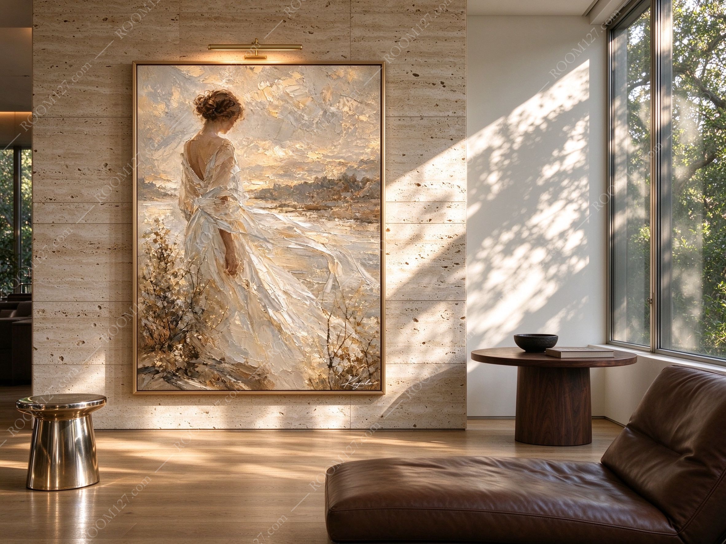
A travertine wall in horizontal bands, a brass picture light angled down, a polished steel stool, a round walnut table, a brown leather chaise. Here the painting is lit like an object in a gallery, and the impasto in the sky casts tiny shadows. The brass light and the gold frame are the only two warm metal notes in the room, and they rhyme.
🫒 Stone house, Provence
A stone arch, a doorway going black, a long scrubbed table with pottery bowls and a clay jug, terracotta tiles underfoot. The painting hangs beside the arch on thick plaster, and it is the only bright surface in a room built of shadows. At four in the afternoon a wedge of sun crosses the wall and lands on the dress.

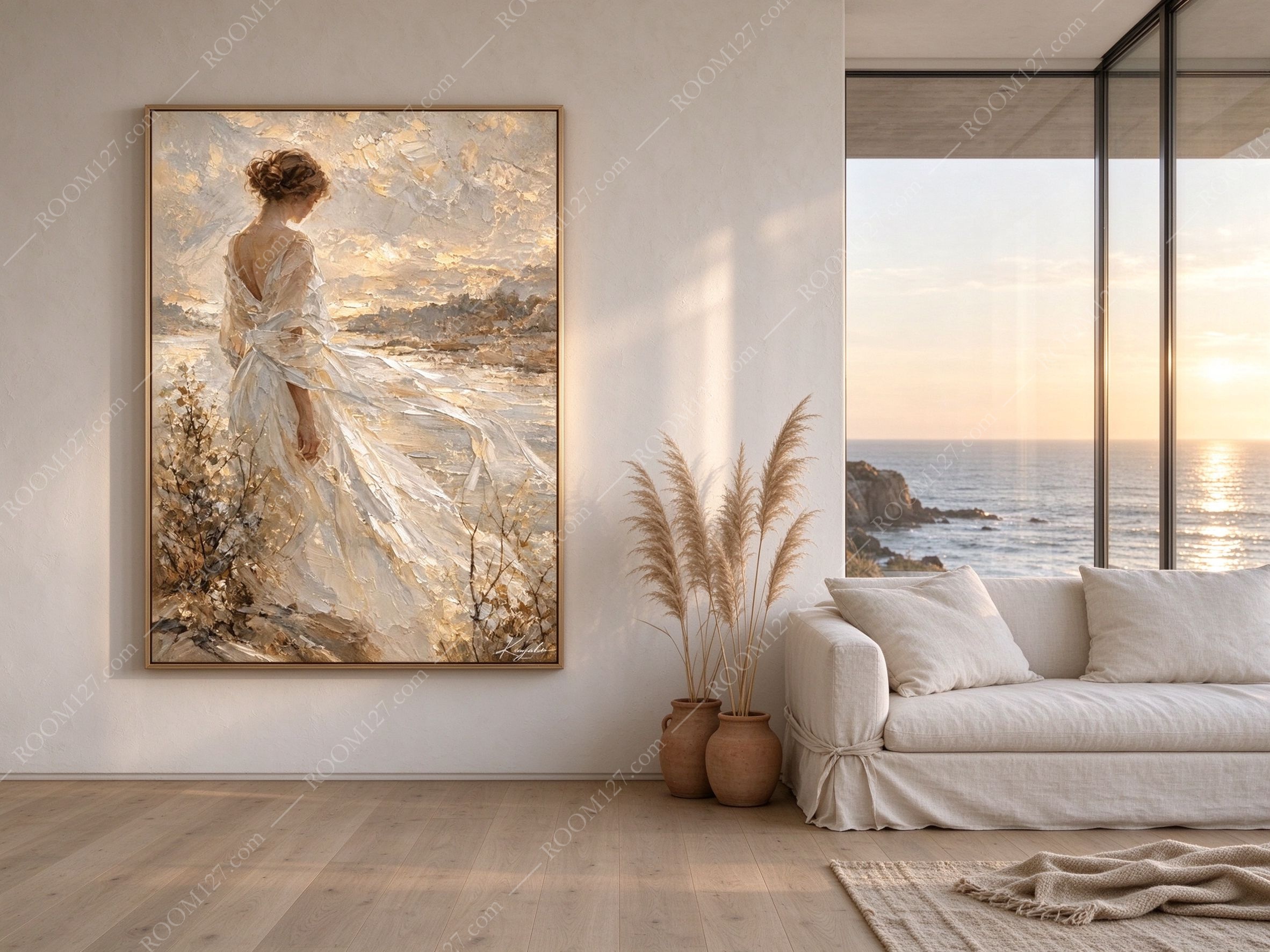
🌊 Coast house, California
White concrete, pale oak floor, a slipcover sofa, pampas grass in terracotta pots, and a glass wall with the actual ocean in it. This is the hard test: a painting of a sunset next to a real sunset. It holds, because the painting's sunset is warmer and flatter and more nostalgic — and because at dusk the real sky goes blue while the canvas stays gold.
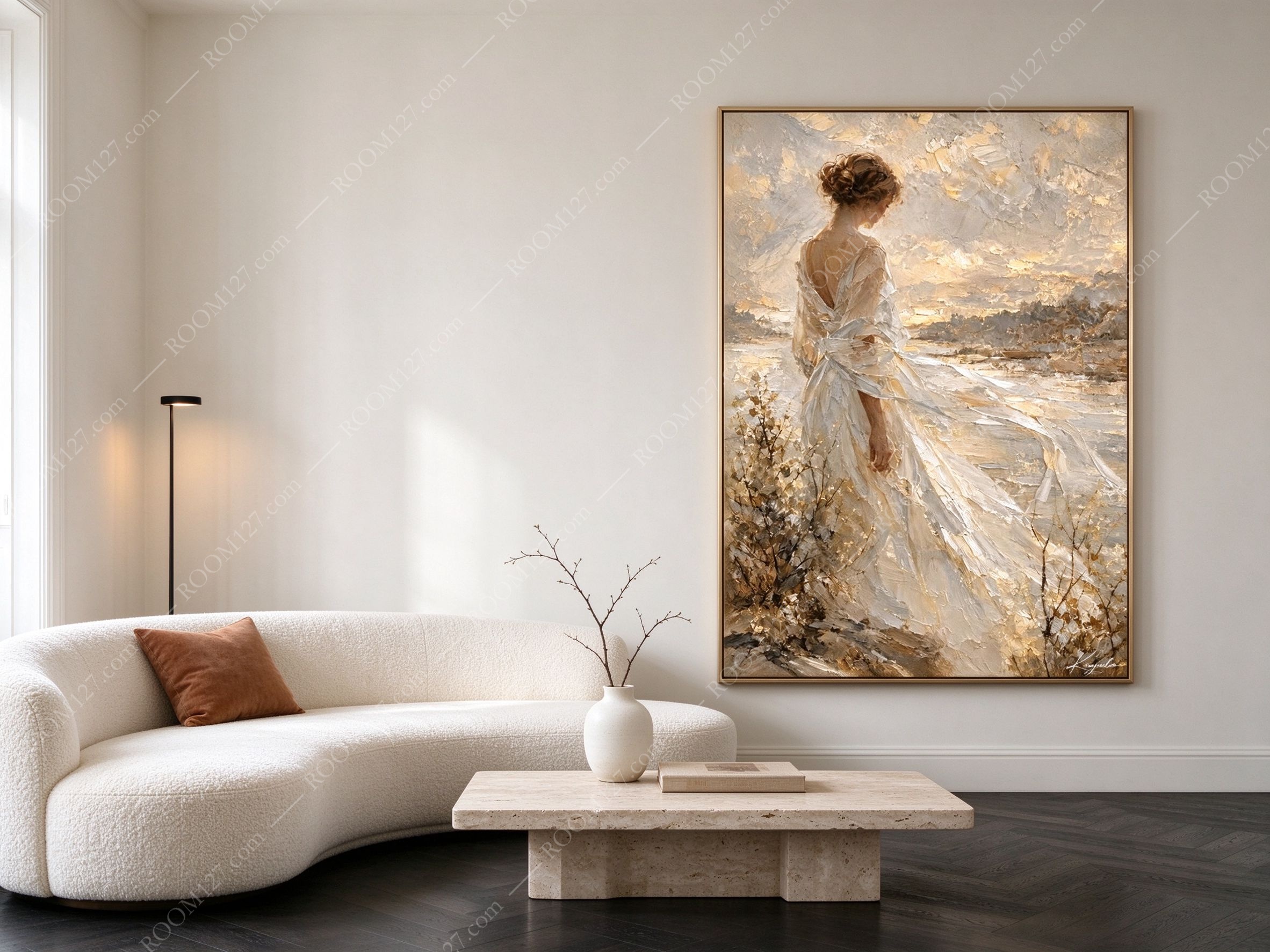
🪞 Modern apartment, Paris
A curved bouclé sofa the size of a small car, a travertine block table, one rust-coloured cushion, dark chevron parquet, a slim black floor lamp. The painting is hung right of centre, on a wall that is otherwise empty. It gives that enormous pale room the one thing it was missing: a direction.
📚 Green study
Deep green plaster walls, tall bookshelves, a leather club chair, a brass side table, one glass of something amber. The picture light is on. In this room she doesn't look like a holiday memory — she looks like the last page of a novel. This is the pairing most people wouldn't try, and it is the best one in the set.

Practical
Height.
Light.
Size.
Height.
Centre it at 145–150cm from the floor. Over a sofa, 20–25cm above the back. Over a bed, 25–30cm above the mattress. In a double-height lobby, hang it so the centre sits at eye level for someone standing at the entrance — not at the room's mathematical midpoint, which will look lost.
Light.
2700K, from above, at about 30 degrees. A brass picture light 15–20cm above the frame is ideal and it will make the texture readable. Two things to avoid: direct west sunlight on the canvas (it will bleach the ochre), and uplighting from below, which flattens every knife mark and makes the sky look like a printed gradient.
Size.
60×90cm for a hallway, a narrow wall, or beside a doorway. 80×120cm above a sofa and in bedrooms — this is the size in most of the photographs here. 100×150cm for hotel lobbies, restaurants, double-height walls and anywhere the painting is read from across a room.
What to pair it with.
Linen, travertine, terracotta, unglazed pottery, warm wood, brass. Avoid high-gloss lacquer, chrome, and very saturated blues — they cool the whole painting down and make the gold look yellow instead of warm. If the room already has a strong colour, let it be green or clay, not blue.
Before you buy — a short checklist
✅ Yes, if you have a wall with nothing on it and no window nearby. That's the ideal condition for this piece.
✅ Yes, if you're furnishing a rental, a B&B, a boutique hotel or a restaurant where guests need to feel somewhere else for a minute.
✅ Yes, if the room is neutral and slightly cold. Cream and champagne will warm it without adding a colour scheme you have to maintain.
❌ Not if the wall is patterned, or already holds a gallery cluster. She needs empty plaster around her.
❌ Not if you want something abstract or graphic. This is romantic realism, and it commits the room to a mood. If that mood isn't yours, it will feel like a hotel you didn't book.
You don't need a sea view.
You need one wall that remembers one.