
Whisper
of Flowers
It looks unfinished.
That's the part that costs the money.
Stand close to this canvas and you can see where the painter stopped.
The petals of the largest flower are not filled in. They are outlined with a single thin umber line, and inside that line there is almost nothing — bare cream canvas, one translucent wash dragged across it, and a few brush hairs dried in. A stem runs off the bottom edge of the canvas and simply ends, mid-thought. Two thin drips of tan come down out of the upper bloom and dry where they landed.
Step back to a metre and none of it reads as unfinished. At a metre it reads as light — four enormous cream flowers against a bone-white field, lit from somewhere that isn't in the picture.
That gap between those two readings is the whole subject of this piece. And it is, as it happens, the exact thing you should be checking before you spend money on any floral canvas.
✦ A client, a hallway, and a bad first week
I staged a flat in a 1926 building for a couple moving out. Cream walls, herringbone floors, the good kind of old. I hung this canvas in the entrance hall, on the wall you face when you come in the door.
They asked me to take it down after four days. "It looks like it's missing a piece," she said. "Like the room is waiting for something to arrive."
I took it down. We left the wall empty. Two weeks of viewings later, they called and asked me to put it back — because three separate buyers had stopped in the doorway and asked what had been hanging there. Not what was hanging. What had. They could feel the absence.
That's the honest review of this painting: it is not decorative, it is load-bearing. An empty-looking wall makes a room feel like it's waiting. Which, if you're selling a house, is terrible. If you live there, it's the feeling you pay for.
Why gaps read as expensive
Most floral wall art fills everything in. A rendered bouquet, in a rendered vase, on a rendered table, with a rendered shadow underneath. Every petal shaded, every background detail accounted for. Technically impressive. And it reads as a poster, because a poster is a complete statement — it tells you the whole thing at once and asks nothing back.
This canvas does the opposite. It is a fragment. The flowers are cropped on three edges — top, left and bottom right — so you are standing inside the bouquet, not looking at it. The background is a wash, not a room. The stems are single hairline strokes that run out of frame.
There is a simple test you can run on any floral print in ten seconds. Count how many finished elements it contains: vase, table, wall, shadow, full bouquet. Four or five rendered elements and you are buying decor. Two or three, and the piece behaves like a painting — it holds a wall instead of decorating one.
This one has one: the flowers. Everything else has been edited out. That's not a shortcut, it's a decision, and it's the reason the same image at the same size looks different from the £30 print two aisles over at the home store.
The detail, up close
🌸 Four blooms, no two the same.
Upper left, one large open flower seen almost flat-on. Upper right, a smaller one turned away, stem long, head tilted — it's the only bloom that looks like it's leaving. Lower right, the biggest of the three, cropped by the canvas edge so a full quarter of it is simply gone. And a fourth petal entering at the bottom, unreadable, just a pale curve.
🖌️ The petals are translucent, and that's deliberate.
Look at the upper-left flower: the outline is a thin umber line, but the inside is barely painted — you can see the weave of the canvas through the wash. Real petals are translucent. Painted petals usually aren't. This is the one place where the "unfinished" surface is doing a physical job instead of just being a style.
🟤 All the contrast lives in the centres.
Dark bronze, almost black at the core, with radiating strokes pulled outward like a whisk. Zoom out and the four centres become the four darkest points in the room — which is what keeps an otherwise all-cream canvas from disappearing into a cream wall.
💧 The drips are not damage.
Two thin vertical runs of tan, coming down out of the upper bloom, drying where they stop. They mark the canvas as a surface that was worked on — flat, tilted, wet. Remove them and the whole thing gets tidy, and tidiness is what makes floral art look like wallpaper.
🧵 The stems are one stroke each.
Olive-brown, hairline, slightly wavering. One crosses the full height of the canvas; one exits the bottom edge. They are the structure holding the composition together and they are drawn with the confidence of someone who wasn't going to fix them.
🖼️ The frame is a thin brushed gold, about two centimetres.
Matte, not lacquered. On a cream canvas a bright polished frame would look like a shop window; this one just closes the edge. It also means the canvas doesn't need a mat or a mount — it's already finished at the boundary, which is the only finished thing about it.
The scale problem
At 80×120cm, the big lower bloom is roughly 50cm across. That's not a flower, that's a cushion. A bloom that size changes what the wall is for — it stops being a surface you put things on and becomes a surface with something happening on it.
This is also why oversized botanicals fail more often than small ones. Hung on a wall with a mirror, a shelf and a lamp, a half-metre flower looks like a mistake. Hung on a wall with nothing else, it looks like architecture. The flower needs the emptiness around it — the empty wall is not a limitation of this piece, it is a requirement of it.
And the tone matters, because this is the trap with cream-on-cream: if your wall is cold grey or brilliant white, the canvas will look dirty next to it. Against warm white, bone, limewash, sage, olive, oatmeal or aged plaster, it separates cleanly. Warm wall, warm painting. Cold wall, and the whole thing goes flat in a way that no lamp will fix.
Six rooms it has already been in
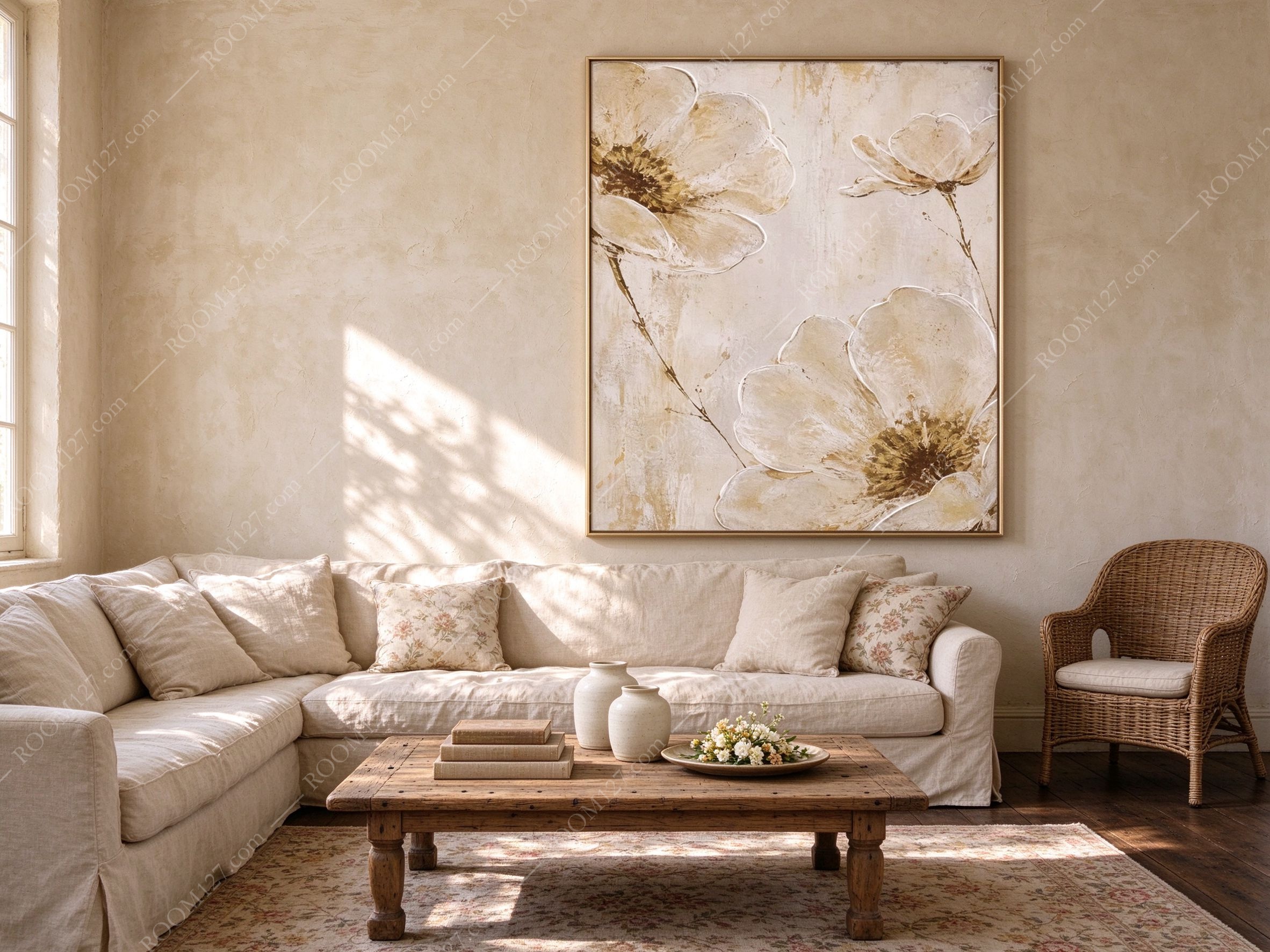
🏡 A French country living room.
Limewash the colour of weak coffee, a deep linen sectional, floral cushions in a small dense print, a reclaimed timber table with stacked books, two white ceramic vases, one wicker chair. You walk in at four in the afternoon and leaf shadows are moving across the wall behind the canvas. The small-print cushion and the metre-wide flower sit in the same room and don't fight, because scale separates them — one is a fabric, the other is a window.
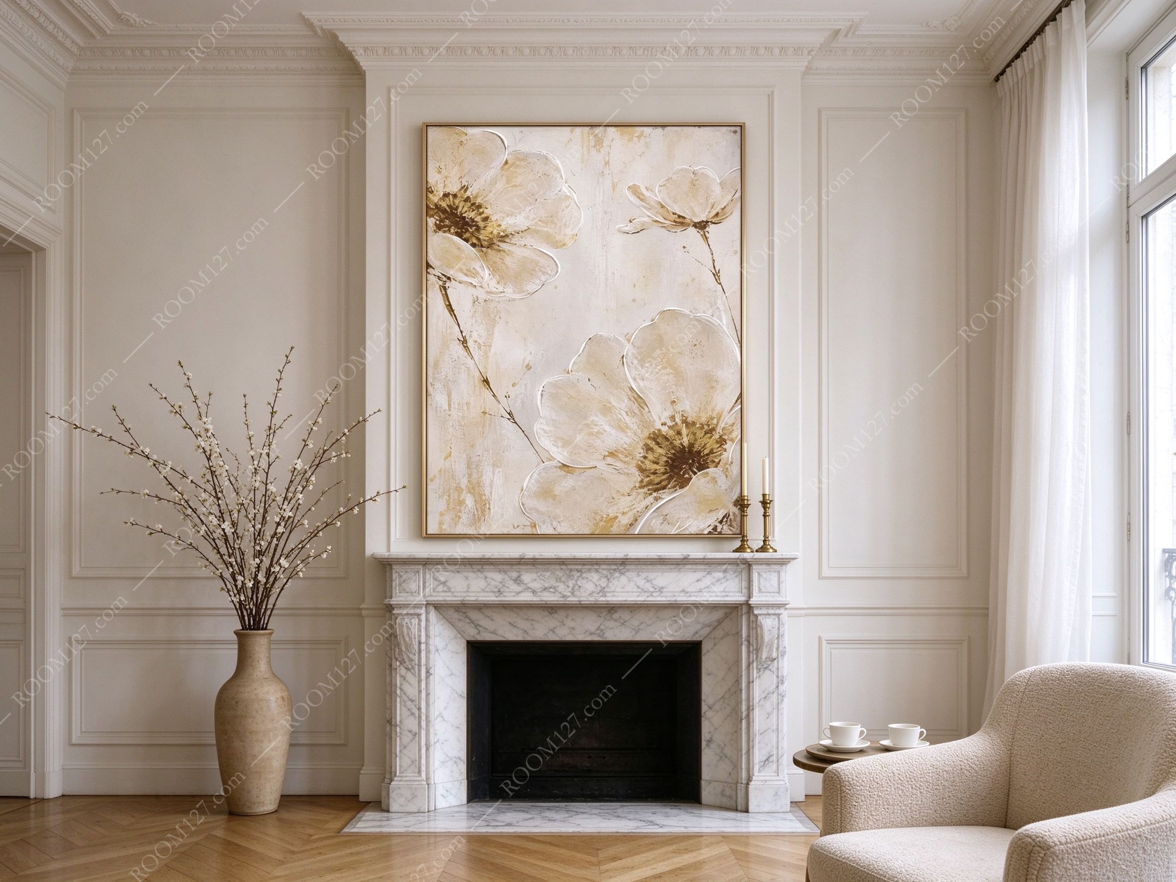
🕯️ Above a marble mantel in Paris.
White boiserie, grey-veined marble, herringbone oak, a tall floor vase of blossom branches, two brass candlesticks either side of the canvas. The black firebox underneath is doing secret work: it gives the cream something to be bright against. Hang floral art above a working fireplace and it starts to look lit even when it isn't.
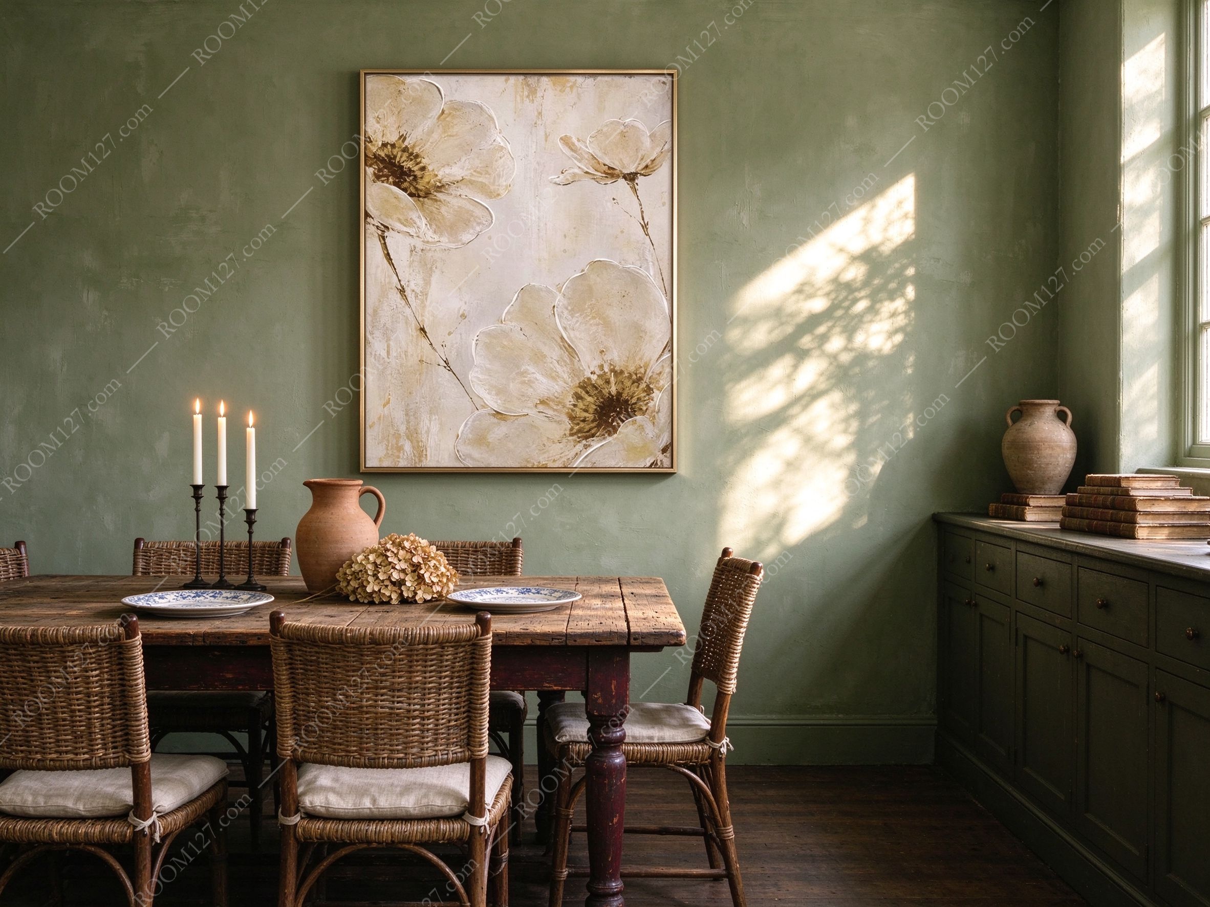
🥀 A sage-green dining room in the English countryside.
An old oak farmhouse table, wicker chairs with linen seat pads, a terracotta jug, a dried hydrangea, blue-and-white porcelain, three candles burning on a black iron stand. Here the flowers are the only pale object in a room built of greens and browns. At night, by candlelight, the canvas goes gold — the cream picks up flame colour and the bronze centres go almost red.
🏛️ A double-height hall in northern Italy.
Travertine walls, travertine floor, a cube of stone as a coffee table with a single dried stem in a white vase, one low sofa, and a glass wall with a lake and cypresses behind it. This is the test most large canvases fail: a six-metre wall. It works here for exactly one reason — the wall is otherwise empty. Put a second frame anywhere on that wall and the painting instantly becomes one of two things rather than the thing.

🛏️ Above a bed on Lake Como.
Limewash, linen headboard, white pillows, a camel throw pulled loose, one terracotta lamp on a small wooden table, a stone-framed window with mountains in it. Above a bed this painting goes quiet — the flowers are enormous but the palette isn't loud, so at 11pm with one lamp on it reads as texture rather than as flowers. This is the calmest room in the set and the one people are most surprised by.

🚪 A bare entrance corridor in microcement.
Polished concrete underfoot, a travertine console, a black bowl, one dry branch leaning against the wall, and a wedge of sun coming through a doorway. This is the most contemporary pairing here and the most unexpected: the painted stems and the real branch are the same line, drawn at two different scales. It stops a minimalist hallway from feeling like an office.

Practical notes
Height.
Over a sofa or sideboard, 20–25cm above the top edge of the furniture. Over a bed, 25–30cm above the mattress. On a standalone wall, centre it at 145–150cm from the floor. In a double-height space, keep the top edge below 2.4m — above that it stops being a painting and becomes signage.
Light.
It needs far less than a dark painting does. In a daylight room, none at all — a cream canvas on a warm wall self-illuminates. If you do add a picture light: 2700–3000K, from above, 30 degrees, 15–20cm over the frame. What it cannot take is direct west sun (the tan drips will bleach first and the bronze centres will go muddy) or an uplight, which flattens the petal outlines into stickers.
Size.
60×90cm for entrance halls, narrow walls, and above a console. 80×120cm above a sofa, a sideboard or a bed — this is the size in most of the photographs. 100×150cm for double-height walls, hotel lobbies, restaurants, and anywhere the canvas is read from the far side of a room.
Pair it with.
Linen, travertine, terracotta, rattan, aged brass, sage or olive walls, raw wood. Keep it away from cold grey walls, chrome, glossy black, and saturated jewel tones — all four make cream look cheap. And skip the gallery wall: one of these is a statement, three of these is a showroom.
Two questions worth asking the seller.
First, is the surface matte? A gloss or satin finish will turn the bare-canvas passages into reflections and destroy the entire effect — this is the single most common way a good floral canvas arrives looking like a laminated poster. Second, how heavy is the canvas face? A thin face on a canvas this large will show the stretcher bars as soft ridges under raking light.
❋ Before you buy
✅ Buy it if you have one big empty wall and nothing else to put on it. This wants to be the only thing in your field of view.
✅ Buy it if the room is north-facing or dim. A cream canvas is the cheapest way to add light to a room that doesn't get any.
✅ Buy it if you want botanicals but the word "floral" makes you nervous. This is a flower painting that doesn't do chintz.
❌ Skip it if the wall behind it has wallpaper, panelling with strong mouldings, or a mirror. Anything with its own pattern competes with a half-metre flower.
❌ Skip it if you need symmetry. The composition is deliberately off-balance — the weight sits low right, the empty space sits upper left. Hung between two matching lamps it will feel lopsided forever.
❌ Skip it if you're matching a floral sofa exactly. Same flowers, different sizes, is a room that looks like it was bought in one order.
You don't hang it for the flowers.
You hang it for the light
they happen to be standing in.